Check out the conversation on Apple, Spotify and YouTube.
A comprehensive guide to designing AI features and products from one of Google’s original designers. Learn how Elizabeth Laraki helped shape Google Search and Google Maps, and discover her framework for building the next generation of AI products.
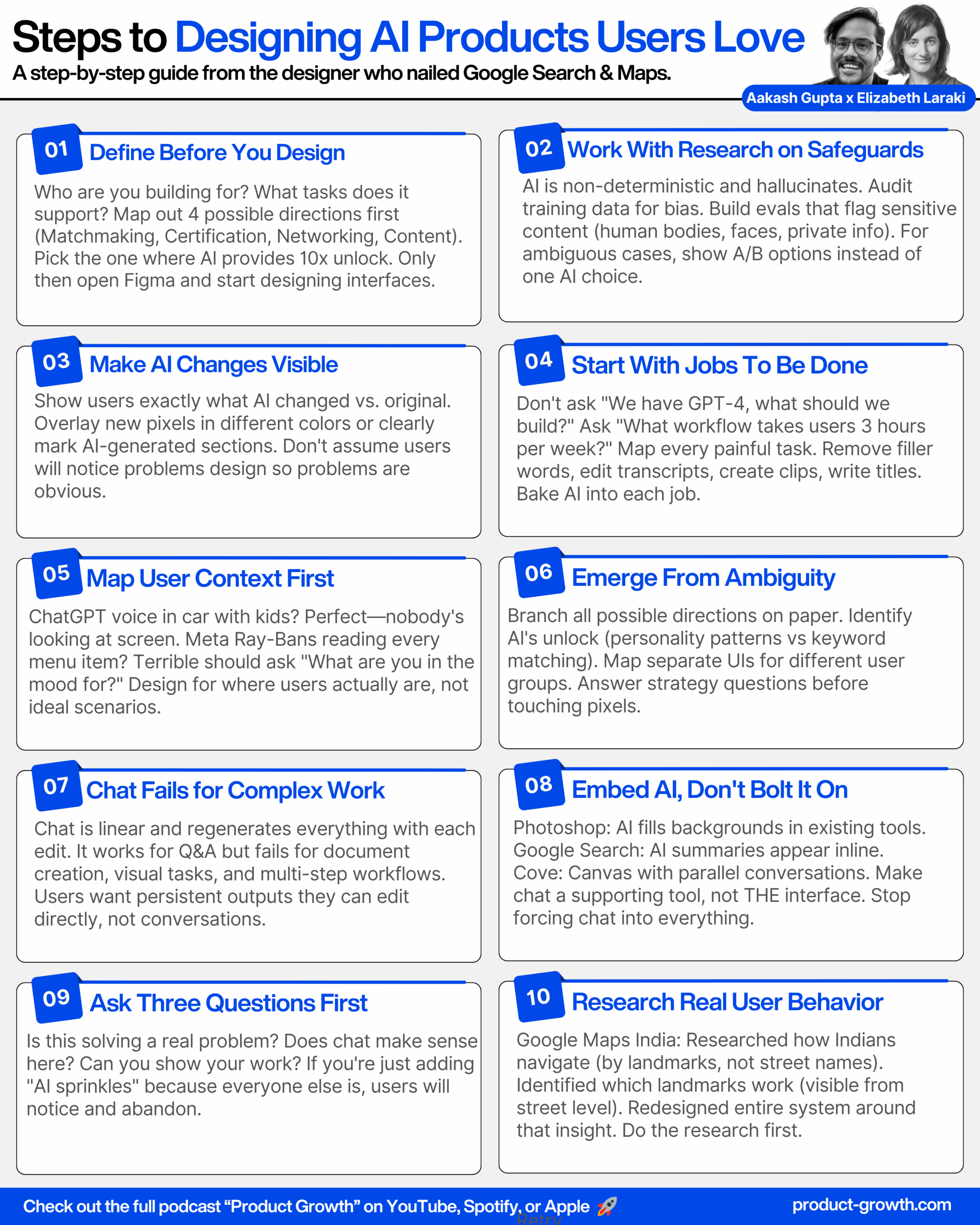
Here is the transcript:
Introduction (00:00:00 – 00:07:45)
Aakash: Product design for AI products is incredibly difficult. How do you break out of the conversational chat UX? How do you design for the next generation of AI products? Today we are meeting with Elizabeth Laraki. She is one of the original designers on Google Maps and Google Search. She is one of the most knowledgeable people in product design in the entire world. And today she is going to break down how to design AI features, how to use AI tools for design, and everything else you need to know about product design for AI features. We are not going to gatekeep any of the knowledge. We are going to actually demo and show you guys the sauce. So strap in and let’s get started. Elizabeth, welcome to the podcast.
Elizabeth: Thank you Aakash.
Aakash: So I’m really excited to break down AI product design with everybody. But I think we need to start with your amazing history and give people the right context for this discussion. I want to start out with Google Search. I think this is literally the most profitable product that’s ever been created, right? It is still growing so many years later. What’s crazy about this product is that you guys nailed the design back in 2005. The design has barely changed until now. How is that? How did you guys nail those designs back then?
Designing Google Search (00:07:45 – 00:17:00)
Elizabeth: In 2006, I was one of four designers on Google Search. At that time, one of the first things that we were focused on—if you look at Google Search results, they were text-only lists of the top matching results based on keywords. And at the time we were really trying to diversify what we could show in the results. So we were looking at how do you begin to mix in images, how do you begin to mix in videos, map results, and this growing corpus of information.
If you look at where Google results is today, it does look quite similar. Designers have been evolving Google Search this entire time. So there’s a lot of little nuances and details that have made it cleaner, have made it simpler, have really allowed it to be dynamic and fold in more and more information. Obviously today you’re starting to see AI summaries show up as well. And if you were to search for someplace like Chicago, you’d be able to see maps and images and hotels, all sorts of information about that particular search.
Aakash: So I think there’s a couple key takeaways there, right? You don’t need to necessarily redesign the whole thing to be doing really good design work. A lot of it is in the details. A lot of it is in taking in the corpus of new information or what’s being added new, whether it’s video, whether it’s maps. And as we both know, the latest new thing, of course, is AI search. So you mentioned this as well. What is your take on how Google is leaning into AI in its search results? A lot of people actually seem to hate it, a lot of people seem to love it. It sometimes hallucinates and forces an answer that is not even true. How would you approach designing for this?
Elizabeth: I’ll put myself squarely in the great camp. I think especially when trying to compete with something like ChatGPT, right? For the last 20 years, when people had a question, they went to Google. Like Google became the answer of all things. And I think what we’re seeing is with ChatGPT, more and more people are starting to go to ChatGPT for answers versus go to Google for answers. So rather than Google staying static and having ChatGPT be very different, I think beginning to fold AI naturally into the places that people already are makes a huge amount of sense.
Yes, sure, it hallucinates. So does every other LLM and AI tool on the planet, right? So I think there are safeguards with which as users we need to think about when assuming any answer. I think it’s very much like the early internet, right? Where people would be like, no, no, no, it’s true. I read it on the internet. The internet is not a definitive credible source in and of itself and neither is AI, right? So I think it still takes some user discretion, but I think it’s actually very smart of Google to be trying to fold AI thoughtfully into where people already are.
Aakash: Yeah, when designing products, I think it’s like, how do we figure out what are the core jobs to be done with new technology? How do we place it into that current flow that they’re doing? So actually where they’re putting it is good. But this example we have here, for instance, where “shake hands with an old bear,” they’re literally talking about shaking hands with an old bear. Part of that is a problem of working with the research teams, working with your evals teams, minimizing hallucinations, maybe not even showing these AI search results when we aren’t as confident in them. So I think there’s this key element around AI products that people need to acknowledge also when they’re building—that this is a non-deterministic product and we need to design accordingly.
Elizabeth: Yeah, I think that all makes sense.
Breaking Out of the Chat Interface (00:19:13 – 00:29:24)
Aakash: You’ve talked about how Google could use image and video in search. What would be a revolutionary new way to design for that?
Elizabeth: So this example was actually not specifically Google. It was for ChatGPT. And I think one of the failings with a chat interface and a chat UI is that the entire conversation is linear, right? ChatGPT had shared a video about wanting to lower a bike seat and using ChatGPT to figure out how they could do it. And I think when thinking about AI or thinking about any product, what you’re trying to figure out is, okay, what is the best possible version of answers?
In this case, it felt like I walked into a bike shop and got the least helpful bike mechanic I could possibly find. It’s sort of like I ask a specific question, they give a specific answer. What you really want to have unfold is a much more dynamic dialogue. If I were to walk into a bike shop with somebody who was really in service of me and my needs, it would be, okay, well, let’s take a look at your bike seat. Does it have a quick release lever? Do you need an Allen key? It looks like maybe it’s this kind of size Allen key here, grab this one. Okay, now let’s check out the height. Don’t forget to tighten it and go take a spin and see how that feels. If not, let’s readjust it. And I think that’s really, really hard to have in a linear conversation.
What you’d want in a remote interaction with a great bike mechanic would be FaceTime. So I can pop open a video and have a dialogue going on at the same time and this back and forth, or even have the image stay central and just have an audio conversation happening around the fringes. But the video stays central versus it being this thing that disappears off the screen while we’re talking back and forth.
Aakash: Yeah, and one could imagine this could be a place even where potentially product design feeds input into research to say, okay, the ideal design experience here is that we’re actually highlighting where that bolt lever is because just reading those words, people may not know that. We’re highlighting, this might be the place to check. Do you need an Allen wrench? So turn that and see. And so then you can go back to the research team. The research team can help you build that and then you can almost implement that into your product.
AI Image Expansion Pitfalls (00:22:13 – 00:29:17)
Aakash: So at this point, we’ve given people a taste and a preview that AI design doesn’t need to just sit in the conversational chat UX of ChatGPT or in the AI search overview answers of Google. You should be thinking about new ways to do that. And one of the ways of course that people have been doing a lot of that is within pictures, things like image expander tools. I think you have a pretty crazy story about an AI image expander tool. It really highlights to me the pitfalls of AI design. Can you talk us through this?
Elizabeth: Yeah, so I was attending a conference and they asked for a headshot. It was an AI conference. I provided a headshot, which was the image in color. And then a couple weeks later, I saw a promotional image for the conference that had the black and white image. And it was one of those things that just made me pause for a minute. I was like, wait, something’s different. And it took me a minute to figure out what was. And then I was like, oh my God, my bra is showing in this image. Has it been showing in my profile picture? And I have never noticed it. And that’s when I looked back at my profile picture and no, it wasn’t there. And I was like, oh my God, are they trying to make me sexier for the conference or what is going on?
And it turned out it was completely innocuous and unintentional. But basically I had sent my profile picture, who had sent it to the person who was doing the website, who had cropped all of the images to be square. And then somebody who was doing social media for the conference took that square image and used an image expander tool to make it a portrait size picture. And the image expander tool created this, completely unintentional, completely reasonable workflow, but with very unintended consequences.
And I think there are lots of points to think about here, but I think one in particular is that when you are interacting with real people or the hybrid AI-people mix, which can happen in many different ways beyond just image expansion, I think there needs to be additional scrutiny in place. Now also, I tried to replicate the same flow using a bunch of different tools and this was really good in comparison to what a lot of other tools ended up with. Obviously it points to interesting cultural biases and all sorts of things that we could dive into, but I think the key is really that AI can have very unintended consequences and as people using these tools, we need to have a heightened level of scrutiny and discretion.
Aakash: And how do we solve the design challenge? We don’t want to be adding in—I even felt we are just putting this image on the screen. We don’t want to be creating these types of images. How do we correctly build that as designers?
Elizabeth: Well, I mean, you can kind of go full cycle, right? So one, there’s what data are these models actually being trained on? I think at least early models had a huge amount of porn content. So I think there’s that, there’s a whole training piece of what are the models being trained on? What’s going into this?
I don’t normally like to talk about my breasts in public. This is not something that I spend a lot of time thinking about, but Photoshop’s auto expander gave me enormous breasts. So one is obviously training data. And then I think the other piece is with human involvement, I think even in this case, when expanding an image, you go from original image to expanded image and you don’t necessarily see a very clear differentiation of what was expanded versus what was original. You just have original as an input and then you have the options for the outputs.
Some tools overlay the new part of the image, which obviously isn’t helpful for discerning what was added. And nine times out of ten it doesn’t matter because you’re adding a little bit of extra space on the sides to a landscape image. So I think it is hard to necessarily put these safeguards in and I think it really has to be something more that lives in people’s discretion. But there are ways with the UI to make the actual versus AI-generated portions of these hybrid images much clearer as to what was original content versus what was AI-filled content.
Aakash: So a consistent takeaway I’m hearing about AI features versus regular features is that you’re going to have to go work with the research team on the underlying AI, whether that is the training data that is going into it or some of the evals that are built on top of it. Perhaps they create an eval that when expanding human body around private parts, go through these checks? Are we showing enough diversity? Maybe that’s a good time for us to show an A and B option to a user. And I really liked your point on then, outside of working with the AI, actually working with the UI as well. So having that UI really clear to whoever it was, poor person on that social media team for that conference, this is what we expanded, so that they can just see it very clearly and they can do their own human in the loop check. So improving the underlying AI, but also making these human in the loop checks, I think is probably the best way for people to deal with AI’s non-deterministic nature.
Well-Designed AI Products (00:29:44 – 00:42:15)
Aakash: So we covered the basics of AI. Can you say more, what are some AI products that you think are designed really well?
Elizabeth: Sure. I think that there are tons of highly useful AI products. Some of the ones that I’m pulling up here—I think ChatGPT has nailed things, right? Where it has really become this all-purpose tool for anything and everything under the sun. And whether it’s that I just have a question to something, whether I want to begin to think about planning a trip or what would be interesting places there, or I want to translate a WhatsApp message, it’s so good at so many different things that it really has become this indispensable tool for me and for many others.
I also do use Claude and Gemini, but more as reference checkers than my first line of knowledge. It kind of reminds me a little bit of early Uber Lyft usage, right? Where Uber was my app, but then I would also check Lyft as a back pocket app if it was taking a while to find a driver or if the pricing seemed really ridiculous. And I feel the same way with ChatGPT. It has just become so ingrained in being the dominant go-to for so many things that I think they have done and continue to do an incredible job.
And then I think there are so many AI tools that cover such an incredibly diverse set of use cases that I don’t even know the half of them. And it’s impossible, I would also say, to stay up to speed on what’s changing, what’s happening day to day, unless it is your full-time job.
Some new use cases that AI tools have opened up for me—either Riverside or Descript, but I don’t really know video editing all that much, but I can really trim something down very effectively and very easily using Descript or Riverside. Then Midjourney is another one that I use quite a bit as well. I tend to be fairly utilitarian in my usage of things. And so I think what it has really replaced is trying to find stock imagery or just looking at is there a possible way to add in imagery that otherwise I would have just skipped and not used imagery for anything. There are a thousand different tools. I have a lot of commentary about Midjourney’s UI because I feel like it could be a lot better in many different ways.
Aakash: So let’s walk through these one by one. ChatGPT. What are the design takeaways for somebody building their own product that they should be noticing in ChatGPT that they’ve done really well?
Elizabeth: So I think the common wisdom on the street is find a target audience and a target use case and build for that and then expand. And obviously Google or ChatGPT are the total inverse of that, where they’re everybody’s tool for everything. And I think most AI tools start with this general purpose for everybody piece that I think is harder to replicate.
As far as takeaways, there’s just not a lot of crap cluttering things. There’s a downside to that too though, which I think we can dive into a little later about how do you overcome the blank screen problem for newer people? And obviously they have suggestions and tips and things. You can use it under many different modes. I can converse back and forth via text, or I can input via voice or I can use it solely in voice mode. I can do all of these hyper-honed wrapper GPTs within it, for translation and things like that.
And so I think maybe main lessons are one, the core use case, which is to come and find information is really dead simple and easy to do. And then it’s all these different level ups of you can also use it for this and you can use it for that and you can go in and specialize it and make your own GPT, but that the most common core use case is just very simple and approachable.
Aakash: Exactly. And I think they’re really genius in getting out of the user’s way, where your average product, they always try to stuff in those walkthroughs, the step-by-step everything. They’re just like, here, here’s some suggested prompts. Let’s go. And it’s been able to handle so many different use cases. And they’ve been layering in so many cool things like voice mode. It’s kind of a master class in product application design on top of AI.
The next category you mentioned was Descript and Riverside. So for people who haven’t used those, what are the AI features within, let’s take one of those, maybe Descript, that you think are really powerful and how did they from a design perspective execute on those well?
Elizabeth: I think what’s interesting with some of these is that I don’t necessarily actually know specifically what’s happening with AI versus what is not. And it kind of doesn’t matter that much either. Being able to just edit from the transcript and have that edit the video versus having to listen to the video and go back and edit it—obviously the auto translation is happening from AI. So AI is in there somewhere, but I think the easy tools of being able to edit in what feels like a very intuitive way is quite different than any other tool and feels very approachable for an amateur.
And then I think things like being able to remove filler words. We all talk with a lot of likes and ums and ahs and things. And the fact that it can just go and identify those—it’s not perfect, but it pulls out a big chunk of them—and then loop them or fill in things pretty seamlessly is pretty incredible. And there are also features like being able to make it look like somebody is always looking at the camera versus looking at the person they’re talking to on the screen, which I hope maybe you use for this, because it’s a lot harder to look at the camera than look at somebody that you’re actually interacting with.
And then the ability to auto-generate a bunch of clips and even thinking about things like titles or sections and titles for sections based on the content that was there—it really provides so much, it extracts so much data and information that it feels more like putting together puzzle pieces versus starting from this massive unapproachable 60 or 90 minutes of video. And so it does a lot of the pre-work for you.
Aakash: What I’m taking away from this is that they’re not sprinkling AI on top, they’re baking it into the cake. What are the core jobs to be done of editing a podcast? Removing ums and ahs, having a transcript that you can edit off of, being able to create magic clips, being able to brainstorm titles for these magic clips, being able to add the word transcriptions, being able to think about what the description once you put it on YouTube is. So they’ve basically taken the entire life cycle of editing a video and they’ve put AI into each of those steps, and they’ve allowed you to see that this is powered by AI, so I might need to double check it, but otherwise they’re not shoving AI into your face. They’re just putting it into the key jobs to be done.
And then the final category of product we were talking about is these products like Midjourney, which have very controversial user interfaces. People who haven’t used Midjourney, you have to sign up for Discord. You join the Midjourney Discord server. Then you join a channel. Then you type in like slash imagine or slash create, and you give it a prompt. And then it comes up with four options. And then you click on that option. It’s very convoluted. So why has it succeeded despite it and how might they improve it?
Elizabeth: So to be fair, I never used Midjourney through Discord. Maybe it was sometime last fall, maybe a year ago or so, that they made an entry without having to sign up for Discord. I did actually sign up through Discord, but I just use a web interface for Midjourney. Discord could be a whole other conversation for another time. I have nothing positive to say about the interface for Discord. And I wouldn’t have used it if Discord had been the hurdle through which I had to use it because there are so many different tools available now.
But what I’m showing here is the web interface. So I literally just pull up Midjourney in a browser tab and have it start creating images. And I think there are several things that I like about it relative to some others. I think one of the things that’s really hard with all these different AI tools is obviously it’s expensive to run any of these AI tools. So there’s not a lot as a user—it’s hard to have lightweight interactions with many because usually it allows a few free interactions and then you have to sign up for a subscription or monthly pass. And which limits the field of things I’m exploring just because I don’t feel like paying 20 bucks a month to 10 different AI tools.
But I think it is quite simple and quite fast to go from idea to set of four possibilities. It doesn’t always nail it and sometimes I’m curious to see what ChatGPT or FreePic or anything else will create instead of Midjourney. But I feel like its output is pretty consistently decent.
Aakash: Okay, so it sounds like key takeaway is Big Unlock was moving it out of the Discord platform into the web browser, making it easier for people to onboard similar way—ChatGPT, open it up, you can use it. That’s really important for an AI product, whether that’s a chat product or an image generation product.
Designing for AI Voice (00:42:15 – 00:47:13)
Aakash: The other really important category of AI products is voice products. How do you design for AI voice?
Elizabeth: So I think voice UI is interesting. I don’t actually have a background in voice UI, I haven’t done much. I know that there has been a lot of research and especially from engineering, accessibility, these different lenses of how do you replicate interfaces through voice.
A couple of examples that I will share is that with ChatGPT’s voice UI, my husband actually set the shortcut button on his iPhone to just be ChatGPT voice. And so we were driving with the kids in the car the other day, someone had a random question, and he’s like, well, just ask ChatGPT. And it was fascinating for me to have the kids just piping up with question after question. And it became educational entertainment in a way. It was just always on in the background.
And I think what’s interesting about designing a UI for this is that the visual UI doesn’t matter, right? It’s not even visible on the screen. In this case, we were driving, nobody was even looking at the screen, but it truly felt just like a conversation. Like we had another person in the car hanging out with us. And so I think it’s very important to think about the context and different contexts people are in when thinking about designing the interface for it.
Limitless is another interesting example that I’ve had. I don’t use it, but I have several friends who’ve had it, especially—I think there are several utilitarian use cases for it of give me the summary of this conversation or remind me what this person said about this thing. But I think one of the most interesting aspects of it is the coaching or feedback piece that comes from it. It’s the thing that everybody who has it talks about first of you know, it gave me feedback on I really shouldn’t hog the conversation so much. Or I should make sure to really let my children finish what they’re saying about something before I interrupt and jump in. And I think what’s so interesting there is it’s this omnipresent sort of—the context is it is omnipresent. And then there’s a question of, what can you do with this data? And then how do people interface with the data that it’s creating?
One other interesting one to think about is I gave my husband a pair of the Meta AI glasses, the Ray-Bans. One of the interesting things—we were in Spain and the menu was all in Spanish, my husband was curious how they’ll translate the menu for him. And he asked it to translate the menu, which it did, or which the glasses did, but they read through the menu like a screen reader. They just started at the top of the menu and literally read every single description for every item. And okay, no, that’s not how you actually read a menu. It’s more this dialogue that you would expect to unfold. Like, okay, here are the appetizers, here are the main courses. Is there anything in particular you’re in the mood for, or do you want me to go through the full section of what’s here for you? There was a lot of opportunity there to make it much more human.
Aakash: So it’s all about understanding people’s correct context, being approachable. Like the ChatGPT voice mode, if you had asked it to analyze a menu, I don’t think it would have responded that way. And it would have actually given you, there’s 12 appetizers and 16 mains that are across fish, beef and chicken. Do you have any preferences or do you want me to read all of them out to you? Something like that it probably would have done. And so also about bringing in the right AI and really testing your product a lot around these different actual contexts that users are going to be using, maybe even collecting the data around, okay, these are the top ways people are interacting with it, going out in the field, testing out how it’s working, and then potentially sculpting that response as a result.
The Design Process for AI Features (00:48:21 – 00:54:00)
Aakash: What is the high level process for designing AI features?
Elizabeth: So I think there are really three key steps. One is defining the product that you’re building. The second is designing it and the third is building it.
Aakash: How do you design for AI without chat? Because everybody is just relying on this tired, forgotten paradigm. And the future is supposedly something else. What is that future?
Elizabeth: I think right now a lot of people are sitting on technology that they think is super cool. And so they’re just building stuff and then trying to find a home for it. And I think there are a lot of ways that it’s clear that we’re in an AI craze where every product under the sun, whether it’s been using AI forever behind the scenes, like machine learning in different ways, or whether it is trying to just find ways to wedge AI into the product—everybody is sort of honed around AI at the moment.
And I think that what a lot of people who are building products are forgetting is that you really do need to figure out what product it is you’re building and then design it and build it. And obviously with AI tools, the cycle is happening and can happen much, much faster. But I think thinking about who are you building for? What needs do they have? What needs do you actually want to support? And then what tasks are people going to want to do when they show up and what will bring them into the product. And then there’s also designing the product. So now you’ve set the goal or positioning for your product and the tasks that people are coming for. And it’s like for those tasks, what features do you need?
How do you within the product organize the flows and the UI elements so that they make sense together? And then for the actual UI, what are the most intuitive UIs for those features? And I think we are very much stuck in this mode of chat at the moment versus thinking about what parts and pieces could and should be pulled out and live perhaps in conjunction with chat. What if chat isn’t the primary element? What if it’s a supporting element? And then also thinking about craft and how do you present these in a simple way that carries the essence of your brand.
A couple of thoughts. One, don’t force AI into your product. I feel like everywhere I look, I can’t help but think of this massive container of AI sprinkles that everybody’s shoving on top of their product—whether that’s Twitter, whether it’s Amazon, whether it’s even Apple Photos. It’s just—I have a very clear mental model and it’s not about using AI right now. Like I just had something that I was looking for. I was just coming to reorder more dog food. I don’t have a question for Rufus or whatever Amazon is calling their AI person. And with Twitter or X, I know some people are big Grok fans. It just feels like a collection of stuff at the bottom and it doesn’t feel at all—it almost feels like it should just live as a separate product. It doesn’t fit the flow of how I use the product.
I do feel like Google has done a good job just bringing AI in. And one of the beauties of using ChatGPT versus Google is that if I ask Google a question, I get a bunch of results and then I have to do the work of going through and looking at the results, comparing the answer, seeing which sources I trust. It just feels a lot more convoluted or harder. Whereas with ChatGPT, I go in, I show up and I just get the answer. And so I think Google thinking about shortcutting that information a bit and just presenting people with the answer to their question is a very thoughtful integration.
And then things like Photoshop—people are already expanding and changing canvases and tools through these products. Being able to just use AI to help with that feels like a very natural integration.
Breaking Out of Linear Chat (00:56:57 – 01:02:44)
Elizabeth: We talked about this a little bit earlier, which is that chat gives you a linear output and it is difficult to go back and reference relevant information that happened before. And it does, I think by nature of being linear, limit the use cases that it can do well. We talked a bit earlier about instead of having a linear conversation, being able to have an image be the central theme and having a conversation around that image.
I think another example is I had tried to use ChatGPT to create an itinerary for my son and I for a weekend in Madrid. And I was actually very surprised in some ways by how good it was at pulling out salient information, but how bad it was at helping me get to what I wanted, which was effectively a Word document. That was, okay, here are the things we’re gonna do, here are the timetables, here are options if we decide not to do this or that.
And I think the challenge was really the UI, that it would create this information in line, and then I would say, well, I don’t want to do this thing or this place actually looks to be closed. It would say, okay, no problem. Regenerate the itinerary, but it would also hallucinate a little bit each time. I think just due to the more dynamic and non-deterministic nature of it, it makes it really hard to do more deterministic tasks. So in this case, I want control over being able to have a fixed body of content. And I want ChatGPT to help me co-create it.
And so I think the more that we can think about these experiences where AI is helping co-create something, I think the more we can position chat as a tool versus chat as the interface. One company that I have seen begin to break away from this is Cove. And this was started by the same duo that did Google Street View and Uber Eats, Andy and Stephen. But I think what is interesting is that it basically gives you a canvas to work from and pull bits and pieces of different information from. So you could think of it as almost having different chats or documents that you’re working on in parallel versus having one linear chat box.
Aakash: Very cool. So this is what the future of AI products is going to look like. We’re going to continue to be shaping it. I think the future isn’t totally written. Whoever’s watching this video and building that next generation of AI products, comment below. Let us know what you think it is. Share your tool. We’ll take a look at it as well and see. But it seems like it’s heading in this direction like a Cove direction.
AI Design Tools (00:59:02 – 01:02:09)
Aakash: So we’ve gone pretty deep on designing AI features. I want to flip gears a little bit and talk about AI design tools, because there’s all those AI design tools out there. We talked a little bit about AI image expanders. What AI design tools should people have on their radar and how should they be using them?
Elizabeth: So I think this is an interesting question. So I am not actually using that many AI design tools. And I probably should be using a lot more than I am. But I think in the same way that I can now do as an amateur a little bit of video editing, a little bit of image creation, a little bit of coding, I think what I find frustrating with design tools is that my expectations are pretty high and the output does not match what I want from them.
I keep not using them and just going back to Figma, not using any of the suite of AI tools around it. That being said, I have several colleagues and friends who are using them more throughout the design process, both using ChatGPT as far as figuring out product spec, using Figma and Figma Copilot to get a first pass of something and then edit it and then plug it into making prototypes and demos. But I keep getting stuck as I try to use these.
Aakash: So what would be your recommendation for the average person and the product designer? It sounds like for the average person, saying, you know, maybe AI design tools can help, just like they’re helping you who is below average on video production get up to average. So if you want to get an average result, yeah, use Figma Copilot. Use your V0 Midjourney Cling workflow to create your design or use the AI prototyping tool like Lovable or Bolt or Replit. But if you’re a product designer, probably just apply your own taste and where possible use it for productivity like alignment and those types of things. But don’t expect it to suddenly create the design for you.
Elizabeth: For designers, I think some of these tools can be helpful around the edges with different aspects, but I think that fundamentally we all still have to rely on our own taste and our own processes to really get the output that is at the bar that we expect.
Aakash: So some potential, but probably the tools aren’t there yet guys for you to just solve your design. Vibe designing is not quite here yet, but we’ll do an updated video if it comes out in the future.
Live Design Session: LinkedIn for AI (01:02:44 – 01:15:19)
Aakash: I want to talk a little bit about the design process. I want to do a little bit of a live design session so people can get inside the mind of a master designer like yourself. Sam Altman recently said he’s working on a LinkedIn at OpenAI. So can you break down LinkedIn for us and help live design what a LinkedIn for AI would look like?
Elizabeth: The first that I had actually heard about this really was through your comments about Sam Altman saying they were designing LinkedIn for AI. And then I went and looked up a little bit about it. I actually know Fiji quite well from having worked with her at Meta.
And I think I would say my top level thinking was, okay, is this actually more—I don’t want to say like a marketing piece. So I think this could go a couple different ways. One I think is what’s actually the real objective of this? Is it to make it less scary that AI is eating and has the ability to eat a whole class of different jobs across many different sectors? Or is it really about the AI education and certification and things like that? Or is it more like some of the dating apps that are really trying to look deeper than bits and pieces of people’s character or attributes and matching them? So is it trying to use more sophisticated matching technology?
And so I think one, there are some questions about what really is the objective of doing this LinkedIn for AI app. Then I also think about, okay, so there’s LinkedIn and what are people actually really using LinkedIn for? I’ve never actually personally used LinkedIn to look for a job myself. I have used it for helping try to either find people that I’m looking to hire or helping other people try to hire for different jobs. But there is an entire set of LinkedIn that I have never used and really not interacted with at all, which is the job hunting and job seeking chunk of things that is equivalent to the dating piece, the matchmaking piece.
I think there is a whole other piece of LinkedIn, and this would be very biased by my own usage of LinkedIn versus how LinkedIn is actually used. But I am seeing and have been seeing LinkedIn be used more and more as just another social feed in many ways, where it is about sharing content, it’s about interacting with content. It’s about connecting with people and building out this network. That is very different to me than just the job searching. That feels more equivalent to a Twitter or Instagram or Facebook, but around the context of work.
So I think where we really sit with this is at product positioning. I will also say I didn’t even open LinkedIn for a very long time until I was at some happy hour that we were hosting in the city. And somebody was like, oh, we should connect on LinkedIn. And I was like, is this person trolling me? Because I look old and I don’t belong here. What is going on? But okay, sure. We can connect on LinkedIn. And then somebody else said it too. And I was like, man, either everybody here really is jerks or maybe LinkedIn is starting to grow again. And it kind of felt like this wave. And there was this wave of my colleagues being like, oh yeah, my kids who are graduating high school and in college are totally using LinkedIn and they have their resumes all set up and they’re trying to connect and network through LinkedIn. I was like, this is fascinating that it really does feel like LinkedIn is beginning to make a comeback.
So I think all of this leads to obviously I’m not moving pixels around as we’re talking, but I think this is where I had said earlier, the first thing is really defining the product. Who is this for and what are the tasks or use cases that it supports? So I think the first thing I would ask would be, okay, we’ve got this idea, which direction do we want to take it?
And I think there’s some guesswork here because obviously I don’t know what Sam and Fiji and everybody is actually thinking about. So I think what I would do—we’ve got this idea of LinkedIn for AI. So we’ve got a couple options. One is about matchmaking. One sort of direction is really about certification and training and a third would be more about networking and another would be more about content sharing and distribution.
Aakash: So many different ones. So let’s say we’re inside the mind of Fiji and Sam and they said, all we really care about is matchmaking because a lot of people are going to ChatGPT and they’re looking for jobs and they’re trying to apply for jobs via ChatGPT. And so we really want to break that part of it and disrupt LinkedIn there.
Elizabeth: Yeah, so we’ll double down on matchmaking. And I actually feel like this could be quite a smart direction. So let’s say we’re gonna go into matchmaking. I think first I would start with the question of what makes a good match? So you have job seekers and then you have employers.
And then I think what you’re looking for here is the magic that is between those. To get to there you need a set of attributes across each to understand what matches well with the other. Just thinking about UI here as well that you’d mentioned, there’s obviously going to need to be some onboarding or input flow for these. But then I think this feels still pretty unsophisticated. So I think the question is what would be the things that the patterns and things that AI could see that humans or just a very rudimentary match A with A kind of system—what goes beyond that? What additional class of things could we begin to capture and input?
Is it like—I had a conversation with someone a couple weeks ago whose job is actually administering personality tests to potential CEOs for hire so that they can actually—the company has a much better sense of how they’ll fit into the organization. Well, that’s actually pretty interesting. I’m sure there are ways you could automate that and make it much more accessible beyond it being right now prohibitively expensive and just doing it for CEOs. You can do that for anybody and everybody. And through a series of questions, like, how do you start your morning? Is it more social and talking to your colleagues or is it you like to get in and just start doing your work right away? I would see aspects of introversion, extroversion. Do you get more energy being in the office with people or do you prefer to be at home?
I think there’s a whole set of skills and potential that could begin to be identified as well. And maybe even predicting potential and fit within a certain group, even within a company. And so I think what’s interesting when I think about the UI for this is that you have two separate UIs. It’s a marketplace. But you have UIs for job seekers and you have UIs for employers. And then all the magic and the AI is happening in the middle.
I think there are opportunities to look at, okay, where does AI fit potentially on either end of this? But I think there even could be a Tinder swipe or something along those lines of yes fit, no fit. But I would also look at other matchmaking apps. I think the only parallels with LinkedIn really would be that LinkedIn is about jobs and work and that you can post and look for jobs through LinkedIn. But I would then diversify and look a lot further beyond LinkedIn to look more at dating apps and all sorts of—even thinking about college admissions. All of these things of where are you really trying to find good fit?
Aakash: So what I took away from this is you’re not just going to dive into pixels and Figma when you’re solving a hairy design problem. The very first thing is actually create alignment on what is the business goal here? Then it sounds like you’re going very deep on, well, what is the new technical innovation that we are bringing to market? Then you go deep on, OK, well, what are the different user groups that we need to design user interfaces for? And that’s where we ended here.
There’s this stepwise process in design. This is a classic design problem that somebody probably created 60, 70 years ago. That still applies for AI features. And you can’t just all of a sudden—I think what people want to do instead is they just want to go into Lovable and say, design me LinkedIn for AI. And they would have expected us to just open up Figma and then go iterate on that design. But there’s this actual classic design process that’s super, super important first. Is there anything else people should know about as they’re tackling and building these hairy sort of vague design challenges?
Elizabeth: I mean, I think the goal I would say is really to emerge from ambiguity with a clear sense of what you’re building and for whom and what you want it to do in the world.
Google Maps Redesign (01:15:33 – 01:23:45)
Aakash: Love it. So that is most of our masterclass on AI. You worked not just on Google Search, but actually on Google Maps. In 2007, you were one of two designers on Google Maps, but it was becoming a cluttered mess. How did you guys redesign Google Maps into one of the most loved apps in the world?
Elizabeth: So I think one of the things that I love about the story is it didn’t seem quite frankly that interesting or that revolutionary at the time. But similar to your question about why does Google Search still look so much today like it did 20 years ago? I think the same is actually true with Google Maps.
When I joined Google Maps, the UI looked very much like you’re showing here, which is that there was at the top a tab effectively for maps, for local search, and for directions. Maps allowed you to look for one place. Local search allowed you to look for a category or restaurant name in a place, so two input boxes, and directions had a from and a to, with also two input boxes.
We had a lot of other things that we wanted to fold into the mix of things that you could search for on maps. We were looking to integrate with transit. So it wasn’t just driving directions, but you also had to be able to figure out different modes of transport for how you wanted to get places. And also we were bringing in user generated content. And basically you very quickly start to run out of space at the top for these tabs. And it just starts to get more cognitively hard to use it because you’re showing up and you’re having to make all these different choices.
So what we ended up—and actually I think it’s funny because I was talking with a colleague who worked on maps after my time. And I think Google Maps has gone through this cycle over and over again of trying to add more and more features. And then it’s starting to feel too crowded and too cluttered and having to go back to core principles and design a UI that works well for core principles.
So what we were looking at is really, what are the use cases for Google Maps? Well, there is trying to find places. There is trying to get directions. And then we were kind of—every product starts to stretch a little bit where it’s like, we should really be a place for discovery and also wouldn’t people want to create. But one of the things that we did was look at really what’s the model for this.
This is an example of diving into get directions, but you have the four main categories. And then within directions, you have the starting point, you have the destination, how you’re going to get there, any specific elements of the route. Then how does that play in? So that you start with directions, you get the route, you have in a list, in a map. How do these things work? What are the actions that sit over all of these different use cases versus what are the actions that are specific to one use case and how do they play together?
And so this is where I do talk about design architecture, but you have the user experience for the product. You have the UI people are looking at, how are all the parts and pieces organized and then how do people move through them and where does it make sense to allow people to go from one path to another. And the TLDR is that we went from effectively three tabs with a total of five different search boxes to one single search box that seems very like a no brainer at this point, but at the time it was highly controversial because directions was the bread and butter for Google Maps.
Obviously we were inspired by Google Search that had a single search box that worked for everything and felt like it really could work for maps, but that also we were probably going to have to teach people what they can search for and how they could use maps in the same way with only a single search box instead of, for example, two with directions.
Aakash: Very interesting. It strikes me that it’s one of the most used probably AI back-end products out there now. And they’ve been iterating with the design a lot. One of the most recent designs you actually said you didn’t love. Why?
Elizabeth: I don’t love it because I don’t feel like they focused on what matters. So I think there are sort of visceral just responses that Google was always kind of nerdy and quirky and even from the logo that was all primary colors. Looking at the old versus the new, the new, I mean, one at a glance just looks like Apple Maps. And two, just feels colder and less real. It looks much more digitized and less representing human colors. So that was a visceral response that I had in just looking at one versus the other.
But then it’s like, okay, now when you start looking, oh my God, there’s so much crap all over the screen and what are all these things? And I’ve just ignored them for so long, but now that I’m actually looking, why are all these things here? And if you’re gonna do a cleanup, why don’t you actually really clean things up? And as I had mentioned earlier that I think Google Maps has—one of the things Google Maps has done extraordinarily well is it keeps purging features and keeping things clean. And I feel like they’re very overdue for a round of that at this point.
I don’t know the usage of any of these things, but you have work, you have pills for work, restaurant, gas, parks at the top, plus the weather. And then you have explore and go and saved and contribute and updates. And then also another sheet that’s between that and the map for latest happening in this area.
Predominantly I use Google Maps in the area that I know, which is where I live, and I’m trying to use it to beat traffic or avoid traffic, going between a set of common routes that I often do, or I’m leaving the area and going somewhere, but that feels like a less common use case. Again, I’m a user of one, but things feel very crowded and cluttered to me on Google Maps today.
Aakash: Yeah, and that was the key takeaway. It’s really full circle to where our discussion started at the beginning of being able to simplify some of these things. Look at the magic of ChatGPT of making things relatively uncluttered.
Google Maps in India (01:23:45 – 01:31:02)
Aakash: One of the most phenomenal things you did in your tenure on Google Maps was you helped launch Google Maps in India. And if people haven’t been there, I’ve been there, I go there every year. India doesn’t use street names. Normally the way it works in India is you just ask somebody on side of the street and they say, you go three gullies this way, then you turn left, then you turn right at the temple. And you’re like, okay, there we go. That’s how I’m gonna get there. How did you guys manage this innovation? I think it’s gotta be one of the world’s most important.
Elizabeth: So I think this was 2007, 2008, somewhere in there that Google did launch—so Google was looking to expand internationally. Obviously, India was a very attractive market as far as number of people. And Google Maps did launch in India. And I think it was—I don’t think any designers were involved at all at that point. It was you turn a few switches and you just expand the geo space that maps is available in.
But it didn’t have a lot of usage. And one of the researchers, one of the user researchers on our team started to look into why, and she was like, oh, it’s because the directions look like this. Here she is sitting in Mountain View, just trying to get directions from A to B. And it’s looking at the UI and it’s like, oh yeah, turn left at NH17 and 11 kilometers turn left and 0.7 turn left and 0.2. And this is also before people had geo-enabled smartphones. And so unless you had a compass and a pedometer, these are totally useless directions.
And so from that—she was originally from Russia. She knew and I think the team was aware that obviously different parts of the world navigate in different ways. We do it very much in the US by turn by turn directions, but other places in the world do it much more landmark based where my husband’s from Morocco and we laugh about this too, but it’s you have a rough approximation of where you’re going and then you have human GPS when you get closer. You ask the person on the street to go here and then the person there and eventually you get to where you’re going.
And so this unleashed this question of, okay, well actually, how do people navigate in India? And if people are navigating through landmarks, one, what landmarks are important and two, how do they actually use them in the navigation? And so Olga, who’s the researcher who worked on this, grabbed the designer who was working on directions at the time, Janet, hopped on a plane, they went to India and they started to just do a bunch of research to begin to understand these parts and pieces. And obviously was working with the engineering team as well to understand, okay, what was possible? What landmarks did we have? What landmarks could we possibly grab and pull in?
And ultimately they ended up launching directions that were building and launching direction systems that were much more landmark based. As you see here, take the first right towards Arabic College main road, pass by UNA cycle traders on the right. And so also I think some of the interesting things they found as far as what landmarks were useful and interesting was like something like the Empire State Building in New York is not a good example because you’re walking by on the ground and it doesn’t stand out from everything else. So it really was these things that were prominent and noticeable from the streets that were good landmarks. And that included things like temples, petrol stations at the time, big bazaar, and things that were highly noticeable.
And so they ended up rewriting maps to integrate directions. And it wasn’t just turn by turn, but it also was—landmarks are used for verifying that you’re still on the right path. Of like, you’ll pass this on your left. Or if you hit the roundabout, you’ve gone too far. And I think they did a really wonderful job integrating landmarks back into directions. And one thing I learned recently is actually that landmarks are available everywhere. This wasn’t a feature that Google built just for India, but it’s only turned on in locations where it makes sense to be using landmarks to navigate.
Final Takeaways (01:28:48 – 01:31:50)
Aakash: I think it’s a fascinating story and wanted to end on that because it is so timeless. It goes back to the key lessons that we’ve emphasized throughout this episode for you guys, which is the core user research problem discovery solution discovery process has not changed for AI features. We did go through a bunch of stuff that did change, whether that’s working with your AI researchers, understanding edge cases and pitfalls, building the UX to accommodate that.
Fundamentally, these core problems are what you’re going to be doing. Most of you guys are going to be building an application on top of a model company. So deeply understanding, just like we left you with that Indian user, understanding how they’re doing it today, bringing it in not as sprinkles on the cake, but baking it into the cake is the key lesson from today’s episode that you guys should walk away with.
We have one last question for you, Elizabeth, before we go. What is your business today? How big is it and where can people find you if they want to learn more?
Elizabeth: Sure. So I’m a design partner with Electric Capital. We have about a billion dollars of investments. And I also am really trying to tell the story of design and how we all can design for humans and for people and really design products that resonate and work well for people.
Aakash: And where can people find you?
Elizabeth: So a couple of different places. Substack is probably where I enjoy writing the most, although I tend to try to use both Twitter and LinkedIn as pointers to Substack articles. I am just E-L-I-Z-L-A-R-A-K-I on all three places.
Aakash: Awesome. Find her there. She has the most amazing storytelling posts out there. It’s a really worthwhile follow. Elizabeth, thank you so much for being on the podcast.
Elizabeth: Thank you Aakash.
Aakash: Bye everyone.