Jump straight into data driven decision making with a one-week roadmap that top PM teams at Google and Meta follow. Pin down your North Star metric, get everyone aligned on definitions, and pick an analytics tool that plays nicely with your stack. By Day 7, you’ll be making insight-backed calls rather than educated guesses.
Begin Data Driven Decision Making Immediately

Here’s your first-week checklist to jumpstart actionable insights:
- Identify your North Star metric (for example, Google’s DAU/MAU ratio).
- Align stakeholder definitions using a one-page glossary.
- Select an analytics platform like Mixpanel or Amplitude.
- Hook up a ready-made Data Studio template for live dashboards.
Once your metrics are clear, build a lean data pipeline on top of your existing stack. This ensures fresh data feeds into your analysis without heavy overhead.
For instance, a managed ETL tool such as Fivetran can mirror event logs directly into BigQuery in minutes.
Set Up A Lightweight Pipeline
You can map your source events to a data warehouse in under an hour.
Here’s a quick SQL script to schedule a nightly load:
-- Sample ingestion script
INSERT INTO events_raw SELECT * FROM source_events WHERE date = CURRENT_DATE;
“A simple pipeline is better than a perfect one you never launch.” – Meta PM Lead
Run A Rapid Metric Audit
Spend a morning vetting the last 30 days of events:
- Look for null or duplicate rows.
- Cross-check event timestamps against your glossary.
- Reconcile raw counts with your dashboard figures.
This audit flags gaps early so your reports stay airtight.
Conduct A Simple Cohort Analysis
Break down users by first-use date to track weekly retention.
Mini Framework Table
| Action | Tool | Outcome |
|---|---|---|
| North Star Setup | Confluence | Shared definitions |
| Pipeline Launch | Fivetran | Data in warehouse |
| Cohort Analysis | SQL & Python | 7-day retention insights |
Use this table as a live tracker and hand off ownership across your team.
Assign Owners And Timelines
Don’t let tasks slip—give each item a clear owner and deadline:
- Data Engineer: Complete ETL by Day 3.
- PM Analyst: Wrap up the metric audit by Day 4.
- Designer: Polish dashboard UX by Day 5.
- Engineering Lead: Verify event schema by Day 7.
Sync these milestones with your sprint backlog so every stakeholder stays in the loop. Use this GitHub repo containing sample Python scripts to automate cohort exports: data-scripts repo.
“Assigning clear roles reduced our setup time by 40% at Google.” – Senior PM
Monitor Early Signals
Finally, watch your key metrics in real time and alert the team the moment things drift:
- Tie alerts into Slack or PagerDuty for instant heads-up.
- Set threshold triggers for sudden drop-offs or unexpected spikes.
This proactive monitoring catches anomalies before they ripple out to users.
Enable Slack webhook alerts.
Understanding The Key Concepts
Imagine your product metrics as the gauges on a car dashboard—each one tells a story about speed, fuel, and engine health. When you monitor those dials closely, you know exactly when to press the gas or ease off to avoid a crash.
That simple image brings data driven decision making into focus. Each metric becomes a live indicator you can read at a glance. And just like every driver needs to understand what the needle means, every team member must share the same data language.
- Data Literacy teaches everyone how to question and interpret the numbers.
- Key Performance Indicators (KPIs) work like your speedometer or fuel gauge—showing product health in real time.
- Data Governance writes the rulebook on data accuracy and access.
- Predictive Analytics scans the road ahead and warns you of bumps before you hit them.
By 2025, we’ll create a staggering 180 zettabytes of data worldwide. That explosive growth makes data driven decision making more than just a buzzword. Learn more about data growth projections
Here’s a quick snapshot of how these ideas connect in your workflow:
Core Concepts At A Glance
| Concept | Role In Decision Making |
|---|---|
| Data Literacy | Aligns team understanding of metrics |
| KPI Selection | Directs focus toward the most critical performance indicators |
| Data Governance | Ensures data quality, security, and consistent access |
| Predictive Analytics | Flags future opportunities and risks |
This table pulls together the essential terms that guide every step in your decision workflow.
Key Data Components
Numbers alone only tell half the story. Qualitative feedback lets you hear the “why” behind a sudden spike or drop in those gauges. It’s like asking your passengers what they felt when the car jolted.
Meanwhile, product usage logs record each click, swipe, and scroll—think of them as the odometer tracking every mile. And external market feeds deliver fuel-price updates or regulatory warnings, nudging your strategy in real time.
- Product usage logs map real customer journeys.
- Surveys and interviews capture the user voice.
- Market feeds keep you aware of competitor moves and macro shifts.
Let’s see how these sources merge into a single pipeline.
Here’s a screenshot illustrating data flow from sources into an analytics warehouse.

The diagram above shows how logs, surveys, and feeds merge into a central store before branching into dashboards and predictive models.
Governance And Analytics Workflows
Setting up clear data governance is like defining checkpoints on a road trip. You decide who can collect data, how it’s stored, and which quality gates it must pass before anyone can use it.
When governance is tight, you never stare at a blank gauge or confusing readout when decisions matter most.
For in-depth strategies on assembling teams that thrive on metrics, check out our guide on building data driven product teams.
To truly grasp the foundation of effective data driven decision making, it's crucial to understand what is business intelligence analytics for banking.
Workflow pipelines then automate the extraction, transformation, and loading of data into your warehouse. This ensures every dashboard widget updates in sync—no missing values, no outdated numbers.
Predictive Analytics In Practice
Think of predictive analytics as reading the road signs ahead. By mining historical dashboards, these models forecast trends and highlight anomalies before they become problems.
They support use cases like:
- Churn prediction to apply the brakes on at-risk users
- Feature adoption trends that steer your product roadmap
- Capacity planning to keep performance smooth under load
Best practices include:
- Running weekly accuracy checks with holdout datasets
- Reviewing feature importances to ensure your signals match product goals
- Pairing model results with user interviews for richer context
Focus on a handful of high-impact metrics to avoid information overload. Keep your dashboards tight, and you’ll always know when to accelerate growth—or when to pump the brakes.
With these core concepts down, you’re ready to steer product decisions with confidence and precision.
Apply Core Frameworks For Data Driven Decision Making
Every product cycle has blind spots—until you lean on a data framework that keeps you on track. In this section, we’ll explore three proven approaches—Data Flywheel, a PM-tuned OODA Loop, and Google’s HEART Model. For each, you’ll see how to pick data points, nail down meaningful metrics, and kick off your first feedback cycle.
According to the DataCamp State of Data & AI Literacy Report 2024, 84% of business leaders view data driven decision making as their most critical skill, up 6% from last year. Read the full report on Atlan.
Framework Comparison
Before we dive into the details, let’s map out when each framework shines. This snapshot will help you choose the right tool for your next sprint.
| Framework | Best Use Case | Primary Benefit |
|---|---|---|
| Data Flywheel | Continuous product optimization | Drives iterative improvements |
| OODA Loop | Rapid decision cycles under uncertainty | Boosts agile responses |
| HEART Model | Measuring user experience | Focuses on user-centric metrics |
Each model has its sweet spot. Next, we’ll unpack how to roll out the Data Flywheel step by step.
Apply The Data Flywheel
Start by embedding a learning loop that spins with every release.
-
Define Data Collection Points
• Map out core events, API calls and survey triggers.
• Think “where will the signal live?” -
Select Success Metrics
• Pick 3–5 KPIs that matter—retention rate, engagement time or task completion.
• Less is more: focus on metrics you can influence. -
Launch Feedback Loop
• Automate a weekly dashboard review.
• Block stakeholder time to discuss wins and surprises.
Customize The OODA Loop For Product Managers
Turn the classic Observe-Orient-Decide-Act cycle into your decision engine.
• Observe: Pull raw data from Mixpanel, Amplitude or internal logs.
• Orient: Slice by user cohort, geography or feature adoption.
• Decide: Score and rank feature ideas or bug fixes.
• Act: Ship experiments, then feed results back into your next “Orient” phase.
Prompt To Automate Insight Generation
Analyze the following event log CSV and summarize top three anomalies affecting retention.
Implement Google’s HEART Model
Balance business goals with real user signals.
- Happiness: Track satisfaction scores via in-app surveys.
- Engagement: Monitor session length and frequency.
- Adoption: Measure new feature uptake.
- Retention: Calculate returning user percentages over 7 days.
- Task Success: Assess completion rates for critical flows.
For each dimension, map data sources and build dashboards in Looker or Tableau.
Enroll your team in a hands-on analytics course like the Data Analytics Bootcamp on Udemy for $299—it covers visualization and statistical testing.
“Using the HEART model helped us shift focus to what users truly value,” says a Senior PM at Google.
Automate Feedback And Reporting
Once your frameworks are in place, automate the grunt work.
- Schedule a daily cron job to clean outliers and feed data into dashboards.
- Use Python scripts or AI tools to generate trend visuals each morning.
- Flag anomalies automatically and ping your Slack channel for quick reviews.
By wiring these automations, you’ll transform raw numbers into guided pathways—speeding up product learning and driving measurable outcomes.
Prompt Templates For Automation
-
Data Cleaning Prompt
“Clean up nulls and duplicates in dataset ‘user_events.csv’ and output a summary report.” -
Insight Generation Prompt
“Generate the top five user behavior insights from the last thirty days of event data.” -
Trend Visualization Prompt
“Create a line chart showing weekly retention and engagement metrics.”
Analytics Upskill Courses
| Course Name | Platform | Price | Focus Area |
|---|---|---|---|
| Data Analytics Bootcamp | Udemy | $299 | Cleaning, visualization, testing |
| Product Data Strategy Mastery | Coursera | $199 | Metrics, frameworks, storytelling |
| AI for Data Teams | Pluralsight | $249 | Automated data pipelines |
These courses fast-track your team’s ability to roll out frameworks in 48 hours.
- Schedule a 30-minute workshop to introduce each framework.
- Assign owners for data collection and dashboard setup.
- Integrate one AI prompt per framework into your Slack or BI tool.
- Review key metrics weekly and refine experiments each sprint.
Start small, iterate quickly, and watch these core frameworks deliver real gains in user satisfaction and business results.
Follow A 30-60-90 Day Data Plan
Turning strategy into action can feel like navigating a maze. A well-mapped 30-60-90 day plan clears the path for your product analytics.
Days 1–30 focus on discovery and alignment. In this first month, you’ll build credibility by showing early wins.
-
Inventory Data Sources
Audit every analytics endpoint and database. You’ll spot where vital signals live—and where they might be hiding. -
Define Metrics And Objectives
Align on targets like 5% weekly retention lift or $100k ARR growth. When everyone shares the same north star, prioritizing becomes a breeze. -
Stakeholder Interviews
Run 10–15 minute conversations using a simple script. Capture pain points, data definitions, and success criteria in Confluence.
By Day 15, audit your current dashboards and mark any blind spots.
“A precise audit in the first month builds trust and avoids rework,” says a PM at Meta.
Setup Dashboards And A/B Testing
In Days 31–60, roll up your sleeves. You’ll build dashboards, write queries, and launch experiments—each step forging data-driven insights.
-
Configure Dashboards
Hook your cleaned data to Looker or Tableau. Visualize retention curves, engagement trends, and funnel drop-offs. -
Sample SQL For User Analysis
Break down your activity with a query such as:SELECT user_id, COUNT(event) AS total_events, MIN(event_time) AS first_seen FROM events_raw WHERE event_date BETWEEN DATE_SUB(CURRENT_DATE, INTERVAL 30 DAY) AND CURRENT_DATE
GROUP BY user_id;
This simple script surfaces who’s active and how they behave.
- **Launch An A/B Test**
Pick a key feature, split a **1000-user** sample, and measure a **primary KPI** like click-through rate. Your hypotheses go from whiteboard to real-world feedback.
Automate weekly checks by plugging scripts into your CI/CD pipeline. Consistent monitoring keeps surprises at bay.
### Use Checklists And Timeline Templates
Treat each 30-day segment like a sprint, complete with milestones and owners. Clarity is your best tool.
- Phase 1 Checklist: Data audit, metric charter, stakeholder map
- Phase 2 Timeline Template: Task start dates, dashboard launch, experiment windows
- Phase 3 Communication Plan: Weekly updates, exec summaries, retrospective notes
- Phase 4 Risk Register: Dependencies, delays, data quality issues
Assign owners and deadlines in a shared board—whether a simple spreadsheet or a Trello lane. A living risk register, reviewed weekly, keeps your plan resilient.
> Keep a risk register handy to navigate dependencies and data quirks before they derail progress.
### Scale Insights And Reporting
The final stretch turns insights into action across teams. Automate your reports, host workshops, and showcase quick wins.
- **Cross-Team Workshops**
Run one-hour dashboard walkthroughs. Align stakeholders on the story behind the numbers.
- **AI-Powered Reports**
Feed prompts like:
“Generate a summary of weekly retention and recommend three action items.”
You’ll end up with executive-ready slides in minutes.
- **Executive Reviews**
In a crisp 5-minute case study, highlight impacts—think a **15% lift** in onboarding success—and link results to strategic goals.
Pro tip: Pipe dashboard exports into AI summarization tools to auto-generate slide decks.
> Always tie metrics back to customer value to keep stakeholders engaged.
Document every choice. Transparency today prevents confusion down the line.
Introduce the timeline infographic to visualize how core frameworks align with each phase of this plan.
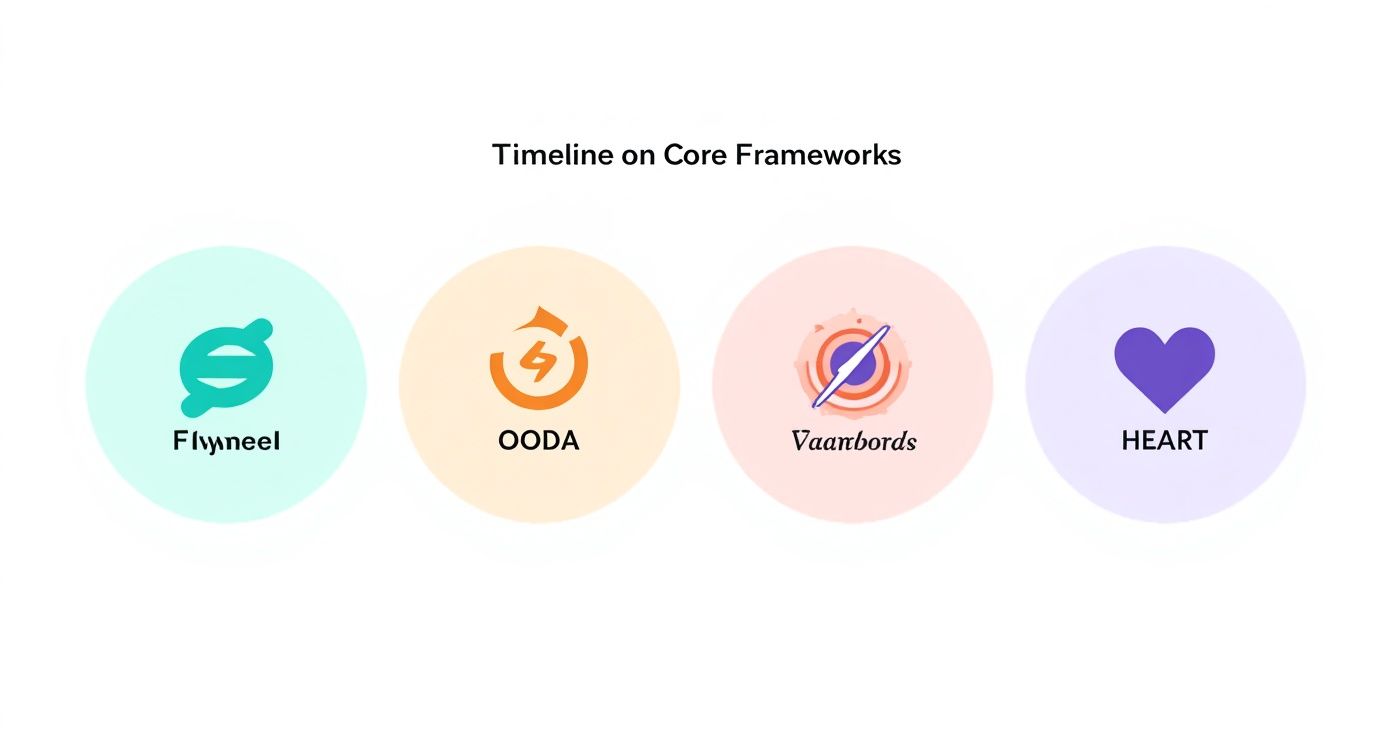
This chart maps the Data Flywheel, OODA Loop, and HEART Model to discovery, testing, and scaling. Think of it as a road trip: the first leg gets your car checked, the second explores paths, and the final leg shares stories with fellow travelers.
- **Case Study: Fintech Team**
A mid-market fintech crew saw a **20% increase** in monthly active users after following this roadmap.
For tips on building the right team and knowing when to bring in specialist talent, see [whether you should hire a data product manager](https://www.aakashg.com/should-you-hire-a-data-product-manager/).
> Key Takeaway
> A structured 30-60-90 day plan transforms data-driven decision making from a concept into measurable impact within 90 days.
## Real World Examples From Leading Companies
Every seasoned product leader knows that data only becomes powerful when it guides action. In the examples below, Meta, OpenAI, and a mid-market SaaS vendor each found a way to turn raw metrics into real wins. Their tool choices, team rituals, and outcome tracking offer a blueprint for anyone building products with numbers at the core.

### Meta Product Growth Experiments
At Meta, experimenting is part of the daily grind. Teams behind Facebook and Instagram push dozens of feature tests live every day, tapping into a stack built on Hive, Presto, and in-house tools.
- An A/B testing engine capturing **100M+** events per day, sliced into cohorts for razor-sharp insights
- Automated dashboards that post key metrics straight into stakeholder Slack channels
- Cross-disciplinary “war rooms” where design, engineering, and marketing align in real time
Yet, even with this firepower, only **37.8%** of Fortune 1000 firms call themselves truly data-driven.
Learn more about these data transformation challenges from NewVantage Partners: [Read the full research on data transformation challenges](https://www.integrate.io/blog/data-transformation-challenge-statistics/).
### OpenAI Feature Rollout Tests
When OpenAI rolls out a new GPT feature, it’s a carefully controlled experiment—no surprises allowed. Tracking happens in Looker, augmented by custom Python scripts that keep an eye on usage, latency, and satisfaction.
1. Release to a **5%** slice of users and log activity and feedback
2. Examine error rates, token-usage patterns, and satisfaction scores
3. Expand access gradually, gating on performance thresholds
This method halved rollout time while sustaining **99.9%** uptime. Plus, it created a continuous feedback loop between product, research, and security teams.
### Mid Market SaaS Predictive Churn Model
A mid-market SaaS team lifted retention with a churn-prediction engine that blends customer usage and billing data. Powered by TensorFlow and BigQuery, the model forecasts who’s likely to leave **one month** ahead of time.
- Trained on **50k** customer records, using signals like login frequency and support tickets
- Fed weekly risk scores into CRM pipelines to trigger targeted retention offers
- Boosted revenue by **15%** over six months thanks to timely, data-driven outreach
Embedding this insight directly into daily workflows turned forecasting from a one-off report into an operational muscle.
### Common Alignment Strategies
Across all three cases, success boiled down to shared goals and clear ownership. When data lives in a single source of truth, teams move faster and avoid duplicated work.
> “A shared North Star metric keeps everyone rowing in the same direction.”
- Define one **North Star** metric that every squad can rally around
- Hold weekly syncs to review results and iterate on next steps
- Rotate dashboard ownership so each team member gains firsthand data context
These habits forge a rhythm of continuous improvement—no one waits weeks for answers.
### Salary Benchmarks And Role Requirements
Data-driven product roles come in all shapes and sizes. As you map your skills to market standards, use these benchmarks to negotiate with confidence:
| Company | Role | Salary Range | Key Requirements |
|----------------|----------------------------|------------------|-------------------------------------|
| Meta | Product Growth PM | $150k–$180k | A/B Testing, Hive/Presto, SQL |
| OpenAI | ML Product Manager | $160k–$200k | Python, Model Evaluation, Looker |
| Mid-Market SaaS| Data Product Manager | $130k–$150k | TensorFlow, BigQuery, Retention KPI |
You might be interested in our deep dive on Netflix’s experimentation culture for more DataOps insights: [Netflix Experimentation Guide](https://www.aakashg.com/netflix-experimentation/).
By studying these real‐world cases, you’ll see how **data driven decision making** scales outcomes. Use their tactics in your next sprint, and watch growth and efficiency follow.
## Networking & Career Advancement for Data-Driven PMs
Building your network and positioning yourself for PM roles requires a targeted approach. Here’s how to fast-track your visibility and career progress:
- Identify target companies and roles:
• Scan job boards for “Product Data PM” positions at Google, Meta, Stripe.
• Save postings and note skill overlaps (SQL, Python, A/B testing).
- Engage in PM communities:
• Join Slack groups like Product Collective and virtual meetups on Meetup.com.
• Contribute to discussions—share your data pipeline wins and ask for feedback.
- Seek mentorship and peer coaching:
• Use ADPList to find experienced PMs at OpenAI or Amazon for 1:1 sessions.
• Schedule monthly “office hours” to review your project artifacts.
- Build a data-focused portfolio:
• Publish a GitHub repo with sample dashboards and scripts.
• Write LinkedIn posts analyzing public datasets and tagging relevant PM leaders.
- Leverage cold outreach with a concise template:
> Subject: Coffee Chat Request – Data-Driven PM Roadmap
>
> Hi [Name],
>
> I’m a PM leading analytics integration at [Your Company]. I admire your work on data pipelines at [Their Company]. Could I grab 15 minutes for a quick chat on best practices?
>
> Thanks,
> [Your Name]
Consistent networking, paired with visibility through content and mentorship, accelerates your path from entry to senior levels—especially in a remote-first world where relationships bridge the distance.
## Common Mistakes And How To Avoid Them
Scaling data projects can feel like navigating a minefield—even seasoned PMs stumble over avoidable missteps. In this section, you’ll find five common pitfalls, each paired with a root-cause breakdown and a ready-to-use corrective action template.
Catching these errors early keeps your decisions transparent, measurable, and on track for real impact.
### Chasing Vanity Metrics
Celebrating pageviews or downloads is a bit like applauding the wrapping paper and missing the gift inside. Those vanity numbers look impressive on a slide deck but rarely shift the bottom line.
- Conduct a metric audit to map each KPI to actual business outcomes.
- Replace superficial counts with **5–7** North Star indicators.
- Use a one-page dashboard template that flags low-impact metrics.
> “Vanity metrics distort team focus,” says a Google PM Lead.
### Ignoring Data Quality
Working from messy data is like building a house on sand—confidence erodes fast. When your datasets are dirty or incomplete, every recommendation becomes shaky.
- Implement a data validation checklist before each sprint demo.
- Automate null and duplicate checks using simple Python scripts.
- Review data sources weekly with a rotating ownership model.
### Over Relying On Gut Feel
Your instincts are a compass, not the map. Leaning too heavily on gut reactions blinds you to fresh insights that live in the numbers.
- Pair each hypothesis with metric-based tests in a hypothesis tracker.
- Log intuition sources to revisit them against actual results.
- Present both data and rationale in stakeholder updates.
### Poor AB Test Design
A/B tests can mislead just as easily as they inform. Skip proper segmentation or skimp on sample size and you’ll end up chasing ghosts.
1. Define sample size and power calculations upfront.
2. Establish significance levels (**p<0.05**) and confidence intervals.
3. Extend test duration to capture true behavior shifts.
> “Our sign-up test saw a **12% lift** after we adjusted sample size,” recalls a Senior PM at Meta.
### Missing Documentation
When analyses live only in people’s heads, you’re building knowledge on quicksand. New team members get stuck, and progress grinds to a halt.
- Capture data schemas, metric definitions, and experiment logs in a shared wiki.
- Use templates for retrospective reports to document insights and next steps.
- Schedule quarterly knowledge-transfer sessions for process updates.
### Action Plan Checklist
Run through this five-item checklist in your next retrospective to head off these errors and rally your team:
1. List the top five mistakes encountered this sprint.
2. Map each mistake to its root cause and a corrective action.
3. Assign responsibility and due dates on your project board.
4. Pin success metrics and review them weekly with stakeholders.
5. Archive templates and log updates in the PM wiki.
### Final Takeaways
Steering clear of these pitfalls will bolster your credibility and sharpen your product strategy. Plug in these templates to keep your decisions clear and data-driven.
### Case Study Example
A fintech squad applied these steps and slashed dashboard errors by **40%** in just two sprints. They credit weekly retrospectives with clearer data ownership and faster fixes.
> “Using a mistake registry saved us three days of rework each sprint,” notes a PM at Stripe.
- Keep a shared error log updated in real time.
- Align metric definitions before every experiment cycle begins.
## Frequently Asked Questions
### How Do I Secure Stakeholder Buy-In For A Data Initiative?
Getting that green light often comes down to small, tangible wins. I recommend kicking off with a **concise pilot** that targets a clear metric—think a **5% lift in retention** over four weeks.
Once you have a simple dashboard mockup and a back-of-the-envelope ROI, invite key players to a **15-minute demo** via a friendly, scripted email. Showing is always convincing.
Next, align everyone’s vocabulary by sharing a one-pager glossary of your core metrics. From there, roll out a **30-day roadmap** with clear milestones and owners:
- **Identify** the North Star metric and 2–3 supporting KPIs
- **Assign** stakeholder leads for data, design, and engineering
- **Outline** quick-win experiments and build in feedback loops
Blockquote your follow-up email so anyone can copy, paste, and personalize:
> Subject: Quick Demo of Our First Metrics Dashboard
>
> Hi [Name],
>
> I’d love 15 minutes to walk you through our new dashboard tracking [North Star]. You’ll see early insights and next steps.
>
> Best,
> [Your Name]
This approach keeps risk low and value front and center.
### Which Analytics Tools Fit A Small Product Team?
When your team is lean, simplicity wins. I often point product folks to **Metabase** or **Looker Studio** for dashboards and SQL queries. Both plug right into popular warehouses and offer generous free tiers—ideal for remote-first teams.
For event tracking without the bloat, try **Countly** or Amplitude’s free plan. And if you need embedded charts, Grafana paired with InfluxDB is a solid combo—just automate your nightly import:
influx write –bucket metrics –file events.csv
Key features of Metabase include:

- **Slack Integration** for instant chart alerts
- A **No-Code Builder** alongside a full SQL editor
- **Role-Based Access Controls** and activity logs

For detailed setup, see [Metabase Docs](https://www.metabase.com/docs).

### Balancing Quantitative And Qualitative Insights

Numbers tell you what happened; conversations tell you why. A dashboard showing retention dips is a great start, but real clarity comes when you pair it with voice-of-customer data.

Once your metrics are live, segment users and conduct short interviews. Then feed those transcripts into tools like **Dovetail** or a ChatGPT prompt:

> “Summarize key themes from this transcript focused on onboarding hurdles.”

Combine that with these field-tested practices:

- Record sessions in **Lookback.io** for playback
- Tag transcripts by sentiment and feature mention
- Sync major themes back into your Jira backlog

This mix of data and dialogue helps you understand both the “what” and the “why.”

### What Steps Ensure Data Privacy And Governance?

Proper governance starts with a quick audit. Use a simple checklist to map out:

1. PII fields in each event schema
2. Access controls via IAM roles
3. Data retention policies documented in Confluence
4. Encryption of sensitive tables at rest (AES-256)

Automate policy checks with tools like OneTrust or Collibra, and schedule quarterly reviews to stay on track. Here’s a sample governance template:

| Step    | Description                                  |
|---------|----------------------------------------------|
| Audit   | Catalog data sources and owners              |
| Control | Map roles and permissions                    |
| Document| Maintain policy pages in wiki                |
| Monitor | Run automated scans weekly                   |

Following these steps will keep risk low and compliance high.

---

Ready to level up your data-driven decision making? Explore **Aakash Gupta’s** resources at [aakashg.com](https://www.aakashg.com) for world-class PM guidance.