Stop looking at your users as one giant, anonymous blob. That’s what aggregate metrics like ‘Monthly Active Users’ do, and frankly, they’re vanity metrics that hide the truth. As a Product Manager, your job isn’t to report numbers; it’s to change them. And the single most powerful tool for understanding and improving user retention is cohort analysis.
At its core, it’s about grouping users by a shared characteristic—usually when they signed up—and then tracking their behavior over time. Think of it as an x-ray for your user base, showing you exactly where the fractures are in your user journey.
Here’s the actionable framework we’ll follow. By the end of this guide, you will be able to:
- Identify the right cohort type (Acquisition, Behavioral, Predictive) to answer your specific product question.
- Run a 5-step cohort analysis using common PM tools like Amplitude or even Google Sheets.
- Apply insights from top companies like Netflix and Slack to your own product strategy.
- Avoid the common pitfalls that lead junior PMs to flawed conclusions.
Let’s dive in.
The PM’s Secret Weapon for User Retention
As a Product Manager, your career progression—from an APM making $90k to a Senior PM at Google earning over $300k—is directly tied to your ability to deliver business outcomes. Building features isn’t the outcome; driving retention is. Cohort analysis is what gets you out of the guessing game and into data-driven confidence. It shows you the real story behind your retention numbers.
It helps you answer the big questions that actually shape your product strategy:
- Onboarding Effectiveness: Do users who went through our new onboarding flow (launched in Q2) have a higher Week 4 retention than users from the Q1 cohort?
- Feature Impact: We shipped that new AI-powered search in May. Did it actually increase the 30-day retention of users who engaged with it versus those who didn’t?
- Marketing Channel Quality: Are users we acquire from LinkedIn campaigns (avg. CPA $50) more likely to convert to a paid plan within 60 days than users from our organic search efforts (avg. CPA $5)?
From Raw Data to Actionable Insight
Let’s play out a common scenario I’ve seen countless times. You launch a killer new feature for your SaaS product. A month goes by, and your overall retention numbers look completely flat. Bummer. It’s easy to call the feature a failure and move on.
But a cohort analysis might tell a totally different story. It might show that new users who actually engaged with that feature in their first week have a 20% higher 30-day retention rate than those who didn’t. Suddenly, the problem isn’t the feature—it’s adoption. This single insight changes everything, shifting your focus from building something new to getting more people to use the awesome thing you already built.
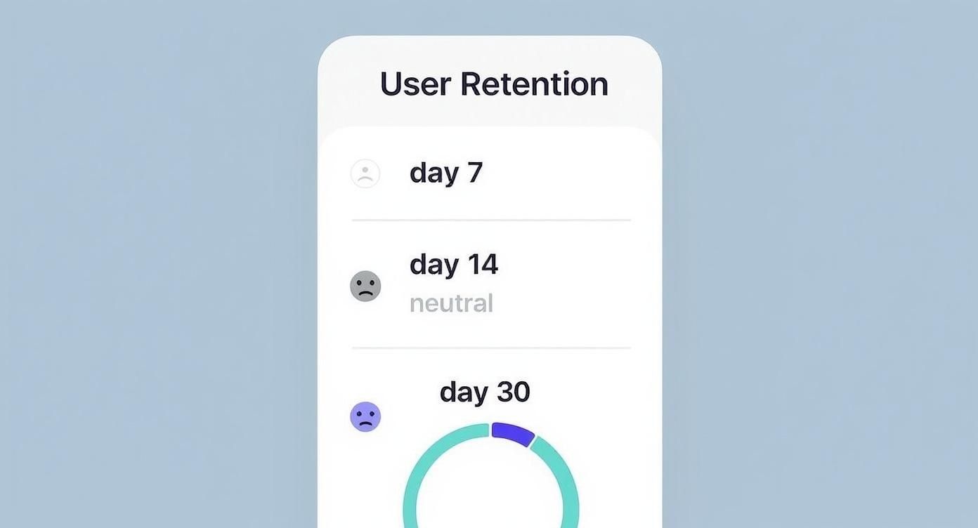
This is why cohort analysis is so critical. It helps you understand customer behavior over time, and the patterns are often startling. Research consistently shows a massive drop-off right after someone starts using a product, with retention rates often falling by 70-75% within the first week. Knowing this, PMs can pour their energy into making that initial experience absolutely phenomenal. You can learn more about how cohort analysis reveals retention trends in more detail.
This visualization shows that classic user retention drop-off pattern in the all-important first month.
This chart perfectly illustrates the “leaky bucket” problem so many products have. The biggest losses happen almost immediately, which screams that the first-week experience is where you need to focus your attention.
The Three Types of Cohorts Every PM Must Know

To really level up your analysis, you need to apply the right lens to your data. A senior PM at Google or Meta isn’t just looking at overall retention; they’re slicing it by cohort to get answers to very specific business questions. Getting a handle on these three cohort types isn’t optional—it’s essential for any PM who wants to drive strategy instead of just reporting numbers.
Think of them like different camera lenses. A wide-angle lens gives you the big picture, a zoom lens hones in on the critical details, and a specialty lens helps you see what’s just over the horizon. Your job is to know which lens to grab for the right shot.
Acquisition Cohorts: When Did They Join?
This is cohort analysis 101. It’s the most common type, grouping users simply by when they signed up—be it by day, week, or month. This is your go-to for checking the health of your onboarding flow and understanding that crucial first impression.
- Core Question It Answers: “Are our new users sticking around longer than last month’s new users?”
- Example in Action: Imagine Airbnb launches a simplified “Host Onboarding” flow in March. By comparing the 30-day retention of the March cohort against the February cohort, the product team gets a direct signal on the new flow’s impact. If retention for the March group is higher, that’s a clear win.
This is where you can start uncovering trends that get lost in the averages. For instance, segmenting acquisition cohorts by marketing channel is huge. You might find that retention for users acquired through organic search is 25% higher than for those from paid ads. That kind of insight tells you exactly where to put your marketing budget. For a deeper dive, Datamation.com explains how segmentation impacts retention.
Behavioral Cohorts: What Actions Did They Take?
This is where you graduate from “when” to “what” and “why.” Behavioral cohorts group users based on specific actions they take (or don’t take) within your product. This is how you find your power users and pinpoint those “aha!” moments that turn casual visitors into loyal fans.
- Core Question It Answers: “Which user actions correlate with the highest long-term retention and monetization?”
- Example in Action: Spotify’s growth team wants to know what separates casual listeners from die-hard fans. They create two behavioral cohorts: users who created a playlist in their first week, and users who didn’t. They’ll almost certainly discover that the playlist-creators have a dramatically higher 6-month retention rate. That’s proof this action is a key activation event to drive all new users toward.
A PM’s job is to find the causal link between user actions and business outcomes. Behavioral cohorts are the tool you use to form and validate those hypotheses. They turn vague assumptions into a data-backed product roadmap.
Predictive Cohorts: What Will They Do Next?
Welcome to the big leagues. This is the most advanced, forward-looking approach, used by data-savvy organizations like Amazon and Netflix. Predictive cohorts use machine learning models to group users based on their predicted future behavior, like their likelihood to churn or their potential lifetime value (LTV).
- Core Question It Answers: “Which of our new users are most likely to become high-value customers, and which are at risk of churning?”
- Example in Action: A B2B SaaS company like Slack could build a predictive model that analyzes early usage patterns. The model might flag a cohort of “at-risk” trial users who haven’t invited teammates or integrated other apps. Armed with that knowledge, the product team can proactively target this group with in-app guides or targeted emails, saving them from churning before it’s too late.
Running Your Cohort Analysis: A Step-by-Step Guide
Alright, knowing what cohort analysis is and why it matters is half the battle. Now, let’s get our hands dirty. This isn’t some dark art reserved for data scientists; any PM with a clear process can turn raw data into game-changing insights.
Think of it like building a piece of IKEA furniture. If you just dump all the screws and panels on the floor, you’re in for a long, frustrating night. But if you follow the instructions, step-by-step, you end up with something solid and useful. This five-step framework is your instruction manual.
Step 1: Define Your Core Business Question
Before you even think about touching data, you have to start with a razor-sharp, specific question. A vague goal like “I want to see our retention” is a recipe for a vague, useless analysis. Your question is your North Star—it dictates every single step that follows, from the data you pull to the type of cohort you build.
Great questions are measurable and tied directly to a business outcome. We’re talking about questions like:
- “Does our new gamified onboarding flow, which we launched on May 1st, actually improve 30-day retention for new users compared to the old one?”
- “Are the users we’re getting from our new TikTok campaign showing a higher LTV after three months than the ones from our tried-and-true Meta ads?”
- “What specific actions do users take in their first 24 hours that strongly correlate with them not churning within the first week?”
See the difference? These are questions you can actually answer.
Step 2: Identify the Necessary Data Points
With your question locked in, the next move is to list out the exact data points you’ll need. This is a simple but surprisingly crucial step. It’s your shopping list before you go to the data grocery store.
For that onboarding question, for instance, you’d need a few key things:
- User ID: A unique identifier for every single user.
- Sign-up Date: The exact timestamp when they created their account.
- Last Seen Date: The timestamp of their last logged activity.
- Onboarding Version: A specific property that tells you if they experienced the ‘old’ or the ‘new’ flow.
Creating a data-driven product culture means PMs have to be incredibly specific about their data needs. If you’re serious about building data-driven product teams, getting this part right isn’t optional.
Step 3: Choose the Right Cohort Type
Your question practically tells you which type of cohort to use.
- For the onboarding question, you’d create two Acquisition Cohorts: one group for users who signed up before May 1st, and another for everyone who signed up after.
- For the TikTok campaign question, you’d again use Acquisition Cohorts, but this time you’d segment them by their marketing source.
- And for the user action question, you’d get creative with Behavioral Cohorts, grouping users based on actions like “completed profile,” “invited a teammate,” or “used feature X.”
Step 4: Select Your Tools
Good news: you don’t need a million-dollar business intelligence suite to pull this off, especially when you’re starting out.
- Spreadsheets (Google Sheets, Excel): Perfect for startups or one-off analyses. You can manually export user data and use pivot tables to build a cohort chart. It’s free and powerful, but it can get tedious fast.
- Product Analytics Platforms (Amplitude, Mixpanel): These are the gold standard for most tech companies for a reason. They make defining, visualizing, and digging into cohorts almost laughably easy—often with just a few clicks. They’re incredibly powerful but come with a cost that grows with your user base.
Step 5: Visualize and Interpret the Results
This is the moment of truth. You visualize the data, and the standard way to do this is with a cohort chart, often a color-coded heatmap.
Here’s a classic retention chart from Amplitude that shows how user retention plays out over several days.
This single chart tells a powerful story. You can immediately spot the common pattern: a big, steep drop-off right after Day 0. The color-coding acts like a weather map, making it easy to scan across each row and see exactly how each group’s engagement decays over time. It helps you pinpoint the precise moments your users are losing interest and falling away.
How Top Companies Use Cohort Analysis to Win

Theory is one thing, but application is how you really move the needle. The best product managers out there don’t just know what cohort analysis is—they use it as a strategic weapon to figure out what’s working, what isn’t, and why. They’ve moved way past the textbook definitions and are using cohorts to answer the big, expensive questions.
This idea of grouping people and watching them over time isn’t exactly new. Its roots are actually in medical research. Groundbreaking studies like the Nurse’s Health Study (1976) and the Framingham Heart Study (1948) used cohort analysis to spot patterns in disease over decades. These studies proved just how powerful this method is for finding real connections—a principle that’s now at the core of product growth. You can dive deeper into the history and benefits of cohort analysis on Julius.ai.
Netflix Cracking the Content Code
Netflix is completely obsessed with retention. To make sure its massive $17 billion annual content budget is well spent, its product teams rely on behavioral cohorts to understand what actually keeps people subscribed for the long haul.
It’s not just about what you watch; it’s about your patterns. For instance, they might group new users based on the first genre they binge-watch. From there, they can track the 6-month retention rate of the “true crime” cohort against the “rom-com” cohort.
If they find that users who get hooked on a sci-fi series in their first week are 20% more likely to stick around after a year, that’s a powerful insight. It directly shapes what shows they buy, produce, and promote on your home screen.
Slack Measuring Feature Adoption Impact
For a B2B powerhouse like Slack, product-led growth is the name of the game. When they launch a big new feature like “Canvas,” they have to know if it’s actually making the product stickier. To do this, they use acquisition cohorts segmented by who uses the new feature and who doesn’t.
Top-tier PMs don’t ask, “Did we ship the feature?” They ask, “Did the feature change user behavior for the better?” Cohort analysis is how you answer that second, more important question.
Imagine they compare two groups of users who signed up in the same week:
- Cohort A: Users who adopted Canvas within their first 14 days.
- Cohort B: Users who did not adopt Canvas.
By tracking the 90-day retention and daily active usage of both cohorts, Slack can put a real number on that feature’s ROI. If Cohort A is way more engaged, it’s clear proof the feature is valuable and justifies pushing for wider adoption—something you can accelerate with strong customer onboarding best practices.
Shopify Optimizing Ad Spend for LTV
Shopify’s success is tied directly to the success of its merchants. So, they use cohort analysis to track the lifetime value (LTV) of merchants coming from different marketing channels. They create acquisition cohorts based on the source, like “Google Ads,” “Organic Search,” or “Content Marketing.”
By following the average revenue from each cohort over 12, 24, and even 36 months, they can see which channels bring in the most profitable customers over the long run—not just the ones that drive the most initial sign-ups. This lets them pour their multi-million dollar ad budget into the channels that deliver real, sustainable growth.
Common Mistakes PMs Make in Cohort Analysis

Sure, running a cohort analysis in Amplitude or Mixpanel takes just a few clicks. But pulling out trustworthy insights you can confidently present to leadership? That’s what separates a junior PM from a senior product leader.
Flawed analysis leads to flawed strategy, which leads to wasted engineering cycles and a huge loss of credibility. Many promising PMs stumble by making the same avoidable errors that completely invalidate their conclusions. Knowing these common pitfalls is critical if you want your analysis to be robust, defensible, and a true driver of intelligent product decisions.
Using Vanity Metrics Over Actionable Data
This is easily the most common mistake: tracking the wrong thing. A junior PM might track “logins per week.” On the surface, it sounds useful, but it tells you very little about real engagement or whether users are getting any value. It’s a classic vanity metric.
- The Mistake: A PM for a project management tool sees that the January cohort has a higher 7-day login rate than the February cohort. They jump to the conclusion that January users are simply “more engaged.”
- The Fix: You need to track a metric tied directly to the core value of your product. Think “projects created” or “tasks completed.” This reveals if users are actually solving the problem your product was built for, which is a far better predictor of long-term retention.
Ignoring Statistical Significance
Another frequent error is drawing bold conclusions from tiny, insignificant data sets. An enthusiastic PM might get excited about a 15% lift in retention but conveniently overlook that the cohort only had 20 users. At that scale, the change is likely just noise.
A senior PM knows that a conclusion is only as strong as its statistical foundation. Acting on insights from cohorts that are too small is essentially gambling with your roadmap.
For your findings to have any credibility, your cohort size has to be large enough to rule out random chance. If your cohorts are too small, try grouping them into larger timeframes (like weekly instead of daily) to get a more reliable signal from your data.
Misinterpreting Correlation as Causation
This is the classic data analysis trap we all fall into at some point. Just because two things happen at the same time doesn’t mean one caused the other.
You might see a spike in retention the same week you launched a new feature, but an external factor—like a holiday weekend or a major competitor’s outage—could be the real reason for the bump.
To get closer to proving causation, you have to isolate variables. This almost always means running controlled A/B tests where one group gets the new feature and the other doesn’t. Comparing the retention of these two specific cohorts provides much stronger, more defensible evidence.
This level of rigor is often where a dedicated data expert becomes invaluable. Understanding when you should hire a data product manager can be a critical strategic decision for a growing team that needs to move beyond simple correlations.
Frequently Asked Questions About Cohort Analysis
Once you start using cohort analysis, a whole new set of practical questions always bubbles to the surface. Getting these details right is what separates a one-off analysis from a continuous, strategic capability.
Here are the answers to the questions I hear most often from the product managers I mentor.
What Are the Best Cohort Analysis Tools for Startups vs. Enterprises?
Your choice of tool really needs to match your company’s stage, budget, and the complexity of the questions you’re asking. There’s no single “best” tool out there—only the right tool for where you are right now.
- For Aspiring PMs & Startups (Free / Low-Cost):
- Google Analytics 4 (GA4): It’s free and surprisingly powerful for basic acquisition and behavioral cohort analysis. If you’re just getting started and need to see how retention differs by traffic source, GA4 is a fantastic first step.
- Spreadsheets (Google Sheets/Excel): Never, ever underestimate the power of a well-organized spreadsheet. For quick, one-off analyses, just exporting your raw data and building a few pivot tables is a super cost-effective way to get answers without committing to a paid platform.
- For Mid-Career PMs & Growth-Stage Companies:
- Amplitude & Mixpanel: These are the industry standards for product analytics, period. They offer incredibly deep, intuitive cohort analysis with just a few clicks, letting you segment by complex user properties and behaviors. Plans often start with a generous free tier, with paid plans scaling from a few hundred dollars per month based on usage. Once you need to move fast, their power more than justifies the cost.
- In-House BI Tools (Looker, Tableau): Big enterprises with dedicated data teams often build their own custom cohort dashboards. This gives you maximum flexibility to join product data with other business data (think Salesforce or Zendesk) for a complete picture of the customer lifecycle.
How Often Should I Run a Cohort Analysis?
The right cadence depends entirely on your product’s natural usage frequency and your business model. Run it too often, and you’ll just be looking at noise. Too infrequently, and you’ll miss critical signals.
A common mistake is treating cohort analysis like an annual physical. For a fast-moving product, you need to be checking its vitals far more often. Your cadence should match the pace of your product development and user feedback loops.
Here are some solid starting points:
- Consumer Mobile Apps (e.g., social, gaming): Go with weekly. User behavior changes on a dime, and you need to monitor how your weekly app updates and marketing pushes are impacting D7 and D14 retention.
- B2B SaaS Products: Monthly is your best bet. The B2B user journey is longer, so monthly cohorts give you a stable signal to measure the impact of feature releases on 30, 60, and 90-day retention without getting lost in the daily weeds.
- E-commerce Platforms: Do both weekly and monthly. Run weekly cohorts to track the immediate repeat purchase behavior from promotions and campaigns. Then, use monthly cohorts to understand long-term customer LTV and loyalty.
Can Cohort Analysis Predict Future User Behavior?
This is a critical distinction every PM needs to get right. Retrospective cohort analysis explains the past, while predictive modeling forecasts the future.
Standard cohort analysis—everything we’ve covered so far—is inherently retrospective. It looks backward to tell you how users have behaved. It’s incredibly powerful for diagnosing problems and figuring out what led to your current retention numbers.
But here’s the cool part: you can use the insights from this historical analysis to build predictive models.
For example, after you identify that users who invite three teammates in their first week have 90% higher retention (that’s a retrospective insight), a data science team can build a model that flags new users who haven’t taken this action yet. This creates a predictive cohort of “at-risk” users.
This is the move that takes you from being reactive to proactive. Instead of just learning why users churned last month, you can actually step in and save the users who are likely to churn next month.
Ready to stop guessing and start leading with data? Aakash Gupta provides actionable frameworks and career guidance for Product Managers who want to win. Join the top-ranked newsletter and podcast for PMs at https://www.aakashg.com.