Before you write a single line of a Product Requirements Document (PRD), you need a prototyping strategy. As a Product Manager, your job isn't just to build; it's to de-risk. I've seen it time and again at Google and Meta—the best PMs don't dive into building. They start by ruthlessly identifying their riskiest assumptions.
These are the core beliefs that, if wrong, will sink your product.
Is the user flow intuitive? Does our value proposition resonate with customers? Will this AI-generated summary actually be trusted by users? A prototype is your fastest path to answering these crucial questions. It's a cornerstone of the product discovery process, helping you move quickly without committing expensive engineering resources to the wrong thing.
The entire point is maximum learning for minimum effort. You're validating your hypotheses with real users before committing six months of your engineering team's time.
Your Prototyping Playbook for Faster Validation
Once you have your list of core assumptions, the next step is to map them to the right prototype fidelity. Not every question needs a pixel-perfect, fully interactive prototype. Sometimes, a simple paper sketch is all you need to see if a user flow makes sense.
Other times, like when you're getting leadership buy-in for a major AI initiative that requires a $500k budget, you'll need a polished, clickable mock-up from Figma.
The name of the game is ruthless efficiency. You want the fastest, cheapest method that gets you a credible answer to your most burning question. Making this call correctly is what separates the PMs who ship great products from those who just ship features.
This decision tree helps visualize how your goals and your audience should directly inform your choice.
The key takeaway? Low-fidelity is your go-to for early, internal validation and just exploring core concepts. High-fidelity is what you pull out for serious user testing and stakeholder presentations where polish and credibility are non-negotiable.
Prototype Fidelity Decision Matrix for Product Managers
To make this even more practical, I use a decision matrix to quickly align on the right approach. It helps frame the conversation with designers and stakeholders so everyone is on the same page about what we're building and why.
| Fidelity Level | Primary Goal | Best For (Audience) | Top Tools | Typical Timeline | Career Level Focus |
|---|---|---|---|---|---|
| Low-Fidelity | Concept validation, flow exploration | Internal team, trusted users | Paper, Balsamiq, Miro | 1-3 days | Aspiring/Entry-Level PM |
| Medium-Fidelity | Test information architecture, layout | Internal teams, early-stage user tests | Sketch, Figma (basic) | 3-7 days | Mid-Career PM |
| High-Fidelity | Usability testing, stakeholder buy-in, demos | End-users, leadership, investors | Figma (advanced), Framer, ProtoPie | 1-2 weeks | Senior PM/PM Leader |
This matrix isn't rigid, but it's a solid starting point that forces you to be intentional about your prototyping efforts instead of just defaulting to the highest fidelity every time.
The Prototype's Strategic Role
Ultimately, a prototype is a tool for validation. But building a cool-looking model isn't enough. It's critical to understand how to validate your startup idea effectively to make sure your prototype is actually testing a genuine market need. A beautiful prototype that doesn't solve a real problem is just a pretty waste of time.
As a hiring manager, I always look for PMs who treat prototyping as a strategic exercise in risk reduction, not just a design task. They can clearly articulate exactly what hypothesis they are testing with each prototype and what success looks like. This is a key differentiator between a junior PM and a PM I would trust to lead a major initiative.
This mindset is what separates junior PMs from true product leaders. It’s not about creating a perfect artifact; it’s about making smarter, faster decisions. This playbook is your framework for doing just that—getting the feedback you need to build products customers actually want and, in the process, accelerating your own career.
Choosing Your Tools and AI-Powered Workflows
Your prototyping toolkit separates the slow and bureaucratic from the fast and insightful. Knowing how to use Figma is table stakes for any PM role today—look at job postings for companies like Stripe or Shopify, and you'll see it listed as a core competency. The real edge now comes from building AI-powered workflows that act as a force multiplier for you and your team.
This isn't about chasing the latest shiny object. It’s about de-risking your product roadmap faster than your competition. The modern PM stack lets you go from a vague idea scribbled on a napkin to something you can put in front of users in a fraction of the time.
This shift is why the rapid prototyping market is set to explode, projected to hit USD 3.25 billion by 2030. When you see data indicating that AI can reduce product development costs by ~30% and cut time-to-market by up to 50%, you understand why this matters. It’s the difference between iterating in weeks instead of quarters.
Selecting Your Core Prototyping Software
Every workflow needs a home base, and for 90% of PMs, that's Figma. Its collaborative DNA, robust component libraries, and powerful prototyping features have made it the undisputed standard from tiny startups to massive enterprises like Microsoft.
But the "best" tool always depends on the job at hand.
- For Early-Stage Startups: Speed is life. Tools like Uizard use AI to turn rough sketches into digital wireframes instantly. Or you might grab Balsamiq to create a deliberately lo-fi experience that forces conversations to stay focused on user flow, not pixel perfection.
- For Large Enterprises: Consistency and scale are everything. Here, Figma, paired with a meticulously maintained design system, is non-negotiable. For incredibly complex, data-heavy applications needing conditional logic, you might still see a specialist tool like Axure RP in the mix.
As a PM leader, fluency in Figma is an expectation for my team. But what really impresses me is a PM who knows when to grab a simpler tool for an early validation goal. It shows they get that learning speed trumps unnecessary polish every single time.
Integrating AI for a Competitive Edge
This is where the top 1% of PMs are creating a massive gap. Instead of waiting days for a designer to mock up initial concepts, you can use AI to generate a dozen different directions in minutes. This is especially crucial for AI PMs, who need to visualize novel, non-traditional user interfaces.
Here’s a practical workflow I've implemented with my teams:
- Generate Concepts with Midjourney: Fire up Midjourney with a specific prompt. For example:
UI for an AI-powered travel itinerary planner, showing a multi-day schedule with map and budget tracking, minimalist, clean, mobile-first --ar 9:16. This generates a flood of visual ideas and gets stakeholders aligned on a direction before a single pixel is pushed in Figma. - Wireframe with AI: Take your favorite concepts and feed them into a tool like Galileo AI or Uizard. They can generate editable Figma wireframes from just a text description or an image, giving you a tangible starting point almost instantly.
- Refine and Prototype in Figma: Import those AI-generated assets into Figma. Suddenly, you and your designer aren't staring at a blank canvas. You’re already iterating on a solid foundation, connecting screens, and adding the interactive details needed for user testing. The Figma community is a goldmine for plugins that can speed this up even more.
This AI-assisted process doesn't make designers obsolete; it supercharges them. It automates the tedious parts of the job, freeing them to focus on high-impact problem-solving. To see just how far this can go, you should explore what's coming next in the future of AI prototyping tools.
No-Code Builders for When You Need More Fidelity
Sometimes, a clickable Figma prototype just doesn't cut it. You need to test a complex user journey with real data, especially for AI features where the output is dynamic. That's where no-code platforms like Bubble or Webflow become your secret weapon.
A PM with some technical chops can use these tools to build a functional, data-driven prototype that feels almost indistinguishable from the real thing, often by piping in data from an API like OpenAI.
This approach is a game-changer for:
- AI-Powered SaaS Tools: Let users validate core workflows with their own data inputs and see real AI-generated outputs.
- Marketplace Products: Test both the buyer and seller experience with live data.
- Securing Investment: A functional no-code app is infinitely more compelling to investors than a deck full of static mockups.
Your choice of tools is a strategic one. By combining a core design platform with the right AI tools and no-code builders, you create a powerful system for learning and iterating at a pace your competitors simply can't match.
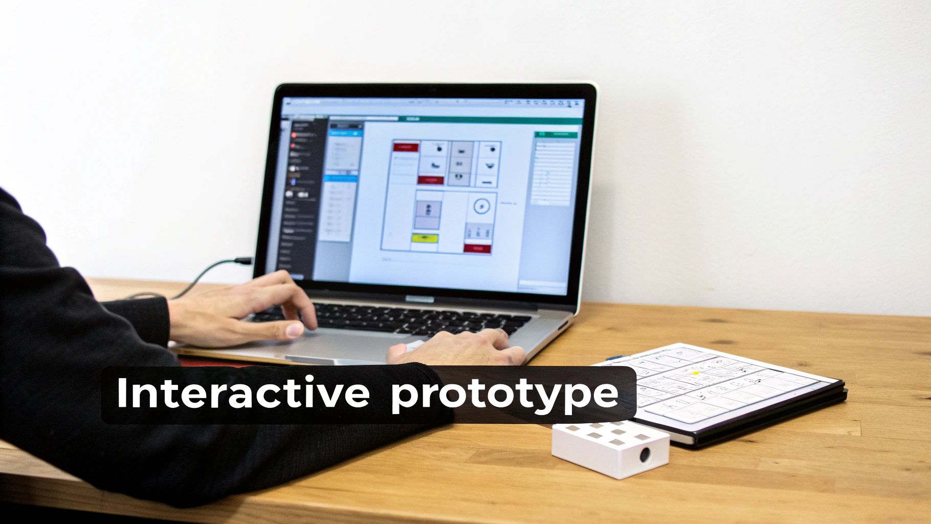
Building Your First Interactive Prototype
Alright, you've got your tools. Now it's time to move from static wireframes to a living, breathing prototype. This is where you transform designs into an interactive experience that shows people not just what your product does, but how it feels to use it. The point here isn't pixel-perfection; it’s about simulating a genuine user journey to test your riskiest assumption.
The goal is to pull your wireframes into a tool like Figma and start connecting the dots. Start by creating reusable components for buttons and navigation bars to keep things consistent. From there, link screens together to mimic the core user flow you've identified as your biggest unknown.
Design for Reality, Not Perfection
A classic rookie mistake is designing the perfect "happy path" prototype—where every click works flawlessly and all the data is pristine. Experienced PMs know that real life is messy.
To build a prototype that's actually useful for testing, you have to design for realistic states. You need to show stakeholders and users what the experience is really like when:
- It’s Empty: What does a user see the first time they log in, before there's any data?
- It’s Loading: How does the UI communicate that information is being fetched? A simple loading spinner can make the app feel faster.
- It’s Full of Errors: What happens when an API call breaks or a user enters invalid data? Showing these error states tests the true resilience of your user experience.
Thinking through these edge cases is what separates a flimsy concept from a thoughtful product simulation. The insights you get are pure gold and will directly feed into the requirements you write for engineering. As you start this process, a good guide to crafting your crowdfunding prototype can be a great resource for structuring your initial build.
Adding Polish with Micro-Interactions
Once the core flow is working, you can add a layer of polish to make the experience feel more convincing.
Don't go overboard and animate every element. Instead, focus on key moments in the user's journey. Subtle micro-interactions—like a button changing color on hover or a screen sliding in smoothly—can dramatically elevate the perceived quality of your product.
A well-crafted transition between two critical screens can communicate their relationship more effectively than any text label. It’s a subtle but powerful way to guide the user and make the entire experience feel more intuitive. This is especially true for AI features, where a subtle animation can signify that the system is "thinking."
This attention to detail is critical when presenting to stakeholders. It helps them engage with the prototype as if it's a real, finished product, leading to better, more insightful feedback. These small details also help you and your designer think through all the necessary user stories. To get a better handle on this, check out our guide on how to write user stories that capture these interactive requirements.
Your Pre-Flight Checklist Before User Testing
Before you put your prototype in front of a single user, run through this quick checklist. Catching these common issues now will prevent distractions during testing and ensure the feedback you get is about your concept, not your prototype's flaws.
- Check All Click Targets: Seriously, click everything. Do all the buttons go to the right place? Are there any dead ends in your main user flow?
- Reset the Prototype State: Can you easily reset the prototype to the starting screen? Testers often need to restart, and a clunky reset process is frustrating for everyone.
- Review Copy for Typos: Obvious spelling and grammar mistakes can break the illusion and make you look sloppy. Do a quick proofread.
- Confirm Realistic Data: Is your placeholder text believable? "Lorem ipsum" is fine for early wireframes, but for user testing, use realistic names, dates, and descriptions. It makes the whole experience feel more authentic.
- Test on the Target Device: If you’re designing a mobile app, test the prototype on an actual phone. What looks great on your giant monitor might feel cramped and totally unusable on a small screen.
Testing Your Prototype with Real Users
A prototype without user feedback is just a well-intentioned drawing. It’s an untested hypothesis. As a PM, your job isn't just to oversee its creation; your real work begins when you put that prototype in front of actual users to see if it holds up to reality.
This is where your assumptions collide with human behavior. The insights you gather here are pure gold—they’ll become the foundation for your product roadmap and the justification for your engineering team’s next six months of work. Getting this right is non-negotiable for your career progression.
Setting the Stage for Actionable Feedback
Before you schedule a single user session, you need to know exactly what you’re trying to learn. Vague goals like "see if users like it" will only get you vague, useless feedback.
You have to get specific. Are you testing the intuitiveness of the onboarding flow? The clarity of your core value prop? The usability of a new feature? Your test objectives need to be sharp and measurable. A good objective sounds like this: "Can a new user successfully create and share a project in under 2 minutes without any help?" This gives your session a clear purpose and a quantifiable benchmark for success.
Recruiting the Right Participants on a Budget
Getting the right people to test your prototype is far more important than getting a lot of people. You need participants who genuinely represent your target audience, not just warm bodies.
Here are a few ways I’ve successfully found great participants without a massive research budget:
- Your Existing User Base: If you already have a product, reach out to a segment of your users. A simple email offering a $50 Amazon gift card or product credits can work wonders.
- LinkedIn & Niche Communities: I often search for users with specific job titles on LinkedIn (e.g., "Data Analyst at a Fortune 500 company") or hang out in relevant Slack or Reddit communities. The key is to offer value in return.
- User Panels: If you have the budget ($100-$200 per participant), services like UserTesting.com, User Interviews, or Respondent.io are worth their weight in gold. They can find highly specific participants for you, saving you a ton of time.
As a hiring manager, I always probe a PM's ability to get creative with user feedback. Resourcefulness in recruiting shows me they understand that user-centricity isn't just a buzzword; it's an action they're willing to take, even when it's tough.
Conducting Moderated User Tests that Actually Work
For high-fidelity prototypes, I’m a huge fan of moderated testing. It lets you ask follow-up questions in the moment and observe non-verbal cues—the sighs, furrowed brows, and moments of delight. Your script is your most important tool. The goal is to ask open-ended, non-leading questions.
Instead of asking, "Is this new dashboard easy to use?" which prompts a simple yes or no, try this: "Walk me through how you would find your latest sales report on this screen." Then, be quiet. Let them think out loud. Silence is your best friend. Letting users struggle a little is where the most valuable insights come from.
To learn more about structuring these sessions for maximum insight, check out our in-depth guide on how to conduct usability testing.
Differentiating Qualitative and Quantitative Feedback
After a few sessions, you'll have a mix of data. Your job is to pull it all together into a coherent story.
- Qualitative Data: These are the quotes, observations, and emotional reactions. Things like, "I was confused here because I expected X to happen," are qualitative gold. This data tells you the why behind a user’s actions.
- Quantitative Data: These are the numbers. Metrics like task completion rates (e.g., 8 out of 10 users completed the task), time on task, and error rates give you the what.
A great PM combines both. "Our task completion rate was only 40% (quantitative), and we saw that most users got stuck on the payment screen because they couldn't find the 'apply coupon' button" (qualitative). This combination is what convinces stakeholders and gives your engineers clear, actionable direction.
Scaling Feedback with Unmoderated Testing
When you need feedback at scale, especially for simpler interactions or quick A/B tests on specific UI elements, unmoderated platforms are incredibly powerful.
Tools like Maze allow you to send your prototype link to hundreds of users and get back quantitative data and video recordings quickly. You lose the ability to ask follow-up questions on the fly, but you gain speed and volume. It’s an excellent way to validate findings from your moderated sessions or to quickly test minor design iterations.
You’ve wrapped up user testing, and now you're staring at a pile of notes and transcripts. This is where a prototype proves its worth—it has generated a ton of learning. The next step is translating that learning into action.
Resist the temptation to jump straight back into Figma and start moving pixels. That's a rookie mistake. I’ve seen junior PMs get swamped by a flood of contradictory user opinions. Experienced PMs bring structure to the chaos first.
Start by sorting every piece of feedback into themes.
My go-to categories are:
- Usability Issues: Where did people get stuck? "I couldn't find the 'Save' button."
- Comprehension Gaps: What parts of the concept or value prop didn't click? "I don't get what this chart is telling me."
- Feature Gaps: What did users instinctively try to do but couldn't? "I wish I could export this as a CSV."
- Delightful Moments: What made people light up? Don't forget to double down on what’s already resonating.
This exercise turns a messy heap of feedback into a clean, prioritized list of problems to solve.

Knowing When to Stop Iterating
One of the most critical skills for a PM—and something I always look for when hiring—is knowing when to stop tweaking the prototype and start building. It’s easy to fall into the "just one more change" trap, which can kill your timeline. A prototype’s job is to de-risk your idea, not be perfect.
My rule of thumb: you stop iterating when the prototype consistently validates your core hypothesis. The feedback will naturally shift from major usability blockers to minor aesthetic preferences. If users can get the main job done and the feedback is about button colors, it’s time to ship.
The goal here is confidence, not certainty. Once you've ironed out the critical issues that stop users from getting value, you have enough signal to start development.
The Art of a Seamless Engineering Handoff
This is where so many great product ideas fall apart. Dropping a Figma link into a Jira ticket and calling it a day is a recipe for disaster. It strips away all the crucial context—the why behind your decisions.
A great handoff is an act of communication. Your engineers need more than just pixels; they need the story. They need to understand the user problems you found, the solutions you tested, and the business goals you're driving toward. Giving them that context empowers them to make smarter decisions when they’re deep in the code.
To make sure nothing gets lost, I swear by a simple "Handoff One-Pager" that lives alongside the Figma file.
Here’s what I always include:
- Problem Statement & Goal: A one-sentence summary of the user problem and the #1 metric this feature is designed to move (e.g., "Increase user activation rate by 15%").
- Key User Stories: The 3-5 most critical user stories, framed from the user's perspective.
- Annotated User Flows: Direct links to specific Figma frames showing the end-to-end journey, with callouts for key interactions, edge cases, and error states.
- Acceptance Criteria: A clear, testable checklist that defines what "done" actually means for each user story. This becomes the foundation for QA testing.
This one-pager bridges the gap between design and engineering. It ensures that when your team starts writing code, they're not just building features; they're solving the right user problems. This structured process is a fundamental part of learning how to write product requirements that get built correctly the first time. It effectively turns your validated prototype into a clear blueprint for execution.
Common Prototyping Questions
Even with a solid playbook, prototyping is messy. Over the years, I've seen product managers run into the same practical questions time and time again.
Here are my direct answers to the ones I hear most often.
How Do I Prototype for an AI-Powered Feature with Unpredictable Outputs?
This is a big one. You can't prototype for AI like you'd mock up a standard UI. Designing the single "perfect" outcome is a waste of time because AI is variable. The whole point is to test how users react to that unpredictability.
Early on, my go-to is the "Wizard of Oz" technique. Get into a user test and have a human teammate manually simulate the AI's responses behind the scenes. It's the fastest way to test the core interaction model without writing a line of code.
As you get more serious, your prototype needs to show the full spectrum of what could happen:
- The Best-Case Result: The AI nails it. The response is ideal and incredibly helpful.
- The Worst-Case Result: The AI completely misses the mark with an irrelevant or unhelpful response.
- A Typical Result: The average, moderately useful output people will likely see most of the time.
This forces you to design for reality, not a perfect demo. You’re building resilience into your UX by testing how users handle variability, which is the most important question for any AI feature.
What Should I Do When Executive Feedback Directly Contradicts User Testing Results?
This is a classic PM rite of passage. Avoid turning it into a battle of opinions. Your job is to be the voice of the user, armed with objective data, not just personal beliefs.
Never frame it as "you vs. them." Instead, present the findings calmly and without emotion.
"During testing with 10 target users, 8 of them struggled with the proposed navigation for these specific reasons. Here are the video clips showing where they got stuck. I understand your perspective on simplicity; perhaps there's a quick, low-cost experiment we can run to test your hypothesis against what we saw from users?"
This data-driven approach shifts the conversation from a subjective argument to evidence-based problem-solving. It shows you're committed to finding the best answer for the business, not just trying to win the debate.
How Can I Justify the Time and Cost of Prototyping to My Leadership?
You have to speak their language. Frame prototyping as a powerful risk mitigation tool, not a design expense. This is about business impact and ROI.
Explain how a two-week prototype can de-risk six months of engineering work. Put a number on it. If your dev team costs $100k/month, a six-month project is a $600k bet. A two-week prototype costing a fraction of that can validate whether that bet is worth making.
Use industry data to make your case. For instance, you can explain that effective prototyping has been shown to reduce development costs by 30% and cut time-to-market by 50%.
Position it as a smart investment with a clear return: ensuring that your most expensive resources—your engineers—are focused only on validated, user-centric solutions with a much higher probability of success.
What Is the Difference Between a Prototype and an MVP?
This distinction is absolutely critical and often misunderstood. The simplest way to think about it is "show" versus "work."
A prototype is a simulation. It’s a learning tool designed to answer specific questions about the user experience, workflow, or design. It feels real but is often completely disposable. A prototype tests a hypothesis like, "Will users understand this new checkout flow?"
An MVP (Minimum Viable Product) is the smallest version of a functional, working product that can be shipped to real users to deliver core value. An MVP tests the business model itself by asking, "Will users actually pay for this solution to their problem?"
It's a one-two punch: you use prototypes to figure out what to build in your MVP.
At Aakash Gupta, we're dedicated to helping you master these skills and advance your product career. For more deep dives, frameworks, and career advice from a PM leader, explore our resources at https://www.aakashg.com.