Creating a prototype isn't a design task you delegate; it's a strategic weapon for Product Managers. It’s how you turn a vague idea into a tangible asset that de-risks your roadmap, secures executive buy-in, and kills bad ideas before they drain engineering resources. This guide provides a step-by-step framework for building prototypes that answer your most critical business questions and accelerate your career.
Prototyping Is a Core Product Management Skill
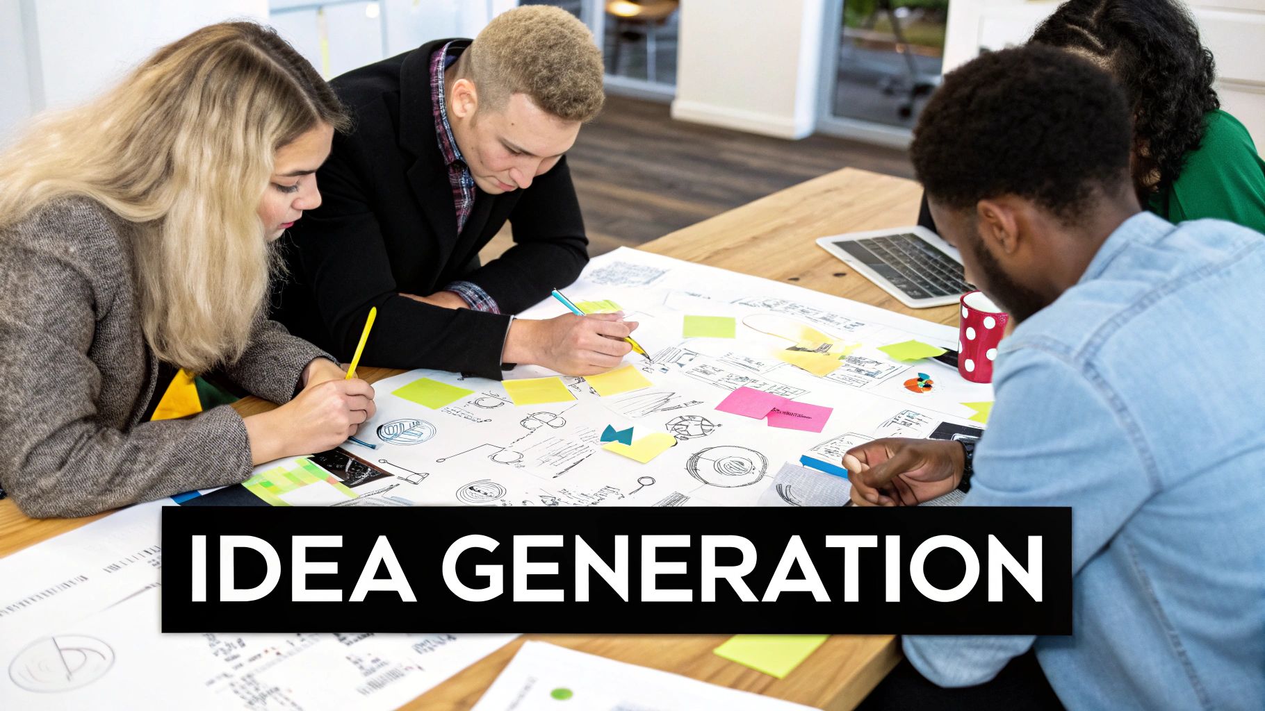
After years of hiring and coaching product managers at companies like Google and startups, I can tell you this: the ability to build a compelling prototype is what separates the top 1% from everyone else. This isn't just a task you hand off to a designer. It’s a strategic lever that can fast-track your career.
Think about the best PMs at companies like Airbnb or Spotify. They don’t just groom backlogs. They use prototypes to validate their riskiest assumptions, get stakeholders genuinely excited, and shut down flawed concepts before a single line of code gets written. A quick look at a Senior PM job posting at a top-tier company like Meta will often list "Experience with rapid prototyping and user testing" as a key requirement, with salary ranges often exceeding $250,000+ total compensation. This skill pays.
This skill has a direct, measurable impact on the business. When you master prototyping, you stop building features just for the sake of it and start eliminating waste. You become the person who prevents the company from spending months of engineering effort on a project that was doomed from the start.
The Strategic Value of Prototyping
For PMs, the why behind prototyping is just as important as the how. It’s about fundamentally shifting the conversation from, "Can we build this?" to, "Should we build this?" That shift is what demonstrates real leadership and drives product success.
Here’s why I consider this a non-negotiable skill for any serious PM:
- De-Risking Launches: You can test your most critical hypothesis with a handful of users in a single week, instead of waiting three months for a full engineering build. A PM at Dropbox once used a simple video prototype to validate the entire concept, securing early users before writing any code.
- Accelerating Timelines: Investing upfront in prototyping has been shown to slash the average product development cycle by about 25%. It's no wonder that 85% of product managers see it as essential for testing ideas. It's the ultimate risk-reduction tool.
- Securing Buy-In: Let’s be honest, a high-fidelity prototype is infinitely more powerful than another slide deck. It makes your vision real and tangible for executives, engineers, and marketers alike.
As a hiring manager, when I see a PM who can prototype, I see someone who can drive the entire discovery and validation process on their own. They don't sit around waiting for resources; they create clarity and build momentum. That makes them invaluable.
Understanding where prototyping fits within the broader Software Development Lifecycle (SDLC) phases is key. It acts as the bridge connecting a vague idea to a well-defined engineering ticket.
By mastering this, you’re no longer just a manager of tasks. You become a true product leader who shapes strategy and, most importantly, delivers results.
Choosing Your Prototype Fidelity And Goal
Before you even think about opening Figma or grabbing a pencil, we need to talk about the most critical decision you'll make: matching your prototype's fidelity to your goal. As a PM, I've seen more time and money torched on beautifully polished prototypes that answer the wrong questions than on any other single activity. The temptation to jump straight into a high-fidelity mockup is real—they look impressive, after all—but it's usually a strategic blunder.
Your first job is to define the single most important hypothesis you need to test right now. Is it about validating a core user flow? A low-fidelity wireframe will get you answers in a fraction of the time. Are you trying to get the executive team to open up the budget? A pixel-perfect, interactive prototype is your best weapon.
Low Fidelity For Speed And Structure
Low-fidelity (lo-fi) prototypes are all about one thing: speed. Think of them as the architectural blueprints for your product. They deliberately leave out visual distractions like colors, fancy fonts, and branding to force the conversation onto the core user journey and information architecture. Nothing else matters at this stage.
This is the perfect approach for early-stage validation when you’re wrestling with questions like:
- Does the user actually understand how to get from point A to point B?
- Is the information we're showing laid out in a logical order?
- Are we missing a crucial step in this entire workflow?
Tools like Balsamiq, Whimsical, or even just a pen and paper let you churn through ideas and get feedback in hours, not weeks. This is where you want to fail fast and cheap.
High Fidelity For Realism And Buy-In
High-fidelity (hi-fi) prototypes are the opposite. They are designed to look and feel exactly like the finished product. They pull in detailed UI elements, brand-perfect visuals, micro-interactions, and sometimes even real data to create a convincing experience. These become non-negotiable when your goal shifts from validating structure to testing usability and securing stakeholder buy-in.
You make the jump to hi-fi when you need answers to questions like:
- Can users complete a task without getting tripped up by the final UI?
- Does our visual design actually connect with our target audience?
- Is this vision compelling enough for leadership to greenlight the project?
Industry-standard tools like Figma and Framer are your go-to here. They allow you to build clickable, interactive experiences that are almost impossible to distinguish from a live app. For product managers, a solid hi-fi prototype is often the most powerful communication tool in your arsenal. It elevates the conversation from abstract documents to a tangible reality.
This visual guide can help you figure out where to start based on what you need to accomplish today.
The bottom line is that your choice depends entirely on your project's complexity and what you need to learn at this exact moment.
Prototype Fidelity Decision Framework
To make this choice crystal clear for my teams, I use a simple framework. Before any prototyping work begins, we run through this table to make sure we're all aligned on the right approach for the job at hand.
| Fidelity Level | Primary Goal | Common Tools | Best For | PM Time Investment |
|---|---|---|---|---|
| Low | Validate core concepts and user flow | Paper, Balsamiq, Whimsical | Early-stage ideation, internal design sprints, quick feedback on structure. | Hours to a few days |
| Medium | Test information architecture and basic usability | Figma (greyscale), Sketch | Refining user journeys before committing to full visual design. | A few days to a week |
| High | Secure stakeholder buy-in, conduct final usability testing | Figma, Framer, ProtoPie | Executive presentations, late-stage user testing, handoff to engineering. | 1-3 weeks (often with a designer) |
This simple exercise saves us from countless hours of wasted effort.
It's also crucial to remember that a prototype is not the same as a Minimum Viable Product (MVP). A prototype is a tool for learning; an MVP is the first functional, shippable version of your product designed to deliver real value. To get deeper into this, check out these examples of what makes a great Minimum Viable Product.
Prototyping is big business for a reason. The global market was valued at around $15 billion in 2025 and is on track to hit $25 billion by 2030. This explosion shows just how vital it is for companies to ship faster and catch design flaws before they become expensive engineering problems.
The goal of a prototype isn't to be perfect; it's to generate the maximum amount of learning with the minimum amount of effort. Choose your fidelity level based on what you need to learn next.
Rapid Idea Validation with Low-Fidelity Prototypes
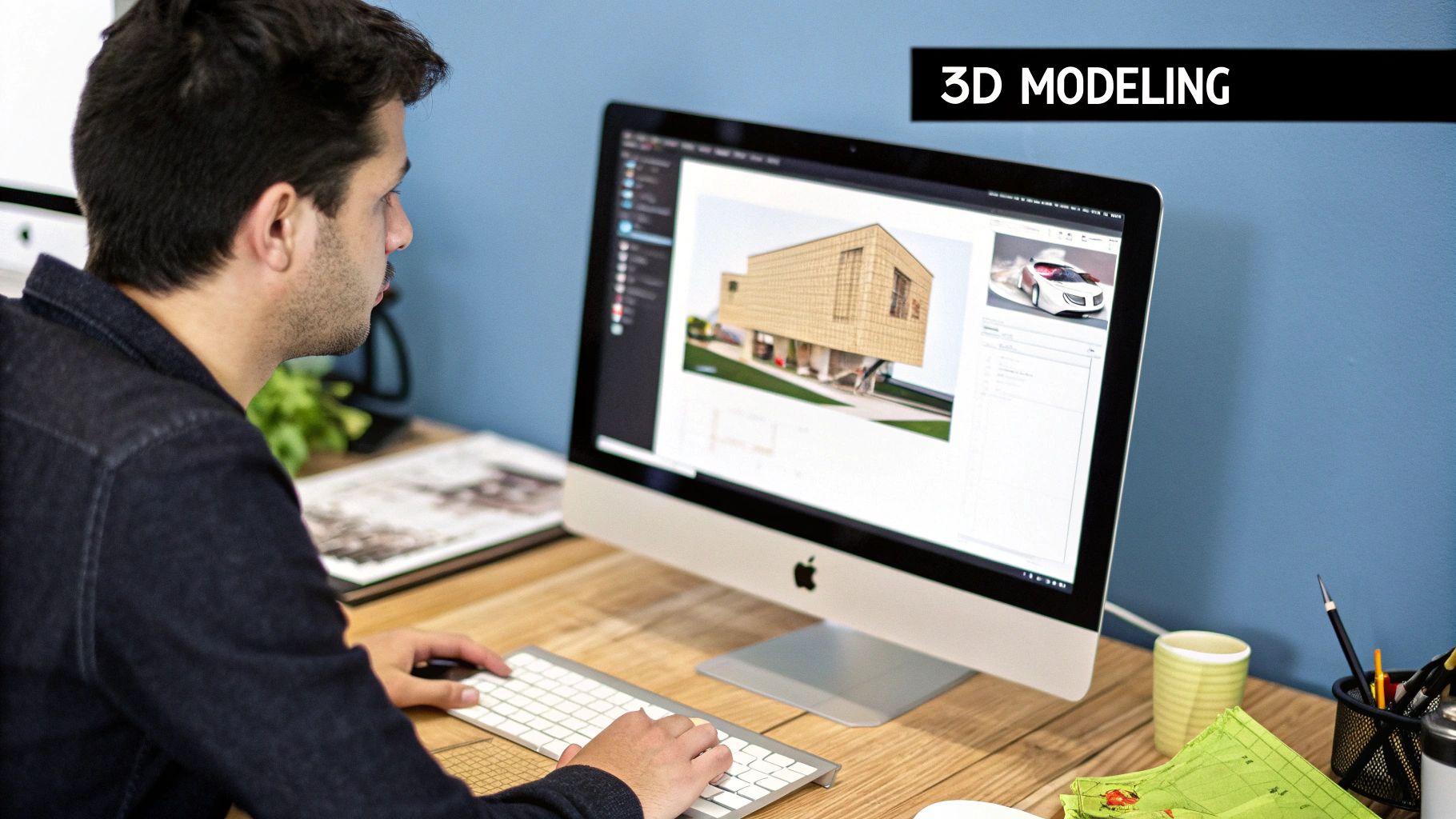
This is where you need to be ruthless. In the early stages of product discovery, your goal isn't to build something beautiful; it's to kill your bad ideas as quickly and cheaply as possible. Low-fidelity (lo-fi) prototypes are your best weapon for this messy but essential work. They’re all about getting maximum feedback with minimum effort.
Forget about colors, fonts, or pixel-perfect layouts. Seriously. The entire point of a lo-fi prototype is to focus on structure, user flow, and the absolute core functionality. You're testing the fundamental logic of your idea, not its curb appeal. This forces everyone—you, your engineers, your stakeholders—to answer the most critical questions first.
From Paper Sketch to Clickable Wireframe
The best lo-fi prototypes often start with the simplest tools you can find: a marker and a whiteboard, or just a pen and some paper. I’ve seen entire checkout flows for a new e-commerce feature get greenlit in a single afternoon, all based on a handful of paper sketches taped to a wall.
Let's say you're trying to fix a confusing onboarding process. Instead of writing a brief for a designer and waiting, you can sketch each screen on a separate piece of paper. This makes it incredibly easy to physically reorder steps, tear out a screen that adds friction, or slot in a new one as you talk through the flow with your team.
Once you’ve landed on a sequence that feels right, the next step is to translate those sketches into a basic, clickable wireframe. This is a huge leap because it turns your static idea into something people can actually interact with.
Essential Lo-Fi Prototyping Tools for PMs
- Whimsical: This is my go-to for speed. You can knock out wireframes, flowcharts, and mind maps all in one place, which is perfect for visually connecting the user journey to the interface you're building.
- Balsamiq: A classic for a reason. Balsamiq’s intentionally sketchy, hand-drawn style is its killer feature. It literally prevents you and everyone else from getting distracted by visual design details, forcing the conversation to stay focused on layout and function.
Using tools like these, you can link different screens together to simulate how a user would navigate the app. A button on your "Welcome" sketch can link to the "Create Account" sketch. That simple interactivity is often all you need to start getting real feedback on whether your proposed flow actually makes sense to a new user.
Focusing on the User Journey
When you're building your first lo-fi prototype, always think in terms of the user journey map. You are not designing screens. You are designing a path for a person to follow to get something done. Every box, button, and line of text must serve that journey.
The most valuable feedback you can get from a lo-fi prototype is when a user says, "I don't know what to do next." That single sentence tells you more than a hundred comments about button colors ever could. It's a pure, unfiltered signal that your core flow is broken.
Imagine you're building a new feature discovery flow inside your app. Your main hypothesis might be: "Users will be able to find and understand our new feature from the main dashboard."
Your lo-fi prototype should be built only to test this. You probably only need two or three screens:
- The Dashboard: It should have one clear entry point to the new feature, like a banner or a new menu item.
- The Feature's Landing Screen: This screen needs a super brief explanation of what the feature does and its primary call-to-action.
By stripping away everything else, you isolate the exact thing you're testing. If users can't navigate this simple, two-step path, you know the problem is fundamental to your approach, not just some minor UI tweak. This is how you get actionable insights, fast.
Building High-Fidelity Prototypes for Buy-in and Testing
Alright, you've got your low-fidelity prototype, you've validated the core flow, and now it's time to make this thing real. When you need to get executives genuinely excited, run those final, crucial usability tests, or hand off crystal-clear specs to your engineering team, a high-fidelity (hi-fi) prototype is your best friend.
This is where you stop sketching and start simulating. We're talking about crafting an experience so polished, so complete with pixels and animations, that users and stakeholders forget they aren't using the final product. At places like Meta and Google, this isn't just a nice-to-have; it's how they sell a vision and de-risk a project before sinking millions into development.
Choosing Your High-Fidelity Weapon
The right tool can be the difference between a clunky click-through and a seamless experience that wins over your toughest critics. While the market is full of options, the industry has really rallied around a couple of powerhouses. If you're a PM, you need to know them.
- Figma: Let's be honest, Figma is the king of the castle for a reason. Its superpower is collaboration. You, your designer, and even your engineers can all be in the same file, at the same time, leaving comments and making tweaks. Its prototyping features are robust enough for complex interactions and smart animations, and its component libraries are a lifesaver for maintaining consistency. For a PM, knowing how to at least navigate a Figma file and leave comments is now table stakes.
- Framer: Framer is the challenger that's quickly gaining ground, especially for teams who want prototypes that are practically indistinguishable from code. It actually uses React components under the hood, giving you unparalleled control over advanced interactions and micro-animations. If you need to demo something truly complex and fluid, Framer is your go-to.
Heads up: these tools aren't just for designers anymore. As a PM, having a working knowledge of Figma is quickly becoming a baseline expectation for many roles. You don't need to be a design wizard, but you need to be comfortable navigating a file and understanding how the pieces fit together. For a great, actionable course, I recommend "Figma for Product Managers" on Udemy, which often costs less than $20 and provides a tactical walkthrough.
Essential Prototyping Tools for Product Managers
Navigating the sea of prototyping tools can be overwhelming. To cut through the noise, I've put together a curated list of my go-to tools, broken down by what they do best from a product manager's perspective.
| Tool | Fidelity Level | Best Use Case for PMs | Pricing Tier (Example) | Key Feature |
|---|---|---|---|---|
| Figma | Low to High | All-in-one: brainstorming, wireframing, and hi-fi mockups. | Free / Professional (~$12) | Real-time collaboration and robust component system. |
| Framer | High | Creating production-ready, code-based prototypes. | Free / Pro (~$20) | Uses real code (React) for hyper-realistic interactions. |
| Marvel | Low to Mid | Quick user testing on simple click-through prototypes. | Free / Pro (~$12) | Incredibly fast workflow from image to testable prototype. |
| Balsamiq | Low | Rapid wireframing and communicating core concepts. | Subscription (~$9/mo) | Sketch-like, hand-drawn aesthetic to focus on ideas. |
| Axure RP | Mid to High | Complex, data-driven prototypes with conditional logic. | Pro (~$25/mo) | Advanced logic and dynamic content capabilities. |
This table isn't exhaustive, but it covers the heavy hitters you'll most likely encounter. Your choice ultimately depends on your team's specific needs—from rapid ideation with Balsamiq to pixel-perfect demos in Framer.
A Workflow for Building Interactive Prototypes
Creating a hi-fi prototype isn't a single step; it's a process of layering in realism. Each layer gets you closer to meaningful, actionable feedback.
First, nail the UI elements. This is where you swap out all those grey boxes and squiggly lines from your wireframes with the real deal. Pull in the actual buttons, input fields, and navigation bars from your design system, all styled with your product's brand identity.
Next, you bring it to life with interactions. This is what separates a static picture from a prototype that feels real. When a user clicks "Sign Up," they should actually go to the next screen. Tapping a dropdown menu needs to reveal the options. Tools like Figma’s "Smart Animate" are fantastic here—they can automatically create buttery-smooth transitions between states, making the prototype feel polished and responsive. This is absolutely critical for usability testing, as it uncovers friction points in the user journey that a static screen could never reveal.
Finally, inject realistic data. Nothing breaks the illusion faster than seeing "User Name" and "Lorem Ipsum" everywhere. Populate your prototype with believable content. A user profile should have a name that sounds like a person and a real photo. A product list should feature actual product names and prices. It’s a small detail, but it dramatically boosts the prototype's authenticity during testing and executive demos.
The PM's Pre-Flight Checklist
Before you put that beautiful prototype in front of a user or, even more nerve-wracking, an executive, please run through this checklist. Trust me, I've seen promising demos completely fall apart because of one simple, avoidable oversight.
- Check All Click Targets: Have you linked up every single button, link, and interactive element in your primary user flow? Hitting a dead end is the fastest way to derail a user test and make you look unprepared.
- Verify State Changes: Does the prototype correctly show different states? What happens when a button is hovered over or pressed? What does an empty search results screen look like versus one with results?
- Simulate Error Handling: Show what happens when things go wrong. What does an invalid password error message actually look like? This demonstrates foresight and proves you've thought through the entire experience, not just the happy path.
- Confirm Data Realism: Is the data plausible? I'll say it again: avoid placeholder text at all costs. Realistic content makes the entire experience more credible and helps testers give you much better feedback because they can actually connect with what they're seeing.
The rise of AI is making this entire process faster than ever. For instance, you can use a prompt in ChatGPT like, "Generate 10 realistic user profiles for a B2B SaaS dashboard, including name, title, company, and profile picture description." This cuts down on the manual work of creating believable data. By 2025, AI-driven design tools are projected to dramatically shrink prototyping timelines, often cutting development time by half or more.
For product managers looking to build functional prototypes or even launch MVPs without deep technical skills, understanding what no-code development makes possible is a huge advantage.
Running User Tests That Generate Actionable Insights
A beautiful prototype without user feedback is just an expensive drawing. The real value is unlocked when you put it in front of people and watch what happens.
Your goal isn't just to see if they can complete a task, but to understand why they struggle or succeed. This is where you separate raw observation from true, actionable insight.
At my last company, we spent weeks on a high-fidelity prototype for a new analytics dashboard. It looked perfect to us. But within five minutes of our first user test, we watched a user completely fail to find the primary filter—a button we thought was painfully obvious. That single, humbling observation was worth more than every internal design review combined.
Structuring an Effective Usability Test
You need to create a scenario that feels natural, allowing you to observe real behavior without leading the witness. You’re not demoing the product; you’re a scientist observing an experiment. A solid test script is your lab manual.
A great script follows this actionable structure:
- The Welcome (2 mins): Set the stage, make the user comfortable, and explicitly state you’re testing the prototype, not them. "We're testing the design to see where it can be improved, so there are no wrong answers."
- Opening Questions (5 mins): Ask broad, context-setting questions. "Can you walk me through how you currently handle [problem the product solves]?"
- The Core Tasks (15 mins): Give them specific, scenario-based tasks. Instead of "Sign up," say, "Imagine you've just heard about this tool and want to create an account. Can you show me how you'd do that?"
- Follow-up Probes (ongoing): Dig into why they did what they did.
- The Wrap-Up (3 mins): Thank them for their time and ask, "If you had a magic wand, what's one thing you would change about what you just saw?"
The magic really happens in the follow-up probes. When a user hesitates or looks confused, resist the urge to help. Instead, use open-ended questions like, "What were you expecting to see there?" or "Talk me through what you're thinking right now."
From Observation to Actionable Insight
The most common mistake I see junior PMs make is documenting observations without translating them into insights. It's the difference between noting "User clicked the wrong button" and uncovering "User misunderstood the CTA 'Manage Subscriptions' because they were looking for 'Billing History'."
An observation is what happened. An insight is the "why" behind what happened. You can't fix a product with observations alone; you need insights to guide your next iteration.
To synthesize your findings, use a simple framework. Create a spreadsheet with four columns: User, Observation, Direct Quote, and Insight. After just a few sessions, you'll start seeing patterns jump off the page. These patterns become the foundation for your next set of product decisions.
Choosing Your Testing Method
Not all tests are created equal. The method you choose really depends on your timeline, budget, and what you need to learn. For a deeper look into the discovery process, our guide on how to conduct user interviews provides a strong foundation.
Here are the main options:
- Moderated Remote Sessions: Using tools like Zoom or Google Meet, you guide a user through the prototype in real-time. This is the gold standard for getting deep, qualitative feedback because you can ask follow-up questions on the spot.
- Unmoderated Remote Tests: Platforms like UserTesting (starting around $49 per video) or Maze (has a free tier) let you send your prototype to a large panel of users who record themselves completing tasks. It’s incredibly fast and great for validating at scale, but you lose the ability to probe deeper.
- In-Person Testing: While less common in a remote-first world, nothing beats sitting next to someone and watching their body language and micro-expressions. It's ideal for testing physical products or really complex digital interfaces.
For a new, high-risk feature, I always start with 5-7 moderated sessions. That's almost always enough to uncover the most critical, glaring usability issues. Once we’ve ironed those out, we might use an unmoderated tool to validate the fixes with a much larger sample size.
This balanced approach gives you both depth and scale, ensuring your next prototype is built on a solid foundation of real user understanding.
From Validated Prototype to Engineering Handoff
Getting your prototype validated feels like a huge win. And it is. But now comes the part where so many great ideas fall apart: the handoff to engineering.
Think of your validated prototype not just as a successful experiment, but as the blueprint for the real thing. A sloppy, rushed handoff can sabotage weeks of hard work, leading to engineers making wrong assumptions and writing code that has to be scrapped.
The goal here is simple: eliminate as much guesswork as possible. Your prototype needs to become a living, breathing spec document. This means going way beyond just the visuals and embedding all the crucial context your engineering team needs. The handoff isn't a single meeting; it's an ongoing conversation, and your prototype is the star of the show.
Annotating for Clarity
To bridge that classic gap between design and code, you have to bake the business logic and user needs right into your design files. It’s like leaving a trail of breadcrumbs for your developers so they understand the why behind every button, field, and screen.
Your annotations should cover a few key areas:
- User Stories: For every key interaction, what is the user trying to do? Keep it simple. (e.g., "As a new user, I need to create an account so I can save my favorite items.")
- Acceptance Criteria: How will we know this feature is actually done? Get specific. (e.g., "The password field must show an error if it's less than 8 characters long.")
- Edge Cases: What happens when things inevitably go wrong? You need to design for error states, empty states (what does a new user see?), and loading states.
- Data Requirements: What information is being shown here? Where is it coming from? Is it dynamic or static?
Tools for a Seamless Handoff
Thankfully, modern tools have made this process so much smoother than the old days of static PDF spec docs. They create a single source of truth that keeps design and engineering perfectly aligned.
Tools like Figma’s Dev Mode are pretty much non-negotiable at this point. They let engineers click around your prototype and pull out the exact design specs they need—CSS, hex codes, spacing, and exportable assets—without having to constantly ping you. Platforms like Zeplin do a similar job, acting as that dedicated bridge between your design files and the dev environment.
A great handoff means engineers almost never have to ask, "What should happen if…?" When you use your prototype to document user stories, edge cases, and technical notes, you empower them to build with confidence and speed.
Ultimately, this whole process is about creating a tight feedback loop. Once engineers start building, they’ll inevitably uncover new constraints or technical possibilities you hadn't considered. Those insights are gold. They need to feed directly back into your next prototype iteration, ensuring the product is constantly getting better.
It’s also crucial to remember the difference between a prototype's goal (which is learning) and a shipped product's goal (which is delivering value). As you plan this transition, you have to think about the critical balance between product feasibility vs. viability. This ensures what you're building doesn't just work on a technical level, but actually has a shot at succeeding in the market.
Common Prototyping Questions for PMs
As product managers, we're constantly living in the gray areas of product development, and prototyping is no different. Over the years mentoring other PMs, I've noticed the same questions pop up time and time again as they get their hands dirty creating their first prototypes.
When Is a Prototype "Done" Enough for Testing?
The short answer? It's "done" when it can answer your most critical question. Nothing more, nothing less.
If you're trying to validate a new user flow, your prototype is ready the second the core navigation is clickable. Forget about adding every last bell and whistle. This is where I see so many PMs fall into the trap of "gold-plating" a prototype that's only meant for early validation.
Remember, the whole point isn't to build a perfect simulation of the final product. It’s to squeeze the maximum amount of learning out of the minimum amount of effort. Spending weeks on minor details before you've even validated the core concept is a classic rookie mistake that just slows everything down.
How Do I Manage Conflicting Stakeholder Feedback?
Ah, stakeholder feedback. It's a double-edged sword, isn't it? You need it for buy-in, but it can send your process spinning off the rails if you don't manage it carefully.
So what do you do when you get conflicting feedback? For example, your Head of Sales is demanding a feature that your Head of Engineering says is way too complex for V1. The key is to stop treating this as a design problem. It’s a prioritization problem.
Your job as the PM is to be the facilitator. Get the conflicting parties in the same room (virtual or otherwise) and re-anchor the entire discussion on the original goal of the prototype.
A prototype exists to test a specific hypothesis. Frame all feedback through that lens. Ask your stakeholders, "How does your suggestion help us validate or invalidate our primary assumption?" This is a game-changer.
This simple question shifts the conversation from personal opinions to strategic alignment, which is a core skill for any product manager. It keeps the focus squarely on user needs and business goals, preventing your prototype from becoming a Frankenstein's monster built by a committee. You end up building based on validated learning, not just the loudest voice in the room.
Ready to level up your product management career with real-world strategies from a seasoned leader? Subscribe to the Aakash Gupta newsletter. You'll get exclusive insights, frameworks, and career advice delivered right to your inbox. Join the largest PM community at https://www.aakashg.com.
