A tech stack diagram is a visual map of all the technology used to build and run your product. For engineers, it’s a blueprint. For a Product Manager, it’s a career-accelerating tool. It's how you translate complex systems into a clear story that connects technical decisions to business outcomes, solidifying your role as a strategic leader, not just a feature manager.
I've hired, mentored, and worked with hundreds of PMs at companies like Google and Meta. The ones who advance the fastest are those who master this skill. They can walk into a room with engineers, VPs, or even the CFO and confidently explain how the product actually works under the hood. This isn't about knowing how to code; it's about understanding the system to make smarter decisions, de-risk launches, and justify resources.
This guide provides a step-by-step framework for creating and using a tech stack diagram to accelerate your PM career, whether you're aspiring to break in or a seasoned leader.
The PM's Tech Stack Diagram Framework: A 4-Step Action Plan
Instead of abstract theory, let's start with an actionable framework you can use within 48 hours. This is the exact process I've used to get PMs on my teams up to speed.
Step 1: Intelligence Gathering (The "Investigator Phase")
- Goal: Map out your product's architecture without wasting engineering time.
- Action: Start by mining your company's Confluence/Notion for existing diagrams, even if they're outdated. Then, book 30 minutes with a Senior Engineer or Tech Lead. Use the specific questions in the "How to Gather Intelligence" section below to guide the conversation.
Step 2: Diagramming (The "Visualization Phase")
- Goal: Create a clear, layered visual of your system.
- Action: Use a tool like Lucidchart (for formal diagrams) or Miro (for collaborative sketching). Structure your diagram into the four essential layers: Presentation, Application, Data, and AI/ML. Add all key third-party services (e.g., Stripe, Salesforce).
Step 3: Strategic Analysis (The "Product Leader Phase")
- Goal: Use the diagram to identify risks and opportunities.
- Action: Trace the data flows for your most critical user journeys (e.g., checkout, onboarding). Ask: "Where are the single points of failure? What services will break under 10x load? Where is our biggest source of technical debt?"
Step 4: Communication (The "Influence Phase")
- Goal: Align stakeholders and justify strategic decisions.
- Action: Create two versions of your diagram.
- The "Executive View": A high-level version for leadership that hides technical jargon and focuses on business capabilities.
- The "Technical View": A detailed version for your team showing specific services and data flows. Use this to negotiate timelines and explain trade-offs.
By following this process, you shift from being a receiver of technical information to a strategic partner who drives the conversation.
Anatomy of an Effective Tech Stack Diagram
A powerful tech stack diagram tells the story of your product’s architecture. It’s the complete supply chain for your product—from data origination to the final user experience. For an AI PM at a company like OpenAI, failing to map the data pipeline from ingestion to inference is a critical blind spot that can lead to spiraling costs and poor performance.
The Essential Layers to Map
Structure is what separates a clear diagram from a confusing one. Organize your stack into logical layers to pinpoint dependencies and bottlenecks. Every modern PM, especially in AI, must think in these layers.
Core Components for a PM's Tech Stack Diagram
| Layer | Purpose | Example Technologies (Real Companies) | For PMs, this means… |
|---|---|---|---|
| Presentation Layer | What the user sees and interacts with. The "storefront." | React, Vue.js, Swift (iOS), Kotlin (Android) | Understanding UI/UX performance and platform limitations. |
| Application Layer | The "engine room" that handles business logic and core functions. | Node.js, Python (Django), Java (Spring) | Knowing how features are processed and where business rules live. |
| Data Layer | Where data is stored, managed, and processed. | PostgreSQL, BigQuery, Fivetran, Airflow | Gauging data availability, quality, and latency for features/analytics. |
| AI/ML Layer | The specialized components for intelligence and machine learning. | Pinecone, OpenAI API, Hugging Face | Pinpointing model dependencies, data pipelines, and potential cost/latency issues. |
The diagram below shows how your PM role fits into this technical context. You’re not just an observer; you’re the strategic leader and the communications bridge connecting it all.
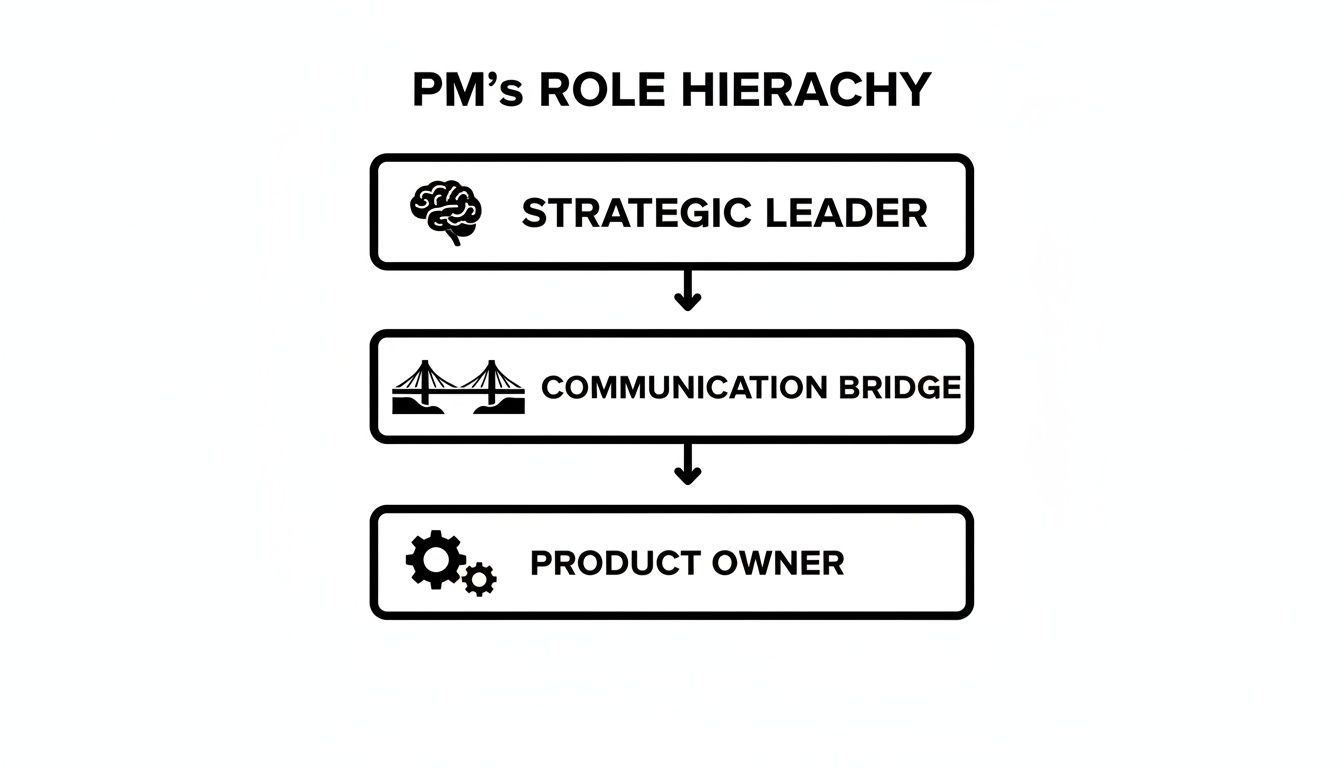
Your job is to use this diagram as a map to connect the technical foundation to the product’s strategic goals.
Mapping Services and Data Flows
Just mapping the core layers isn't enough. Your diagram must show all external services and internal data flows.
The real power of a tech stack diagram isn't just listing components; it's visualizing the relationships between them. Drawing the lines that connect services is where you'll find the most critical insights.
Make sure you explicitly include:
- Third-Party APIs: Map every key integration. Are you using Stripe for payments? Twilio for communications? A CRM like Salesforce? These are external dependencies and potential points of failure.
- Observability Tools: Show how monitoring tools like Datadog or New Relic plug into your services. This helps in conversations about reliability and SLOs.
- Data Flows: Use arrows to trace how data moves. For instance, trace the path from a user clicking a button, to a backend API call, to a record being written in the database, and finally to an analytics event being logged.
It’s these flows that often uncover the hidden dependencies that can introduce massive amounts of technical debt if you’re not paying attention.
How to Gather Intelligence for Your Diagram
Building an accurate tech stack diagram is an exercise in investigation, not engineering. Your job is to ask the right questions to extract the necessary information efficiently.
Start by booking time with your tech lead or a senior engineer. Don't just ask, "Can you explain our architecture?" Be tactical. Your goal is to uncover the why behind the technology.
The Right Questions to Ask (Your Tactical Playbook)
Frame your questions around user actions and business value. This connects technology to outcomes, which is your core function as a PM.
Here are specific questions I provide to PMs on my teams:
- Follow the User: "Walk me through the complete data flow, from the moment a user clicks 'Sign Up' to when they see their personalized dashboard. Which services are hit, in what order?"
- Find the Weak Spots: "If we ran a Super Bowl ad, what part of our stack would fall over first? What's the single point of failure for our checkout process?"
- Map External Risks: "Which external APIs are critical for our 'X' feature? What are their rate limits, and what is our fallback plan if that API goes down for an hour?"
- Acknowledge the Legacy Code: "I see we have a legacy monolith. How does this new AI feature interact with it? Are we creating a data bottleneck or a performance risk we need to mitigate?"
- For AI PMs – Prompt for ChatGPT:
Act as a senior software architect. I am a Product Manager building a tech stack diagram. Based on a feature that [describe feature, e.g., "generates personalized user recommendations"], list the likely microservices, databases, and third-party APIs involved. For each component, specify its role and the data it exchanges with other components. Focus on potential bottlenecks and scalability concerns.
This line of questioning doesn't just map technology; it maps business risk, which is invaluable for a PM.
Mining Existing Resources
Your engineers' time is your most precious resource. Don't waste it.
You can often piece together 70-80% of the diagram by becoming a master of your company's internal knowledge base before you ever ask an engineer for their time.
Before booking meetings, do your homework. Dig into Confluence, Notion, and GitHub repos. Look for outdated diagrams, design docs, and README files. This shows your team you respect their time and allows you to ask more intelligent, targeted questions. For a deeper dive into understanding your environment, you might find our guide on building a competitive analysis template useful for structuring your information gathering.
Choosing the Right Tools to Visualize Your Stack
Once you've done the detective work, you need to turn that information into a clear visual. A confusing or ugly tech stack diagram gets ignored, defeating its purpose.
The tools you pick matter. I’ve seen PMs at Google sketch ideas on a whiteboard for a quick jam session, but for a document that needs to live on, you need something more permanent and shareable.
Selecting Your Diagramming Tool
Your tool choice depends on your goal: quick collaboration or a formal presentation.
For quick sketching and collaboration: Miro is my go-to. It's a digital whiteboard perfect for early-stage workshops where you and your engineering counterparts can rapidly map out the system's structure. It's fast, messy, and collaborative—exactly what's needed initially.
For structured and formal diagrams: Tools like Lucidchart or the free diagrams.net (formerly Draw.io) are the gold standard. They offer pre-built icon libraries for AWS, GCP, and other services, making your diagram look professional and clear instantly. This is what you use to create the "official" version for documentation and presentations. And while you're at it, there are plenty of other useful tools for Product Managers that can streamline your workflow.

Notice the clear separation of layers and consistent icons. This makes the relationships between components easy to follow.
From Artifact to Living Document
A senior PM at Meta once told me the biggest failure of a tech stack diagram is when it becomes a "forgotten artifact." An outdated diagram is more dangerous than no diagram at all.
The real value of a tech stack diagram is unlocked when it becomes a living document, integrated into your team's daily workflow. It should evolve with your product.
Here’s how to ensure your diagram stays relevant:
Version Your Diagrams: Your architecture will change. Label diagrams "V1" (Current State) and "V2" (Future State) to show migration paths. Store them in a shared space like Confluence or Google Drive, not your local machine.
Embed Everywhere: Use the live embed feature from your tool to place the diagram directly into your PRDs, wikis, and team pages. This ensures documentation is always in sync with the source of truth.
Create Different Views: One size does not fit all. Create a high-level "Business View" for leadership (focus on capabilities) and a detailed "Technical View" for engineering (focus on specific services and data flows).
Real-World Tech Stack Diagrams That Drive Decisions
Theory is one thing; seeing a tech stack diagram used to solve real business problems makes the concept stick. Let's analyze how top PMs use these diagrams to influence strategy.

These examples show how a visual map of architecture directly influences strategy, investment, and team velocity.
Scenario 1: The SaaS Startup MVP
A seed-stage SaaS startup is racing to build its MVP. The goal is speed and capital efficiency. The PM’s diagram is brutally simple: a React front end, a single Node.js monolith, a PostgreSQL database, and integrations with Stripe for payments and Auth0 for identity.
- Clarity for Investors: In the seed round pitch, the PM used this diagram to show what was "in" and "out" for the MVP. This demonstrated a lean, focused approach, reassuring investors their capital wouldn't be burned on over-engineering.
- Engineering Alignment: The diagram became a contract. If a new idea required another service, it was deferred. This protected focus and accelerated their launch. You can find more details on how SaaS companies achieve this velocity by exploring examples of SaaS product-led growth.
Scenario 2: The E-commerce Monolith Migration
A large e-commerce platform is crippled by a legacy monolith. Releases are slow, and bugs take down the entire site. The Senior PM is leading a high-stakes migration to microservices.
Here, the tech stack diagram was the central command document. The PM created a "Current State" diagram—a beautiful mess of dependencies—and a "Future State" diagram showing a clean, service-oriented architecture ("Checkout," "Inventory," "Search").
This side-by-side visual was the key. It allowed the PM to justify a multi-million dollar investment by showing leadership a direct, visual path from architectural pain to increased feature velocity and system stability.
Scenario 3: The AI Feature Data Flow
An AI PM is building a new text summarization feature. The initial high-level diagram showed a simple flow: user data -> LLM API -> summary.
Wrong. The detailed diagram revealed a minefield of complexities:
- Ingestion: Raw data is pulled from a customer's CRM via a Fivetran pipeline.
- Transformation: A Python script cleans and chunks the text.
- Embedding: Text chunks are sent to an embedding model, and the resulting vectors are stored in a Pinecone vector database.
- Inference: Relevant chunks are retrieved from Pinecone and sent to an OpenAI API as context for the final prompt.
- Caching: The final summary is cached in Redis to cut latency and cost.
This detailed flow immediately exposed potential issues. The PM could now ask the right questions: "What's our P99 latency on the embedding step?" and "How will our OpenAI API costs scale? Are we forecasting our burn rate correctly?"
By mapping the complete system, the PM turned a vague concept into a tangible project with clear risks, enabling smarter trade-offs between performance, cost, and user experience.
A Few Questions I Get All The Time
Even seasoned PMs have questions when documenting their product's architecture. Here are answers from the trenches.
How Technical Do I Really Need to Be?
You don't need to be a coder. You need to be technically literate.
Your job isn't to write the code; it's to understand what each component does for the business and how it connects to everything else. Think of it like a restaurant manager: you don't need to be a Michelin-star chef, but you must know every ingredient, how dishes are made, and the impact of a late supply delivery.
This is a skill that separates a good PM from a great one. Translating technical complexity into a clear business narrative builds incredible credibility and is a hallmark of senior PMs and Group PMs. A PM with this skill often sees a salary bump of 15-20% when moving to their next role.
How Often Should I Update This Thing?
Your tech stack diagram must be a living document. A quarterly review is a solid cadence, aligning perfectly with QBRs and roadmap planning.
A major update is non-negotiable during significant architectural shifts, such as:
- Migrating from AWS to GCP.
- Integrating a major new partner (e.g., a new payment gateway).
- Breaking apart a monolith into microservices.
Weave this diagram into your team's planning rhythm so it evolves with the product.
What's the Biggest Mistake PMs Make With These?
Creating a diagram with the wrong level of detail for the audience.
A diagram drowning in jargon is useless for leadership. A diagram that's too high-level won't help your engineering team de-risk a project. The art is tailoring the view. I always recommend two versions:
- The "Context View": For leadership, focusing on business capabilities.
- The "Component View": For your team, detailing services, data flows, and APIs.
The second biggest mistake? Making it once and forgetting it. An outdated diagram is more dangerous than no diagram at all.
How Can This Help Me Land a PM Job or Promotion?
For aspiring and junior PMs, this is a massive differentiator.
- For Job Seekers (Salary Range: $120k – $160k): Walk into an interview with a simplified tech stack diagram of a past project. It instantly proves technical fluency and systems thinking. For a take-home assignment, diagram the company’s current architecture and show how it would evolve for the new feature. This is how you stand out from the 200 other applicants.
- For Mid-Career PMs (Seeking Senior/Lead, Salary Range: $170k – $240k): Use the diagram to lead strategic conversations. Show how a proposed architecture will reduce costs by X% or increase developer velocity by Y%. This demonstrates your ability to connect technical decisions to P&L impact, a key requirement for promotion.
It proves you aren't just a PM who writes user stories—you're a strategic partner who thinks about the long-term health and profitability of the product. That’s how you get hired and promoted.
At Aakash Gupta, we're focused on helping you build career-defining skills just like this. For more deep dives into product strategy, growth, and leadership, head over to https://www.aakashg.com.