A growth review once opened with applause. Sign-ups were up, activation looked healthy, and the team felt fast. Then the retention cohort closed, renewal conversations started, and the business learned the ugly truth. We had improved motion, not outcomes.
The Ten Million Dollar Mistake We Saw Coming Too Late
We celebrated a quarter that should have worried us.
Top-of-funnel numbers were up. Sign-ups climbed, demo requests climbed, trial starts climbed, and every weekly review pointed to the same conclusion. Growth looked healthy. Then the slower metrics arrived and exposed what we had built.

In one portfolio review I led, the team had improved nearly every metric that gets attention in a status meeting. Onboarding had less friction. Sales had more pipeline. Marketing had lower acquisition costs. None of that fixed the core problem. We were attracting more users who looked good in early conversion reports and weak in every metric that mattered to the business 60 days later.
That mistake was expensive. Contracts were signed with the wrong customer profile. Support volume rose because low-fit accounts needed more hand-holding. Expansion forecasts missed because those accounts never reached repeat value. Finance had to rework the plan after the quarter was already committed.
This is the trap.
Lagging indicators answer the question that activity metrics cannot. Did the behavior produce durable business value after enough time passed for the result to show up? In product, that usually means retention, churn, renewal quality, gross margin, expansion, or long-run task success.
The delay is what makes them dangerous and useful at the same time. Dangerous, because teams can spend weeks congratulating themselves on motion. Useful, because once the outcome lands, it gives you hard evidence about what was true. Good PMs use that evidence the way a strong operator uses a post-incident review. To assign causes, isolate weak assumptions, and improve the early-warning system.
Practical rule: If a metric spikes right after launch, test whether it reflects activity, or whether it has a proven connection to customer value and business outcomes.
The labor market offers a clean analogy. Employment usually weakens after the broader economy has already turned because hiring managers react with delay, budgets reset slowly, and layoffs show up before recovery hiring does. Product works the same way. Revenue, retention, and renewals often reveal the damage long after the launch review is over. The issue is not that lagging indicators are slow. The issue is that teams fail to treat them as inputs for building better leading indicators.
That distinction matters for PMs who own real revenue. A lagging metric is not just a scorecard. It is forensic evidence. If retention dropped, the question is not whether the team should stare at retention harder. The question is which earlier behaviors predicted that drop, and whether your dashboard was instrumented to catch them in time.
In practice, that means pairing every lagging outcome with a short list of upstream signals. If trial-to-paid conversion falls, inspect activation paths by segment. If renewals weaken, look at time-to-value, feature adoption depth, support tickets, and stakeholder breadth inside the account. If you are still debating whether a metric belongs in your KPI set or your objective framework, then the distinction starts to matter operationally.
Senior PMs internalize this early. They do not use lagging indicators to admire the wreckage. They use them to generate hypotheses about what should have been visible sooner, especially in AI products where output quality, trust, and repeated usage often break before revenue does. That is how a backward-looking metric becomes a better predictive system.
Lagging vs Leading Indicators A PMs GPS and Rear-View Mirror
The cleanest mental model is this. Leading indicators are your GPS. Lagging indicators are your rear-view mirror.
Your GPS helps you choose a route before you arrive. It updates quickly. It’s useful. It can also be wrong.
Your rear-view mirror tells you where you’ve already been. It can’t help you avoid the turn you missed. But it gives you a more accurate record of the path you took.
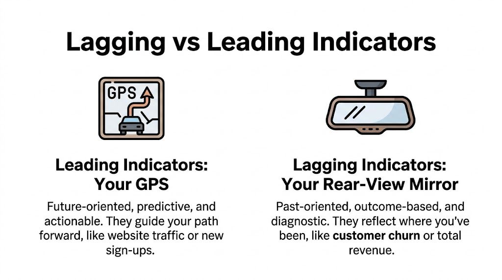
The difference that matters in product work
A leading indicator is useful because a team can influence it early. Think sign-up completion, projects started, invitations sent, or prompt submissions in an AI workflow.
A lagging indicator is useful because it confirms whether the business result materialized. Think retention, churn, recurring revenue, or successful long-run task completion.
Amplitude puts the distinction well. Lagging indicators in product analytics validate trends only after they’ve materialized, which creates a time-lag constraint. It also notes that lagging indicators are based on historical aggregation, making them more stable and reliable than leading indicators, which are more prone to false signals. That’s why they’re valuable for validating whether earlier predictions were right and for extracting lessons for the next cycle, as explained in Amplitude’s guide to leading and lagging indicators.
A practical comparison
| Attribute | Leading indicators | Lagging indicators |
|---|---|---|
| Time orientation | Forward-looking | Backward-looking |
| Typical use | Guide action | Confirm outcome |
| Speed | Faster signal | Slower signal |
| Certainty | More fragile | More reliable |
| PM question answered | “Are we on track?” | “Did it work?” |
| Example | Onboarding completion | Churn rate |
That’s why teams need both.
A weekly product review without leading indicators becomes passive. A weekly product review without lagging indicators becomes theater.
How this shows up in PM systems
If your team debates objectives, targets, and measures every quarter, this problem usually hides inside your KPI design. A clean distinction between objectives and metrics helps. If you need a sharper framework for that, the trade-off becomes clearer when you compare OKRs vs KPIs.
The best dashboards answer two different questions at the same time. “What are we seeing early?” and “What did we actually accomplish?”
A junior PM usually starts by tracking what moves fastest. A senior PM knows the fastest-moving metric is often the least trustworthy one in the room.
The Lagging Indicators That Actually Matter in Product Management
Most product teams track too many metrics and still miss the few that matter.
The easiest fix is to organize lagging indicators by business model. Different products create value differently, so their confirmation metrics should differ too. A B2B SaaS product shouldn’t obsess over the same lagging indicators as a marketplace or a consumer social app.
The short list by business model
| Business Model | Key Lagging Indicator | What It Confirms |
|---|---|---|
| B2B SaaS | MRR | Whether product value translated into recurring revenue |
| B2B SaaS | Churn rate | Whether customers stayed after living with the product |
| B2B SaaS | NPS | Whether delivered experience created durable satisfaction |
| Consumer product | Retention | Whether users formed a habit |
| Consumer product | MAU | Whether the product sustained meaningful recurring use |
| Consumer product | Customer satisfaction | Whether the shipped experience met expectations |
| Marketplace | GMV | Whether supply and demand interactions produced transaction volume |
| Marketplace | Take rate | Whether the platform captured value from transactions |
For SaaS PMs
MRR is a lagging indicator because it can only be confirmed after the billing period closes and customer behavior settles. If MRR drops after a bad release, the result confirms that past product decisions hurt monetization.
That pattern maps to a broader business reality. Corporate profits act the same way in the economy. In the U.S., S&P 500 corporate profits declined 12.5% in 2008 following the 2007 recession onset, lagging GDP contraction by 3 to 6 quarters, according to Boston Institute of Finance’s summary on leading and lagging indicators. The same source notes that lagging product measures like MRR or NPS outcomes validate past strategies, which is exactly how mature SaaS teams should use them.
For B2B PMs, three lagging indicators usually matter most:
- MRR: Confirms that customers not only signed but stayed billable.
- Churn rate: Reveals whether the product solved a recurring problem, or just won a purchase order.
- Net revenue retention: Shows whether the product earned expansion after adoption matured.
For consumer PMs
Consumer teams often get seduced by top-of-funnel volume. Downloads look good. Registrations look good. Even first-session activity can look good.
The lagging truth is usually retention.
If users don’t come back after enough time has passed, your acquisition engine may be strong while your product is weak. That’s why strong consumer PMs treat retention as the judge, not the cheerleader. Monthly active users can also serve as a lagging indicator when used to confirm sustained adoption rather than immediate launch interest.
Retention tells you whether users wanted the product after the novelty wore off.
Customer satisfaction also belongs here, but with caution. It’s useful after users have had enough exposure to evaluate the experience. It’s not a substitute for actual behavioral durability.
For marketplace PMs
Marketplace products add one more layer. You need to confirm not just product usage, but balanced value exchange.
A few lagging indicators matter disproportionately:
- GMV: Confirms whether buyers and sellers completed enough transactions to create real market activity.
- Take rate: Confirms whether the business captured value from that activity.
- Repeat transaction behavior: Confirms whether the marketplace experience was good enough to become repeatable.
A marketplace can show strong leading activity and still fail. You can fill the top of the funnel with listings or demand requests. If completed transactions and repeat behavior don’t materialize later, the system isn’t healthy.
If you’re building your own scorecard, a broad benchmark list helps. This roundup of metrics for product managers is useful as a menu, but the job is choosing the few lagging indicators that prove business value for your product type.
What these metrics really do
Lagging indicators answer one uncomfortable question. Did our strategy survive contact with reality?
That’s why senior PMs don’t collect them for decoration. They use them to expose weak assumptions, poor segmentation, shallow adoption, and fake growth. If a metric can’t confirm a strategic decision, it probably doesn’t belong in the executive view.
The Four Deadly Sins of Using Lagging Indicators
Lagging indicators are powerful. Teams still misuse them constantly.
The mistake isn’t tracking them. The mistake is treating them as passive reporting artifacts instead of decision tools.
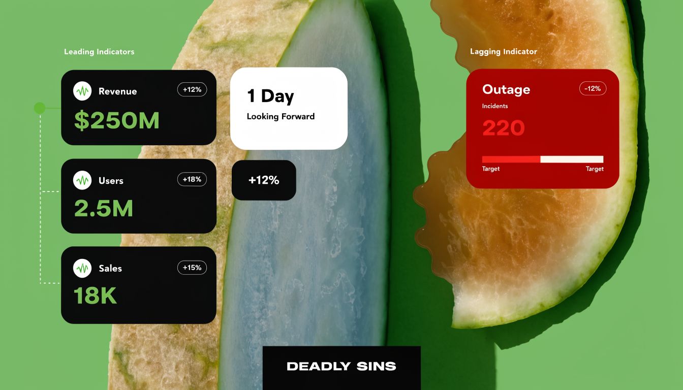
Sin one The watermelon dashboard
Everything looks green on the surface. The inside is red.
This happens when a team reports healthy leading indicators while lagging indicators gradually deteriorate. Sign-ups rise, feature clicks rise, email open rates rise, but retention, renewal quality, or customer satisfaction weaken later.
The cure is uncomfortable. Force every dashboard to pair an activity metric with an outcome metric. If you show activation, also show downstream retention. If you show prompts sent, also show task success after enough time has elapsed.
Sin two Driving with only the rear-view mirror
Some teams swing too far the other way. They wait for lagging indicators to move before acting.
That approach feels rigorous because the data is more stable. It also makes the team slow. By the time churn confirms a problem, the users are already gone. By the time revenue confirms a bad pricing change, the quarter is damaged.
A better operating rhythm uses lagging indicators for judgment and leading indicators for intervention.
- Use lagging indicators to decide whether the strategy worked.
- Use leading indicators to decide whether to intervene this week.
- Use reviews to connect the two, not to discuss them in separate rooms.
Sin three Misattributing causality
A lagging indicator moves and the team immediately blames the most recent release.
That’s often wrong.
Lagging indicators aggregate the effects of earlier decisions, older cohorts, seasonal context, pricing choices, support quality, sales promises, and market shifts. If churn worsens, the cause may not be the feature you shipped last sprint. It may be the customer segment you started acquiring two months ago.
BMC’s framing is useful here. It argues that teams often stop at “confirmation” and miss the deeper value of lagging indicators as a forensic input for root-cause analysis, then a basis for translating anomalies into better leading-indicator instrumentation in the next cycle. That’s the ultimate upgrade, and it’s well captured in BMC’s discussion of leading vs lagging indicators.
Good PMs ask, “What happened?” Strong PMs ask, “What chain of behaviors produced this outcome?”
This short video gives a decent mental reset before you audit your own habits:
Sin four Success theater
Some teams only surface lagging indicators when they’re positive.
That destroys trust fast. Executives can smell selective reporting. So can engineering and finance.
The fix is cultural, not technical. Report lagging indicators on a fixed cadence, whether they look good or bad. Then attach a forensic note:
- What changed
- What likely contributed
- What leading indicators need to be added or refined
- What decision you recommend now
That final step matters most. If a lagging indicator only produces commentary, you’ve built a museum. If it changes instrumentation and decision-making, you’ve built a product system.
Building Your Product Health Dashboard
A useful dashboard doesn’t start in Looker, Tableau, or Amplitude. It starts with metric design.
Most dashboard failures come from three issues. The team picked weak definitions, events were instrumented inconsistently, or the view mixed executive outcomes with operator noise.
Start with a three-layer layout
I prefer a dashboard that separates decision horizons.
Layer one is executive health. Within this layer, lagging indicators reside. Show the few outcomes that confirm whether the product is healthy.
Layer two is behavioral drivers. These are the leading indicators most likely to influence the lagging outcomes.
Layer three is diagnostic detail. Cohorts, segments, release markers, support themes, and funnel cuts belong here.
A visual reference helps when you’re laying this out:
Use the right tools for the right jobs
Different tools solve different layers.
- Amplitude or Mixpanel: Best for event-level product analytics, funnels, cohorts, and behavior analysis.
- Looker or Tableau: Better for executive reporting, multi-source business views, and durable KPI governance.
- Looker Studio: Useful when teams need a lighter-weight reporting surface that’s easy to share.
The common mistake is trying to make one tool do everything. Product analytics tools are not always ideal board-reporting tools. BI tools are not always ideal for behavioral debugging.
If you’re revisiting how your team defines outcomes, this framework on measurements of success is a good companion to a dashboard redesign.
Instrumentation checklist that saves pain later
Don’t let the dashboard team invent definitions after the fact. Write them down first.
- Define every metric precisely. “Retention” means nothing until you specify user type, time window, and qualifying action.
- Create event taxonomy rules. Event names, properties, ownership, and deprecation policy should be documented.
- Mark product changes. Every major release, pricing change, and onboarding experiment should be annotated so lagging shifts can be traced back.
- Separate global and segment views. Aggregate dashboards hide broken cohorts.
- Automate recurring reports. If a PM or analyst has to manually pull the same lagging indicators every week, the system is brittle.
Design for interpretation, not decoration
A lot of PM dashboards are hard to read because they were built to impress, not to inform.
That’s where basic visual discipline matters. If you want a concise refresher on chart choice, hierarchy, color restraint, and readability, this guide on data visualization best practices is worth using during dashboard reviews.
Operator check: If an executive can’t answer “Are we healthier than last period, and why?” within a minute, the dashboard needs simplification.
The final test is simple. Every lagging indicator on the page should point to a strategic decision, and every leading indicator below it should explain how the team plans to influence the future version of that outcome.
The North Star Framework The Art of Pairing Indicators
A dashboard gets useful when it stops being a pile of metrics and starts becoming a system.
The cleanest version of that system is a North Star framework. One core outcome sits at the top. A small set of leading indicators sits underneath. The relationship between them is explicit, tested, and reviewed over time.
What belongs at the top
A North Star metric is usually closer to a lagging indicator than a leading one.
It represents durable value creation, not just user activity. It should confirm that the product produced a meaningful result after the user had enough time to experience the product properly. In many cases, that means the top metric reflects sustained value, not immediate clicks.
The operating principle is balance. In performance measurement, lagging indicators trade speed for reliability, while leading indicators react faster but can produce false signals. IG’s guide argues that lagging indicators should make up approximately 40 to 50% of performance dashboards, with the remainder dedicated to leading indicators, so teams don’t end up managing yesterday’s problems alone, as described in IG’s overview of leading and lagging indicators.
A product example
Take a collaboration product like Miro or Figma.
A weak metric at the top would be “boards created” or “files opened.” Those are useful, but they’re too close to activity. A stronger North Star would be something like weekly active collaborators completing meaningful work.
Now the PM team can identify leading indicators that plausibly drive that outcome:
- New collaborative projects started
- Templates used in the first session
- Invitations sent to teammates
- Comments or edits made in shared workspaces
None of those proves durable value by itself. Together, they create a predictive system. The lagging North Star later confirms whether the early signals were the right ones.
The pairing method I’ve seen work
Use this sequence.
| Step | Question | Output |
|---|---|---|
| 1 | What lasting customer value are we trying to create? | North Star candidate |
| 2 | How will we know that value truly happened? | Lagging confirmation metric |
| 3 | What early behaviors usually precede that outcome? | Leading input metrics |
| 4 | What segments matter most? | Cohort cuts |
| 5 | What would disprove our theory? | Kill criteria |
PMs often exhibit a common oversight: they choose leading indicators because they’re easy to measure, not because they causally relate to the desired outcome. Then they’re shocked when the top-line result doesn’t move.
A stronger approach is to treat the framework like a living model. If the lagging result doesn’t follow, revise the inputs.
For teams that want a deeper reference on choosing that top metric, this primer on the north star metric is useful.
Don’t ask whether a leading metric is “interesting.” Ask whether it repeatedly precedes the lagging outcome you care about.
What doesn’t work
Three patterns fail repeatedly.
- Too many stars: If every function has its own top metric, nobody knows what product value means.
- No linkage: Teams track inputs and outputs but never test the connection between them.
- Static instrumentation: The lagging metric changes, but the leading indicators stay frozen from a previous strategy.
A North Star framework only works when lagging indicators are treated as judges and leading indicators are treated as hypotheses. That’s the pairing discipline often overlooked.
Lagging Indicators in the Age of AI Product Management
AI products make the old metric playbook look thin.
If you’re building an AI assistant, agent, copilot, or workflow layer, pure usage metrics can mislead you fast. Sessions, prompts, and active users matter. They still don’t tell you whether the product delivered an outcome the user trusts enough to repeat.
Outcome beats activity in AI products
For many AI products, the strongest lagging indicators are closer to successful task completion, workflow adoption, trust, retention after repeated use, and reduction in time-to-value than simple top-line usage.
That shift matters because AI products often create a lot of curiosity before they create durable value. A feature can generate heavy experimentation and still fail to become part of the user’s real workflow. In that case, high early usage is a weak signal and a poor substitute for lagging evidence.
An AI PM should care a great deal about questions like these:
- Did the user complete the job they came to do?
- Did they return because the AI saved time or improved quality?
- Did team-level behavior change after adoption matured?
- Did customers expand usage after learning the system’s strengths and limits?
Those are lagging questions. They require time and repeated exposure.
What to instrument differently
For AI products, the forensic angle is even more important.
If a lagging indicator weakens, the PM needs to break the outcome apart. Was the issue prompt quality, model latency, poor onboarding, trust failure, low editability, weak handoff to human workflows, or a segment mismatch? The lagging metric won’t answer that alone. It tells you where to investigate.
That’s why AI teams need better leading indicators, not fewer. If you want a broader perspective on workflow shifts, tooling, and role expectations, this overview of AI in product management is a useful complement.
For PMs working in this area, this guide to artificial intelligence product management is also a practical reference.
AI prompts you can use tomorrow
You don’t need to guess your way into the right metric set. Use an AI tool to pressure-test your thinking.
Try prompts like these:
“I’m a PM for an AI writing assistant used by marketing teams. Give me a list of lagging indicators that confirm durable customer value, then propose leading indicators that would predict those outcomes earlier.”
“For an AI agent that automates support workflows, identify the difference between usage metrics and outcome metrics. Then suggest a dashboard that pairs each lagging indicator with likely leading indicators.”
“Here are our product events and business outcomes. Which events are likely vanity metrics, which are leading indicators, and which lagging indicators should executives review monthly?”
The quality of the output depends on your context. Include user type, product job, monetization model, and the behavior you believe creates value.
The bar is higher now
AI product management punishes shallow instrumentation.
If your dashboard only says people tried the feature, you don’t yet know whether you built a business. The lagging indicators are what reveal whether the AI moved from novelty to habit, from habit to trust, and from trust to monetizable value.
Your Action Plan From Insight to Impact
A team usually does not get in trouble because they lacked metrics. They get in trouble because they reviewed the wrong metrics too late, then treated the post-mortem as closure instead of raw material.
That is the practical use of a lagging indicator. It confirms what already happened, but its real value is forensic. A lagging metric tells you where to investigate, which user behaviors to examine, and which earlier signals should earn a place on next quarter’s dashboard. That shift matters even more in AI products, where usage spikes can hide weak retention, low trust, or poor monetization.
If you’re an aspiring PM
- Practice with a real business outcome: Use retention, expansion revenue, renewal rate, or churn instead of feature adoption.
- Show the full chain: Explain the lagging indicator, the delay before it becomes reliable, and the earlier behaviors you would track to predict it.
- Use language that signals judgment: Say which metric you would review weekly, which one monthly, and what decision each one should inform.
If you’re a junior PM
- Choose one outcome metric that matters: Pick the clearest lagging indicator in your area, such as 90-day retention, paid conversion, or support ticket reopen rate.
- Write down the latency: If the metric takes a quarter to stabilize, say that plainly. Teams make bad calls when they treat slow signals like real-time controls.
- Build a hypothesis pair: Add two or three leading indicators that might explain movement in the lagging metric. For an AI assistant, that might be first-week task completion, edit acceptance rate, or repeat use in a core workflow.
- Review misses with discipline: If the lagging outcome drops, do not stop at reporting. Ask which earlier signals failed to warn you, and update instrumentation.
If you’re a senior PM or product leader
- Audit dashboards for decision value: Remove metrics that look active but do not connect to customer value or business performance.
- Require metric pairing: Every team should own a lagging outcome and a small set of leading indicators tied to it by an explicit hypothesis.
- Use post-mortems to improve prediction: A miss in renewal, retention, or margin should trigger a better measurement model, not just a recap deck.
- Separate operating reviews by time horizon: Weekly reviews should focus on driver metrics. Monthly and quarterly reviews should focus on confirmed outcomes.
Here’s the standard I use. If a lagging indicator falls, the team should be able to answer three questions fast: what happened, what earlier behaviors should have predicted it, and what we will instrument now so we see the next version sooner.
That is how lagging indicators stop being report cards and start becoming an input to strategy.
Aakash Gupta publishes the kind of product thinking that helps PMs make that leap from reporting metrics to driving strategy. If you want sharper frameworks on growth, product leadership, hiring, and AI PM work, start with Aakash Gupta.