If you want to get hired, promoted, and ultimately become a top 1% Product Manager, you must become fluent in the language of numbers. It’s that simple. In my experience hiring and mentoring PMs at Google, Meta, and various startups, the clearest signal of a high-potential PM is their ability to connect product work to measurable business impact.
Your ability to move the needle on the right metrics—like boosting user retention or growing customer lifetime value—is what separates the PMs who get the top-tier comp packages (>$300k+) and leadership roles from everyone else. This isn't just about theory; it's about delivering concrete results that your CEO and board actually care about.
This guide is your playbook. We'll start with a concrete framework you can use today to structure your metrics, dive into specific models for growth and user experience, and cover the essential new metrics for the AI-driven product world of 2026.
The Metrics Pyramid: Your Framework for Impact
Great PMs don't just ship features for the sake of shipping. They drive measurable outcomes that tie directly back to what the business actually cares about. They understand that metrics aren't just data points on some forgotten Looker dashboard; they are the vital signs of your product's health.
But the sheer number of metrics can feel overwhelming. For aspiring PMs, it's easy to get lost in an alphabet soup of acronyms—DAU, MAU, LTV, CAC, NPS—with no real map to connect them.
To cut through that noise, you need a solid framework. I call it the Metrics Pyramid. It's a simple, powerful way to structure your thinking and see how everything connects, from the high-level goals of the C-suite all the way down to the tiny, daily interactions users have with your product.
This structure ensures that every feature your team builds, every experiment you run, and every decision you make has a clear line of sight to what actually matters.
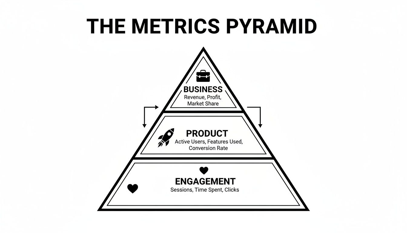
The model is built on a simple cause-and-effect chain: daily user engagement fuels product-level success, which in turn drives overall business results. Let's break down how this works in practice.
The Product Manager's Metrics Pyramid
This framework categorizes metrics to align your team's tactical work with strategic goals. It clarifies what to measure, who cares about it, and why it matters at each level of the organization.
| Pyramid Level | Metric Category | Example Metrics | Primary Audience | Your Role (as PM) |
|---|---|---|---|---|
| Top | Business Metrics | Monthly Recurring Revenue (MRR), Customer Lifetime Value (LTV), Profitability | C-Suite, Board, Investors | You influence this by driving the metrics below. You must be able to articulate this connection. |
| Middle | Product Metrics | User Retention Rate, Conversion Rate, North Star Metric | Product Leadership, VPs | You own this. Your performance reviews and career progression are tied to moving these numbers. |
| Bottom | Engagement Metrics | Daily Active Users (DAU), Session Duration, Feature Adoption Rate | Product Managers, Designers, Engineers | You monitor and diagnose with this. These are the levers you pull daily to impact the product metrics. |
By internalizing this structure, you gain a superpower. You can confidently walk into any leadership meeting and explain exactly how your team's work on improving a specific feature (Engagement) directly contributes to retaining more users (Product) and, ultimately, growing the company's bottom line (Business).
This is how you demonstrate strategic value and get promoted.
Finding Your North Star Metric: The PM's Compass
Okay, you have a pyramid for structure. But on a day-to-day basis, your team—and the entire company—can't focus on a dozen different numbers. You need one. A single, unifying metric that everyone from engineering to marketing can rally behind.
This is your North Star Metric (NSM). It’s the one number that best captures the core value your product delivers to customers.
Think of it as the ultimate destination on your product’s GPS. Without it, you're just driving, burning fuel on features and initiatives that might feel productive but ultimately lead nowhere. With a clear NSM, every decision, from a tiny UI tweak to a massive new feature launch, gets filtered through a single question: "Will this move our North Star?"

What Makes a Great North Star Metric
A powerful NSM isn't some vanity metric like "total sign-ups." That's a trap for junior PMs. A true NSM has to be directly tied to both customer value and the health of your business.
- Measures Customer Value: The metric should only go up when your users are getting real, tangible value. For example, Slack’s NSM isn't just Daily Active Users (DAU). It’s the number of teams that send over 2,000 messages. Why? Because their data showed that's the point of no return—the clear signal a team is deeply embedded and can't live without the product.
- Reflects Product Strategy: Your NSM should be a direct reflection of your product's core promise. It’s the living embodiment of your strategy, telling you if you're actually delivering on what you set out to do.
- Acts as a Leading Indicator of Revenue: It’s not a direct revenue metric, but it should predict future revenue. If your NSM is climbing but revenue is flat, something is broken in your monetization model. There’s a disconnect between the value users are getting and the value the business is capturing.
- Is Not a Vanity Metric: It can’t be easily gamed or juiced by a short-term marketing blitz. It has to represent true, sticky engagement that stands the test of time.
A great North Star Metric forces you to see the world through your customer's eyes. It’s not about what you’re building; it’s about the value they're receiving. Get this right, and you create a powerful alignment tool that drives sustainable growth across the entire company.
Choosing Your NSM: A Practical Guide
The right NSM depends entirely on your business model. A B2B SaaS tool and an e-commerce marketplace create value in fundamentally different ways, so their North Stars should be different.
Here’s a quick-start guide based on common business models to help you define or critique your current NSM:
| Business Model | Core Value Proposition | Potential North Star Metric | Real-World Example |
|---|---|---|---|
| SaaS | Solving a recurring business problem | Number of Weekly Active Teams Completing Core Action | Asana: # of tasks completed per week |
| Marketplace | Connecting buyers and sellers successfully | Total number of successful transactions | Airbnb: Nights booked |
| E-commerce | Delivering products customers want | Number of weekly repeat purchasers | Amazon Prime: # of items delivered via Prime |
| Media / Content | Providing valuable information or entertainment | Total time spent consuming content | YouTube: Watch time |
| Social Network | Facilitating meaningful connections | Daily Active Users sending a message or reacting | Facebook (early days): # of users with 7 friends in 10 days |
Once you've landed on a candidate for your NSM, stress-test it with your team. Get the key stakeholders (Eng Lead, Design Lead, Marketing) in a room and ask this one simple question: "If we could only improve one number for the next 12 months to guarantee the success of our product, would this be it?"
If the answer is a resounding "yes," you've likely found your guiding light.
AARRR Pirate Metrics: The PM's Map for Growth
While a North Star Metric is your compass, you need a full map of the customer journey to find and plug the leaks in your growth funnel. That’s where the AARRR framework comes in. Famously nicknamed "Pirate Metrics," it’s a growth PM’s most trusted tool for diagnosing problems and identifying opportunities.
The framework breaks the entire customer lifecycle into five distinct, measurable stages. This isn't some abstract model; it's a battle-tested diagnostic tool that helps you pinpoint exactly where your product is "leaking" users so you can focus your team's firepower for maximum impact.
This visual from Amplitude lays it out perfectly. Your job is to understand this flow, find the bottlenecks, and fix them. Each stage demands its own metrics and its own set of plays.
Acquisition: How Do Users Find You?
This is the top of your funnel. The temptation is to chase vanity metrics like raw traffic or total downloads. Don't. What really matters is the quality and efficiency of your acquisition channels.
The key metric is Customer Acquisition Cost (CAC). It’s the bottom-line number telling you exactly what you’re paying to get a new customer.
- Formula:
CAC = Total Sales & Marketing Spend / Number of New Customers Acquired - Actionable Tip: Never look at CAC as a single, blended number. You have to segment it by channel (organic search, paid ads, social media, etc.). A healthy-looking average CAC can easily hide a channel that's bleeding money. A good PM knows which channels bring in the highest LTV customers, not just the cheapest ones.
Activation: Do Users Experience the "Aha!" Moment?
Activation is the magic moment a new user truly gets the value your product promises. This is the chasm between a casual sign-up and a user on their way to becoming a fan. Defining and measuring this moment is non-negotiable.
- What to Measure: Your first job is to identify the specific user actions that correlate with long-term retention. For Dropbox, the activation moment wasn't just signing up; it was a user putting one file in one folder on one device. For Facebook, it was getting to 7 friends in 10 days.
- Example Metrics:
- Percentage of new users who complete your onboarding flow.
- Time to complete a critical "first" action (e.g., sending the first message in a chat app).
- Percentage of signups that hit that "aha!" moment in their first session.
Retention: Do They Keep Coming Back?
If users don't stick around, nothing else matters. Retention is the single best indicator of product-market fit. The gold standard for measuring this is cohort analysis. You group users by the week or month they signed up and then track what percentage of them are still active over time.
A healthy retention curve that flattens out over time is the clearest signal you've built something people actually want. For an early-stage B2B SaaS product, even a 10-15% flat retention curve means you've found a core group that loves your product. That's a solid foundation to build on.
If you’re not already using tools like Amplitude or Mixpanel to build these cohort charts, you're flying blind.
Referral: Do They Tell Others?
This is where you measure your product's built-in growth engine. The key metric is the viral coefficient, or K-factor.
- Formula:
K-factor = (Number of invites sent per user) * (Conversion rate of invites) - Interpretation: A K-factor over 1.0 means you're experiencing exponential, viral growth. This is the holy grail, but incredibly rare. However, even a K-factor of 0.2-0.4 can dramatically lower your overall CAC and pour fuel on your growth fire.
Revenue: How Do You Make Money?
Finally, the part that connects user value back to business value. For any PM, the two numbers that matter most are Customer Lifetime Value (LTV) and its relationship to CAC.
This brings us to the fundamental unit of a sustainable business: the LTV/CAC ratio. A healthy product should have an LTV that is at least 3x its CAC. This 3:1 ratio means for every dollar you spend to acquire a customer, you get three dollars back. If that ratio drops, it's a signal your business model is becoming less efficient, and you need to figure out why—fast.
Once you master the AARRR framework, you’re no longer just building features. You have a complete diagnostic toolkit to drive sustainable product growth strategies.
The HEART Framework: Measuring User Love
While Pirate Metrics (AARRR) give you a solid map for growth, chasing growth at all costs is a classic mistake. It can lead to a terrible user experience, which is like pouring water into a leaky bucket. This is where the HEART framework comes in.
Developed by PMs at Google, HEART is the perfect counterbalance to purely growth-focused metrics. It's designed to measure product quality from the user's perspective, ensuring you're building something people don't just use, but actually love.
The framework is a simple acronym: Happiness, Engagement, Adoption, Retention, and Task Success. Let's break down how to turn these concepts into real metrics you can track.
Happiness: Quantifying User Delight
Happiness is about turning users' subjective feelings about your product into hard numbers. The gold standard is the Net Promoter Score (NPS). You ask users how likely they are to recommend your product and subtract the percentage of Detractors (scores 0-6) from Promoters (scores 9-10). A score above 50 is considered world-class.
- Key Happiness Metrics:
- Net Promoter Score (NPS): Measures overall loyalty and willingness to recommend.
- Customer Satisfaction (CSAT): Great for measuring satisfaction with a specific feature or support interaction.
- App Store Ratings: A public proxy for how users feel.
Engagement, Adoption, and Retention
These three are distinct but deeply connected.
Engagement is about the depth of usage. Instead of just counting active users, measure how deeply they're interacting. A common trap is measuring only session duration; a long session could mean the user is confused. Instead, focus on actions that signal productive engagement, like the number of key actions a user takes per session.
Adoption measures how many people are trying a new feature for the first time. This is critical for knowing if your hard work paid off.
- Adoption Metric Example: If you launch a new photo filter, track the % of active users who applied the new filter in the first week.
Retention, as in AARRR, tracks who sticks around. In HEART, the focus is on your product’s inherent stickiness—its ability to become a habit.
Task Success: Can Users Get Things Done?
This is the bottom line: can users actually accomplish their goals with your product, quickly and without frustration? This is where you might use methods from our guide on how to conduct usability testing.
- Key Task Success Metrics:
- Task Completion Rate: % of users who successfully finish a key workflow (e.g., checkout).
- Time on Task: How long it takes a user to complete that task.
- Error Rate: Frequency of errors users encounter.
By combining these five HEART categories, you create a complete picture of product health that balances aggressive growth with a fantastic user experience.
Essential Metrics for AI Product Managers in 2026
As a product manager, you get used to certain metrics. But when you step into the world of AI and machine learning, the old playbook isn't enough. Managing products powered by AI requires a new vocabulary that goes beyond standard software KPIs.
If you’re building with AI, you’re not just measuring clicks. You have to measure the model's performance and, crucially, the user's trust in what that model is doing. PMs at the forefront of this at places like OpenAI and Anthropic live and breathe these numbers. The core of artificial intelligence product management is connecting a model's technical performance to the tangible value a user feels.
Here are the AI-specific metrics you must master to stay competitive.
Model Performance The User Can Feel
At the heart of every AI product is the model. Its technical performance directly shapes the user's experience. You need to understand three bedrock metrics: precision, recall, and the F1 score.
Let's use the example of an AI-powered spam filter:
Precision: Of all the emails your model flagged as "SPAM," how many were actually spam? High precision is critical. It means you’re not hiding important emails in the junk folder. It answers: "When the AI acts, is it right?"
Recall: Of all the actual spam emails that came in, how many did your model successfully catch? High recall means you're protecting users from junk. It answers: "Does the AI catch all the stuff it's supposed to?"
These two metrics are always in a trade-off. Crank up precision, and you might miss some spam (lower recall). The F1 Score is the harmonic mean of precision and recall, giving you a single number to track this delicate balance.
As an AI PM, your job is to understand the trade-offs. A medical diagnostic tool needs insanely high recall (never miss a potential disease), even if it means false alarms (lower precision). A movie recommender needs high precision (a few great suggestions are better than a ton of mediocre ones).
Business-Critical AI Metrics
Beyond accuracy, you must track the metrics that hit the bottom line. These are what your leadership team will care about.
Inference Latency: How long does the model take to give an answer? For a real-time translation app, high latency makes the product feel broken. Measure this in percentiles (p50, p90, p99) to understand the experience for your slowest users, not just the average.
Cost Per Prediction: AI models are expensive to run. Calculating your cost per 1,000 predictions is essential for understanding your unit economics. Is the value this feature provides worth what you're paying to run it?
Model Drift: The world changes, and so does data. Model drift measures how much your model's performance degrades over time. You need a system to monitor this and trigger alerts for retraining.
Measuring User Trust and Intervention
Ultimately, the game with AI products is building user trust. Two powerful metrics here are the Human-in-the-Loop (HITL) Rate and the AI Acceptance Rate.
The HITL Rate is simple: how often does a human have to jump in and fix the AI's mistake? For an AI content moderation tool, a high HITL rate means your operational costs are skyrocketing and your model isn't good enough.
Conversely, the AI Acceptance Rate is a fantastic proxy for trust. It measures the percentage of AI suggestions that users accept without modification. When users consistently hit "accept," you know you've built something they genuinely find useful.
Mastering these metrics allows you to translate the complex world of machine learning into business outcomes and build AI products that people trust and love.
Avoiding Common Metric Traps and Anti-Patterns
Knowing which metrics to track is important. But knowing which ones to ignore is what separates a good product manager from a great one.
The most common trap is the vanity metric: total sign-ups, page views, or app downloads. They feel great because they always go up and to the right. But they don't tell you if your business is healthy. A million downloads are worthless if 99% of those users churn after one session.

The Danger of Chasing a Single Number
Another massive pitfall is optimizing for a single metric above all else. This is a fast-track to building a product people hate. For instance, a PM is tasked with increasing "engagement," measured only by time spent in the app. A quick way to do that? Make the UI confusing.
The "time in app" metric ticks up, but the user experience plummets. You've traded a short-term win for a long-term loss of trust. A senior PM understands that no single number tells the whole story, which is why it's critical to know the difference between a simple metric and a true Key Performance Indicator (KPI). I've written before about the critical distinction between a KPI vs metric, and it’s a concept every PM needs to master.
The best way to avoid this trap is by using counter-metrics.
- If you're trying to boost conversion rate, you must also watch product return rate.
- If your goal is to drive down support tickets, track customer satisfaction (CSAT) to ensure you didn't just make it impossible to get help.
- If you're pushing to increase ad clicks, monitor your user retention rate to see if you're just annoying people into leaving.
Why Averages Lie and Segments Tell the Truth
Here's a critical piece of advice: never trust a single, aggregated number. Averages almost always hide the real story. Segmentation is your most powerful tool for finding what's really going on.
Never trust a single, aggregated number. The most important insights are almost always found by slicing your data. Averages can make a dying product look healthy or a successful feature look like a failure.
For example, your overall retention might look stable. But when you segment it, you might find that retention for new users on Android has cratered by 30% in the last month. That's a fire alarm screaming at you to investigate a bug or performance issue. This is especially critical for AI products, where understanding AI bias is essential to ensure your metrics are fair across all user segments, not just the majority.
Retention: The One Metric You Can't Fake
If I were forced to pick one area to focus on, it would be retention. It’s the ultimate signal of product-market fit, and it's incredibly hard to game.
You can't trick users into coming back if they don't get real value. Your retention rate is a direct reflection of how essential your product is. A great way to measure this is the "stickiness" ratio: Daily Active Users (DAU) divided by Monthly Active Users (MAU). A stickiness ratio above 20% is often a sign of a strong, habit-forming product. You have to earn a high stickiness score by building something people truly need.
Your Product Metrics Questions Answered
This is where theory hits the road. Let's walk through the questions I hear most often from PMs about using metrics day-to-day.
What Are The First 3 Metrics a New Product Should Track?
When you’ve just launched, your job isn't to scale; it's to validate. You need to find out if you've built something people want.
I always tell new founders and PMs to start with this trio:
- Activation: Did a new user experience the core promise of your product? Define that "aha!" moment and measure if people are getting there.
- Retention: Did they come back? A simple Day 1 or Day 7 retention number is the most honest signal you have for product-market fit. If no one returns, you have a leaky bucket.
- Key Engagement: Pick a single, crucial action that proves a user is getting real value. For an e-commerce app, "items added to cart." For a social product, "messages sent."
These three metrics are your canary in the coal mine, confirming you have a flicker of user love before you pour gasoline on it.
How Do I Choose Between AARRR and HEART?
You don’t have to choose. In fact, you shouldn't. They’re different tools for different jobs.
AARRR is your telescope. It gives you the wide, business-centric view of the entire customer journey, from acquisition to revenue. It gets marketing, sales, and finance on the same page.
HEART is your microscope. It zooms in on the user's actual experience, helping you answer qualitative questions like, "Are people happy using this?" and "Are they getting stuck?"
The most effective product leaders use a hybrid approach. They use the AARRR telescope to spot a leak in the business funnel, then grab the HEART microscope to understand why users are dropping off.
How Do I Present Metrics to Executive Leadership?
When you walk into a room with executives, you have to answer the "so what?" question before they ask it. They don't care about raw data; they want to know what it means for the business.
Never just show a chart of Daily Active Users going up and to the right. That’s table stakes. You must connect your product metrics directly to revenue, market share, and operational efficiency.
The best PMs tell a story with their data. You start with the business goal. You show how your product metrics are moving the needle on that goal. You share what you’ve learned, and you end with a clear, data-informed plan for what you’re doing next. This is how you stop being a feature manager and become a strategic partner.
At Aakash Gupta, I'm focused on helping you master these skills. For more deep dives, frameworks, and career advice to help you become a top 1% PM, you can find more resources at https://www.aakashg.com.