You’re looking at a dashboard with too many green arrows and not enough truth.
DAU is up. Feature adoption is up. Session length is up. But churn is also up, support tickets are getting worse, and the growth story starts falling apart the moment someone asks the obvious question: which metrics are moving together, and which ones are just noise?
That’s where product managers need correlation analysis. Not as an academic exercise, and not as a stats flex. You need it because shipping without understanding metric relationships is how teams confuse motion with progress. If you want a practical answer to what is a correlation analysis, it’s this: a way to measure whether two variables tend to move together, in what direction, and how strongly.
Your Dashboard Is Lying To You
A common PM mistake is treating every movement in a dashboard as meaningful. It isn’t. Metrics often rise together for reasons that have nothing to do with your feature.
A retention chart might improve right after onboarding adoption rises. That does not automatically mean onboarding caused retention. It might mean a marketing campaign brought in a better-quality cohort. It might mean seasonality changed user behavior. It might mean power users did more of everything.
That’s why strong PMs stop asking only “what changed?” and start asking “what changed together?”
If you’ve worked on growth, this pattern feels familiar. A team rolls out a collaboration feature, then sees higher team invites, more weekly active days, and stronger expansion signals. Junior PMs celebrate all three. Senior PMs ask which relationships hold up once you segment by user type, cohort, or acquisition source. That’s the difference between reporting metrics and understanding a system.
A fast way to build intuition is to study how correlation works in other domains. For example, traders spend a lot of time analyzing currency pair correlation because assets can move together in ways that matter operationally, even when no direct causal relationship exists. Product metrics behave the same way. They co-move, they mask each other, and they can mislead you if you read them in isolation.
The PM job isn’t tracking more metrics
The PM job is choosing which relationships deserve action.
That’s why correlation analysis belongs next to funnels, cohorts, and experiments in your operating toolkit. If cohort analysis tells you how behavior changes over time, correlation helps you inspect which behaviors tend to travel together inside those cohorts. If you need a refresher on that lens, cohort analysis for product managers is the companion skill.
Don’t let dashboards answer strategy questions by accident. Make them earn the answer.
The PMs Correlation Analysis Toolkit
A PM does not need more charts. A PM needs a reliable way to test whether two metrics move together strongly enough to influence a roadmap decision.
That is the job of correlation analysis. You use it to examine whether changes in one variable tend to line up with changes in another. In product work, that usually means questions like whether onboarding completion tracks with paid conversion, whether power-user behaviors track with retention, or whether feature satisfaction scores rise with usage depth. The output is a correlation coefficient from -1 to +1. Positive means the variables tend to rise or fall together. Negative means one tends to increase while the other drops. Values near zero mean there is little linear relationship to work with.
For PMs, the toolkit matters more than the textbook definition. The wrong coefficient can turn a healthy metric review into noise, especially when dashboards mix behavioral counts, survey scores, and ranked inputs in the same view.
The three coefficients you will use
You do not need ten methods. You need to choose correctly among three.
| Coefficient | Best For | PM Example | Trade-off |
|---|---|---|---|
| Pearson r | Continuous variables with a roughly linear relationship | Weekly active days vs. revenue per account | Easy to explain, but sensitive to outliers and non-linear patterns |
| Spearman ρ | Ranked data or monotonic relationships | Satisfaction score rank vs. expansion likelihood | More forgiving with skewed data, but less direct for raw metric-to-metric comparisons |
| Kendall τ | Small samples and ordinal agreement | Customer priority ranking vs. internal roadmap ranking | Stable for rank comparison, but slower and less common in day-to-day product reporting |
How to choose without overthinking it
Use Pearson for operational product metrics. Event counts, usage frequency, time spent, seats added, and revenue metrics often start here. If the scatter plot looks roughly linear and outliers are under control, Pearson is the fastest path to an answer your finance, growth, and data science partners will all recognize.
Use Spearman when the relationship is ordered but not cleanly linear. That happens all the time in PM work. Feature satisfaction, task difficulty, and intent signals often move in one direction without following a straight line. Spearman works well when survey data is skewed, bucketed, or messy.
Use Kendall when you care about rank agreement more than raw distance between values. It is useful for smaller samples, especially when you are comparing ordered preferences from customer interviews, sales feedback, and internal prioritization. I use it less often, but when the input is ordinal and the sample is thin, it is the safer choice.
What experienced PMs check before running correlation
First, inspect the metric type. Raw event counts and revenue behave differently from ranked satisfaction inputs.
Second, check whether your variables are cousins wearing different names. In many dashboards, weekly active users, sessions per user, and active days are so tightly related that you are measuring the same behavior three times. That creates multicollinearity, which makes dashboards look more conclusive than they are. If you do not reduce overlapping metrics, teams over-credit the wrong driver and build the wrong fix.
Third, plot the relationship before you calculate anything. A scatter plot will catch outliers, bends, and ceiling effects faster than a matrix full of coefficients.
Your default PM stack
Keep the workflow simple and repeatable:
- Amplitude or Mixpanel for event-level behavioral data
- Sheets or Excel for quick checks and stakeholder reviews
- SQL plus Python or R for repeatable analysis, segmentation, and correlation matrices
- A shared metrics definition layer, because inconsistent inputs ruin the analysis before the math starts
If you want implementation help, YourAI2Day's R correlation tutorial is a practical walkthrough.
Before you run any model or build any dashboard, align on the underlying metric definitions. A shared framework for product manager KPI and metric selection prevents the most common failure mode. Teams correlate poorly defined metrics, then argue about strategy using numbers that never meant the same thing in the first place.
How to Interpret Correlation Results Like a Pro
A PM pulls a dashboard before a roadmap review and sees a clean correlation between feature usage and retention. The room starts treating that number like proof. That is usually the moment judgment matters more than math.

Good interpretation has three jobs. Read the direction. Judge the strength. Decide whether the relationship is decision-useful in a product context.
Read the coefficient before you build the narrative
Start with the sign.
A positive correlation means the variables tend to rise together. A negative correlation means one tends to rise as the other falls. A value near zero means you do not have much linear relationship to work with, even if the metrics look related in a dashboard.
For stakeholder conversations, keep the translation plain:
- Strong positive: users who do more of X also tend to do more of Y
- Strong negative: users who do more of X tend to do less of Y
- Near zero: X and Y do not show a useful linear relationship
Do not oversell the coefficient. An r of 0.4 is not “proof” that one metric drives the other. It is a signal that the two metrics move together to a moderate degree, and that signal may or may not survive segmentation, time controls, or a closer look at outliers.
Use r² carefully, not theatrically
r² can help in business reviews because it turns an abstract coefficient into a cleaner explanation of shared variation. If the correlation is 0.7, r² is 0.49. That means roughly half of the variance in one variable is associated with variance in the other in that simple relationship.
That is useful language for PMs. It is also easy to abuse.
In product work, r² is a communication aid, not a shortcut to causality. A high r² can still come from a bad pairing of metrics, a narrow sample, or two variables that are both reacting to the same underlying behavior. I have seen teams present a high relationship between notifications sent and retention, then realize both were just proxies for power-user activity.
If you cannot explain the relationship in one sentence a GM can repeat accurately, you are not ready to use it in a prioritization meeting.
Choose the right correlation for the shape of the data
Pearson is the default because it is familiar and built into every analytics tool. It is also overused.
Use Pearson when you expect a roughly linear relationship and your data is reasonably well behaved. Use Spearman when the relationship is ranked, skewed, or monotonic without being cleanly linear. That is common in PM work. Survey scores, satisfaction ratings, account health tiers, and feature adoption ladders often fit Spearman better than Pearson.
A practical example: if users who rate onboarding more highly also report higher satisfaction, but the jumps are uneven across score bands, Spearman is usually the safer read. Pearson can understate a relationship like that or make the output look weaker than the product pattern really is.
This video gives a clean visual explanation of how to think about correlation outputs in practice.
Interpretation breaks when context is weak
The coefficient is only the start. The real work is asking whether the relationship holds in the segment you care about.
If a metric pair is correlated across your full user base but disappears for new users, enterprise accounts, or a key geography, the headline result is not wrong. It is just too broad to guide a real product decision. At this point, strong PMs separate reporting from analysis. They ask, “For which users is this relationship strong enough to matter?”
That habit matters even more when your dashboard includes overlapping metrics. If onboarding completion, activation score, and first-week engagement are all tightly related, each one may correlate with retention. That does not mean you found three independent levers. It often means you found one underlying behavior showing up under three labels.
Correlation is for insight. Regression is for estimating change.
Use correlation to find promising relationships worth investigating. Use regression when the team needs to estimate how much Y changes when X changes, while accounting for other variables. If your discussion is drifting from “these metrics move together” toward forecast, prioritization modeling, or driver analysis, move to correlation vs regression analysis.
That is the practical line. Correlation helps you frame the question. It does not finish the job.
A 5-Step Correlation Workflow for Product Managers
The best PM workflows are boring. They’re repeatable, they survive stakeholder pressure, and they keep you from making flashy but weak claims.
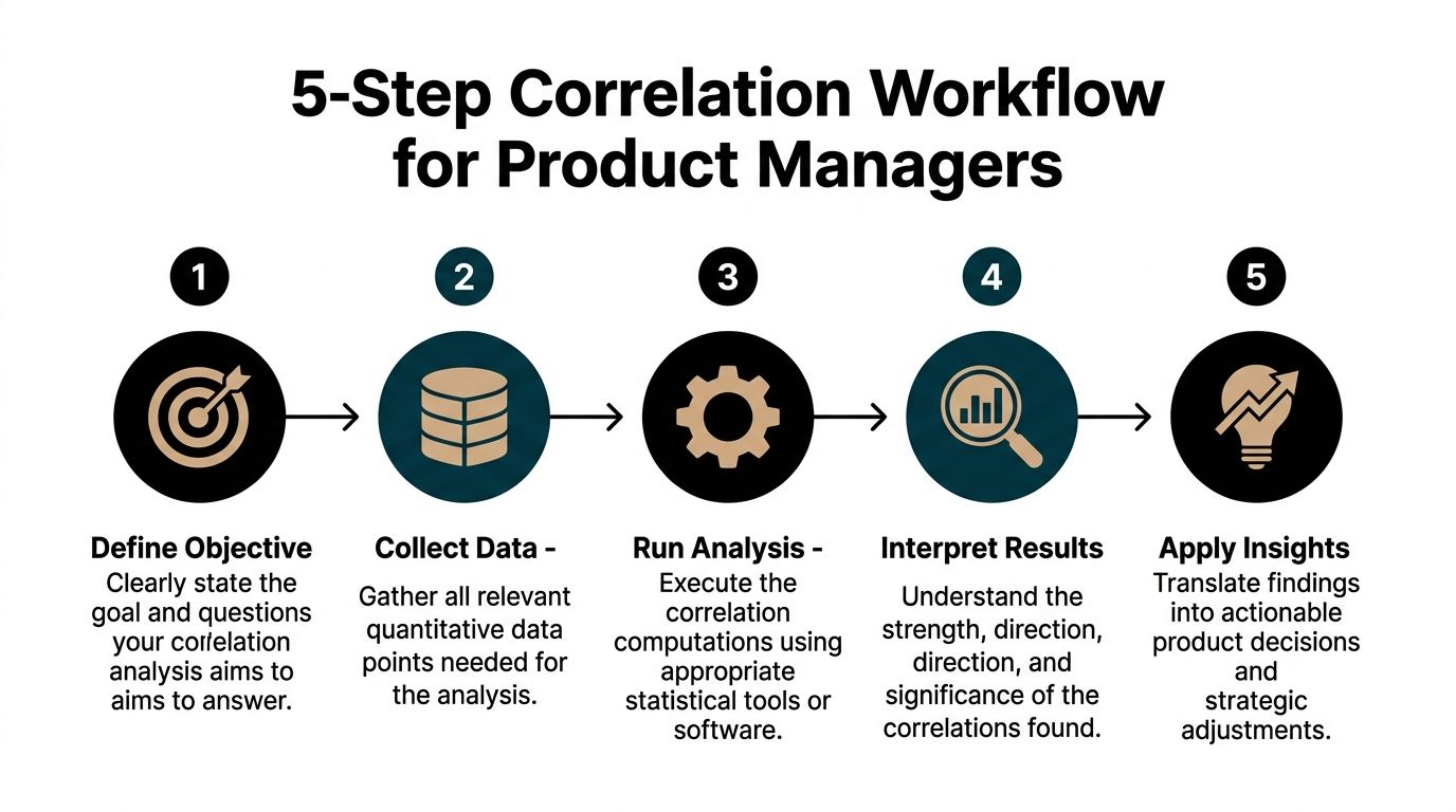
Step 1 Define a product hypothesis
Start with a testable question, not a vague curiosity.
Bad PM question: “Is onboarding important?”
Better PM question: “Do users who complete onboarding step three in their first week also show stronger retention later?”
The discipline here matters because correlation analysis can always find something. If your question is fuzzy, your conclusion will be fuzzy too.
Step 2 Pull the right data
Get the variables into one table at the right grain.
That usually means user-level or account-level rows, with columns for the behavior you want to compare. Pull from your warehouse, Amplitude, Mixpanel, or a clean export from your BI layer. Then fix the basics:
- Align the time window: Compare metrics from consistent periods.
- Remove obvious junk: Delete test accounts, bots, and malformed records.
- Check metric definitions: Make sure “active user” or “adopted feature” means one thing everywhere.
A clean but imperfect dataset beats a giant dirty export every time.
Step 3 Choose the coefficient intentionally
Don’t run Pearson by reflex.
Ask three quick questions:
- Are both variables numeric and roughly linear? Use Pearson.
- Are they ranked, skewed, or monotonic? Use Spearman.
- Are they ordinal and small-sample? Consider Kendall.
Many PM analyses fail. The tool choice gets made by habit, not by data shape.
Step 4 Visualize before you present
A scatter plot catches mistakes faster than a spreadsheet.
If the plot shows a clear line, Pearson may be fine. If it curves, clusters, or forms an obvious non-linear shape, don’t pretend a simple linear coefficient tells the whole story. Sheets can do this. Excel can do this. Python makes it cleaner, but you don’t need Python to be competent.
A quick review checklist helps:
- Look for outliers that may distort the relationship
- Check clustering by segment or cohort
- Scan for curves that linear methods will miss
Step 5 Turn the result into a recommendation
It is here that PMs separate themselves from analysts.
Don’t present “the correlation between X and Y is positive.” Present the product implication. For example:
- Users who adopt feature X early tend to retain better, so the onboarding surface for that feature deserves more traffic.
- High satisfaction rank tracks with repeat usage rank, so the feature likely matters for stickiness.
- No meaningful relationship appears between vanity metric A and outcome B, so stop using A as a success proxy.
A reporting template that works
Use a short narrative structure in docs or meetings:
| Component | What to say |
|---|---|
| Question | What product relationship were we testing? |
| Method | Which coefficient did we use, and why? |
| Result | What direction and strength did we observe? |
| Caveat | What could still be confounding the result? |
| Action | What product decision changes because of this? |
If you want to go beyond correlation into forecasting or modeled relationships, that’s the right moment to move into how to perform regression analysis. But don’t skip the simpler step. Correlation is often the fastest way to decide whether a relationship is worth deeper investment.
Correlation in Action Real-World Examples from Top Tech
Correlation analysis becomes valuable when it changes what a team does next.
Take a Spotify-style consumer product scenario. A PM suspects that users who create more playlists early in their lifecycle retain better. The relevant variables might be playlists created in the first month and active status later on. If those move together strongly, the PM doesn’t just celebrate. They examine whether playlist creation is an activation behavior worth emphasizing in onboarding, recommendations, and lifecycle messaging.
The next move is not “ship more playlist UI.” The next move is narrower. Which surfaces drive playlist creation among new users who resemble high-retention cohorts?
A Netflix-style engagement question
A streaming PM might ask whether adding shows to My List is associated with deeper viewing behavior. The point isn’t to prove that saving causes bingeing. The point is to find whether list-building works as a useful signal.
If the relationship is strong, the PM may prioritize better save prompts, more visible watchlists, or recommendation modules that turn passive browsing into explicit intent. If the relationship is weak, the team may stop overvaluing saves as a proxy for future engagement.
Strong PMs use correlation to improve the quality of roadmap bets, not to win arguments about who was right.
A B2B SaaS renewal scenario
Now shift to a HubSpot-style SaaS environment. A PM notices that accounts with more activated integrations often look healthier. The product question becomes whether integration depth tracks with renewal quality or expansion potential.
That analysis can sharpen several decisions:
- Onboarding design: Should the product push setup flows for core integrations earlier?
- CSM playbooks: Should customer success focus on integration adoption as an account health signal?
- Packaging: Should premium plans make key integrations easier to discover and configure?
The strategic value comes from finding a relationship that is both measurable and operationally useful. Correlation won’t tell you the whole renewal story, but it can tell you which account behaviors deserve more attention in your health model.
What these examples have in common
In all three cases, the PM isn’t chasing abstract statistical elegance. They’re asking one practical question: which behaviors are worth promoting because they travel with outcomes we care about?
That’s what makes correlation analysis useful in product work. It narrows the field. It tells you where to look harder.
Critical Pitfalls That Sabotage Product Decisions
A PM sees a strong correlation on the dashboard, tells the team they found the growth lever, and six weeks later the experiment does nothing. That failure usually starts with bad interpretation, not bad SQL.

The familiar warning about causation is too broad to help. Product teams need a tighter checklist because the mistakes are predictable, especially in messy dashboards with overlapping metrics, segmented users, and AI-generated summaries that look polished before they are correct.
Confounders wreck clean-looking charts
A feature can correlate with retention for reasons that have nothing to do with product value. Enterprise accounts may adopt it first. A launch campaign may send in higher-intent users. Seasonality may lift both adoption and retention in the same month.
I treat any unsegmented chart as a draft, not a conclusion.
If the story disappears after controlling for acquisition source, plan type, tenure, or geography, the original result was not decision-grade. It was a blended average hiding the underlying drivers.
Multicollinearity is a dashboard disease
PM dashboards often track several metrics that measure the same underlying behavior. Session length, page views, actions per session, and depth of visit tend to travel together. Teams then paste all of them into a model, or worse, present each one as separate evidence for the same roadmap bet.
That creates false confidence.
If two inputs overlap heavily, your model gets unstable and your narrative gets sloppy. Coefficients can swing. Importance rankings can flip. Stakeholders walk away thinking you found four drivers when you found one cluster. For a plain-English explanation of variance inflation factor and the common rule of thumb that VIF values above 5 may indicate problematic multicollinearity, see GeeksforGeeks: what is correlation analysis.
My advice is simple. Prune aggressively. Pick the metric that is easiest to explain, hardest to game, and closest to the product behavior you want to influence. If you need the full set for prediction, use modeling methods and diagnostics that acknowledge overlap instead of pretending each metric is independent.
Non-linear relationships hide in plain sight
Correlation coefficients reward straight-line thinking. Product systems rarely behave that way.
Acquisition spend, notification volume, recommendation exposure, and onboarding prompts often show diminishing returns. Early increases help. Later increases flatten out or start hurting the outcome you care about. A single linear correlation can wash that pattern into a weak result and push the team to ignore a relationship that matters operationally.
Look at the scatter plot. If the curve bends, model the curve.
Simpson’s paradox shows up in segmented products
Aggregate results can point in one direction while every meaningful segment points in another. I see this constantly in B2B SaaS, marketplaces, and products with free and paid tiers.
A feature may look positively associated with retention overall because power users adopted it at higher rates. Inside the new-user segment, the same feature may have no relationship at all. If you ship based on the aggregate view, you can optimize for the wrong audience and call the rollout a data-backed decision.
A short defensive checklist
Before you turn a correlation into a roadmap argument, check five things:
- Confounders: campaign exposure, pricing changes, seasonality, acquisition source, and account size
- Metric overlap: variables that are measuring the same behavior in slightly different ways
- Shape: curves, thresholds, plateaus, and saturation effects
- Segments: new vs. mature users, free vs. paid, SMB vs. enterprise, supply vs. demand side
- Outliers: a small number of accounts or users creating an inflated signal
Teams using correlation in high-stakes forecasting run into the same discipline problems. In regulated industries, analysts working on predictive analytics in banking still have to separate signal from overlap, segment effects, and spurious relationships before anyone should act on the model.
Correlation is a search tool. Use it to narrow the field, pressure-test a hypothesis, and decide where deeper analysis is worth the time. Do not use it as courtroom proof for your favorite product idea.
Integrating AI into Your Correlation Workflow
AI has changed the mechanics of product analysis faster than most PM teams have updated their habits.

You no longer need to be excellent at Python to run a useful correlation analysis. You do need to be excellent at framing the question, validating the output, and catching bad interpretations.
Where AI actually helps
For PMs, AI is strongest in the repetitive parts of the workflow:
- Summarizing a dataset
- Generating a correlation matrix
- Visualizing top positive and negative relationships
- Drafting stakeholder-ready explanations
- Flagging suspicious variables for follow-up
ChatGPT with Advanced Data Analysis is a practical option for this. So are AI-native analysis tools that let you upload a CSV and ask plain-English questions. The value is speed. You can go from export to first-pass insight in one sitting.
Prompts worth using
Try prompts like these with a cleaned user-level dataset:
“Act as a product analyst. Review this dataset and identify all numeric columns suitable for correlation analysis. Create a correlation matrix, rank the strongest positive and negative relationships, and explain which ones might matter for retention, activation, and monetization.”
Or:
“Use Spearman correlation for ordinal or rank-like variables and Pearson for continuous linear variables where appropriate. Show me scatter plots for the most useful relationships and flag possible outliers or non-linear patterns.”
Then ask the follow-up that many PMs skip:
“Which of these relationships are most likely to be confounded by seasonality, acquisition channel, or user segment?”
Where AI still needs adult supervision
Don’t let AI choose your business logic. It doesn’t know your metric definitions, instrumentation bugs, or organizational context.
It can generate a matrix. It can’t know whether “active_project_count” was redefined last month or whether a sales-assisted motion is skewing the enterprise data. You still need judgment.
A good mental model comes from adjacent fields using prediction-heavy workflows. Financial teams, for instance, use pattern-finding tools in high-stakes environments where interpretation discipline matters. That’s one reason resources on predictive analytics in banking are useful for PMs too. The domain is different, but the workflow lesson is the same: faster analysis only helps if decision quality stays high.
From Data Points to Decisive Product Strategy
Knowing what is a correlation analysis won’t make you a better PM by itself. Using it to improve decisions will.
The career difference is obvious in meetings. One PM reports metric movement. Another PM explains which behaviors move together, which signals are misleading, and where the team should investigate next. The second PM gets trusted with harder problems.
That’s because product leadership isn’t about sounding analytical. It’s about reducing uncertainty well enough that a team can act with confidence. Correlation analysis helps you do that. It helps you pressure-test intuition, cut through vanity metrics, and turn messy behavior data into a sharper roadmap.
If you want to build that muscle, start small. Pick one important product outcome, one behavior you believe matters, and test the relationship with clean data and a skeptical mindset. Then communicate the result in business language, not statistical theater.
That habit compounds. Over time, you stop being the PM who brings charts. You become the PM who brings judgment.
If you want to deepen that skill set beyond correlation into stronger product judgment, mastering data-driven decision making is the broader capability to keep building.
Aakash Gupta has built one of the most useful bodies of work in product management for PMs who want sharper judgment, stronger execution, and faster career growth. If you want practical frameworks, high-signal content, and resources grounded in real product leadership, explore Aakash Gupta.