You shipped a new onboarding flow on Monday. By Wednesday, activation is up. By Friday, support tickets are up too. Retention looks flat. Sales says leads from the new flow “feel better.” Analytics says time-to-value is down. Your GM asks the question every PM eventually gets.
Which of these metrics are moving together, and which ones are just noise?
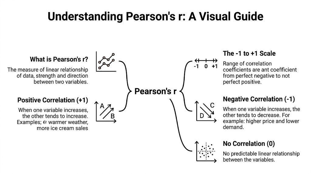
That's where most product teams either get sharper or start telling themselves stories. The sharp teams don't jump straight to causation. They first ask a simpler question. Is there a meaningful relationship between two variables at all? The tool for that is the linear coefficient correlation, usually called Pearson's r.
If you're a PM, this matters more than most stats terms you learned and forgot. It helps you screen proxy metrics, sanity-check A/B readouts, and avoid chasing features that look promising in one dashboard but don't line up with the business outcome that gets you promoted.
When Your Metrics Move Together Or Dont
A practical PM rarely struggles with a lack of metrics. The problem is too many metrics moving at once.
Say a team launches a new recommendation widget. Session depth rises. So does latency. Conversion nudges up in one segment and down in another. Customer feedback is mixed. If you don't have a way to evaluate whether those movements line up consistently, you end up with opinion-driven product reviews dressed up as analytics.
Pearson's r gives you a disciplined starting point. It was introduced as a formal statistical measure of linear association in the late 19th century by Karl Pearson, building on earlier work by Francis Galton. In modern statistics, it's defined as covariance divided by the product of two variables' standard deviations, and it always sits between -1 and +1 according to this statistical reference on Pearson correlation. Near +1 means a strong positive linear relationship. Near -1 means a strong negative one. Near 0 means little or no linear relationship.
That bounded scale is why PMs should care. It lets you compare relationships across very different product metrics without getting distracted by units.
Where this shows up in real product work
You'll use linear coefficient correlation when you need to answer questions like these:
- Proxy metric validation: Does weekly feature usage move closely with retention, or is it just a vanity metric?
- Trade-off review: When support tickets rise with engagement, is that a stable pattern or a one-week anomaly?
- AI feature evaluation: Does model confidence track user acceptance, or are they drifting apart?
- Voice of customer analysis: Are the complaints from your feedback channels lining up with the behavior you see in product analytics?
If your workflow includes survey feedback, session behavior, and support data, it helps to learn strategies to turn feedback into growth so you're not treating qualitative signals and quantitative signals as separate worlds.
For PMs who want a broader analytics framing, Aakash Gupta's guide on what a correlation analysis is is a useful companion to the product decision side of this topic.
Correlation won't make the decision for you. It will stop you from making a sloppy one.
Deconstructing the Linear Correlation Coefficient
The easiest way to understand Pearson's r is to forget the formula for a minute and think about synchronization.
If two rowers speed up and slow down together, that's positive correlation. If one speeds up while the other slows down, that's negative correlation. If one rows with no pattern relative to the other, correlation is near zero. That's the basic mental model.
What the formula is actually doing
Under the hood, Pearson's r is a normalized measure of linear dependence. It's defined as covariance divided by the product of the two variables' standard deviations, which makes it unitless and bounded in [-1, 1] as explained in this overview of the linear correlation coefficient.
That sounds technical, but the PM translation is simple:
- Covariance asks whether two metrics tend to move together.
- Standardization removes the scale problem.
- The final score tells you strength and direction in a way you can compare across very different datasets.
A useful consequence of that normalization is that you can compare relationships across metrics with different units. Daily active users and average response time don't live on the same scale, but correlation still gives you a common lens.
What Pearson's r does not do
It only works when both variables have some spread. If either variable has zero variance, r is undefined. That matters more than it sounds. If every user in your filtered dataset has the same value on one metric, correlation isn't “low.” It does not exist for that slice.
It also doesn't capture non-linear dependence. A metric can have a real relationship with another metric and still show a weak Pearson correlation if the pattern bends instead of following a line.
That's why PMs should think of r as a fast screening tool, not a final verdict. If you want a clean mental separation between relationship strength and prediction, this comparison of correlation vs regression analysis is worth keeping in your toolkit.
How to Interpret Correlation for Product Insights
You are in a weekly product review. Activation is up, retention is flat, and an AI assistant usage metric is climbing fast. Someone points to a correlation value and argues that usage is driving retention. That is the moment good PMs separate signal from storytelling.
Interpret correlation in three passes: direction, strength, and decision value. Direction tells you whether two metrics rise together or move in opposite directions. Strength tells you how closely they line up in a linear pattern. Decision value is the part PMs often skip. Ask whether this relationship is stable enough to change roadmap priority, metric design, or experiment sequencing.
A PM-friendly interpretation frame
Use a simple operating frame in product reviews:
| Correlation read | PM interpretation | Typical next move |
|---|---|---|
| Positive and strong | The metric may work as a leading indicator or proxy | Validate it in an experiment or holdout |
| Negative and strong | You may have a real trade-off, friction point, or quality issue | Check the user flow and segment by intent or platform |
| Near zero | The aggregate view is not giving you a useful linear signal | Look for segments, thresholds, or non-linear effects |
| Changes a lot across slices | The average is hiding different behaviors | Break down by cohort, market, device, or user type |
The practical mistake is treating one correlation value as a verdict. In product work, one number rarely survives contact with segmentation. A metric can look meaningless in the overall population and become highly informative for new users, power users, or a specific acquisition channel.
A second mistake is overreacting to labels like "strong" or "weak." Those labels are fine for screening. They are not a product strategy. A moderate correlation between a fast feedback metric and long-term retention can still be useful if it lets the team learn in days instead of quarters.
What correlation is actually good for
Correlation helps most when speed matters and causality is not settled yet.
- Prioritize experiments. If a feature-level behavior consistently moves with an outcome you care about, it deserves a test before lower-signal ideas.
- Choose proxy metrics. PMs often need a faster read than revenue, retention, or trust. Correlation can help you decide whether a short-cycle metric is good enough to guide iteration.
- Reduce dashboard clutter. If two top-line metrics move together almost every week, one may be enough for the exec view.
- Evaluate AI features. For AI products, relationships between acceptance rate, edit rate, repeat usage, and user satisfaction often reveal whether the model is helping or creating cleanup work.
For example, if AI suggestion acceptance correlates with repeat usage, that is useful. If acceptance also correlates with higher error reports in one segment, the story changes. A PM who only cites the aggregate value misses the product risk.
If the goal is prediction rather than screening, use regression analysis for product decisions to estimate the effect size while controlling for other variables.
What weak correlation actually means
A low correlation does not kill an idea. It says the linear relationship is weak in the version of the data you chose to look at.
That distinction matters in practice. Early funnel metrics often have noisy relationships with revenue because many downstream steps intervene. AI quality metrics can also behave this way. Latency may barely correlate with satisfaction until response time crosses a threshold, then satisfaction drops fast. Pearson correlation will understate that pattern.
This is why experienced PMs check the slices that map to real product decisions. New versus returning users. Mobile versus desktop. High-intent versus casual traffic. Free versus paid. The aggregate is useful for orientation, not commitment.
A career-relevant rule
Use correlation to decide where to investigate, where to test, and which metrics are worth monitoring closely. Do not use it to claim you found the cause.
Teams that get this right move faster. They spend less time debating vanity metrics and more time building experiments around metrics that can change a business outcome. If you want to get more hands-on with the data work behind that process, mastering Python for data wrangling helps PMs and analysts inspect these relationships without waiting on a full data science cycle.
A Practical Guide to Calculating Correlation
You probably won't calculate Pearson's r by hand at work. You still should understand the mechanics once, because it prevents black-box thinking.
Take a tiny dataset:
- X = [1, 2, 3, 4, 5]
- Y = [2, 4, 5, 4, 7]
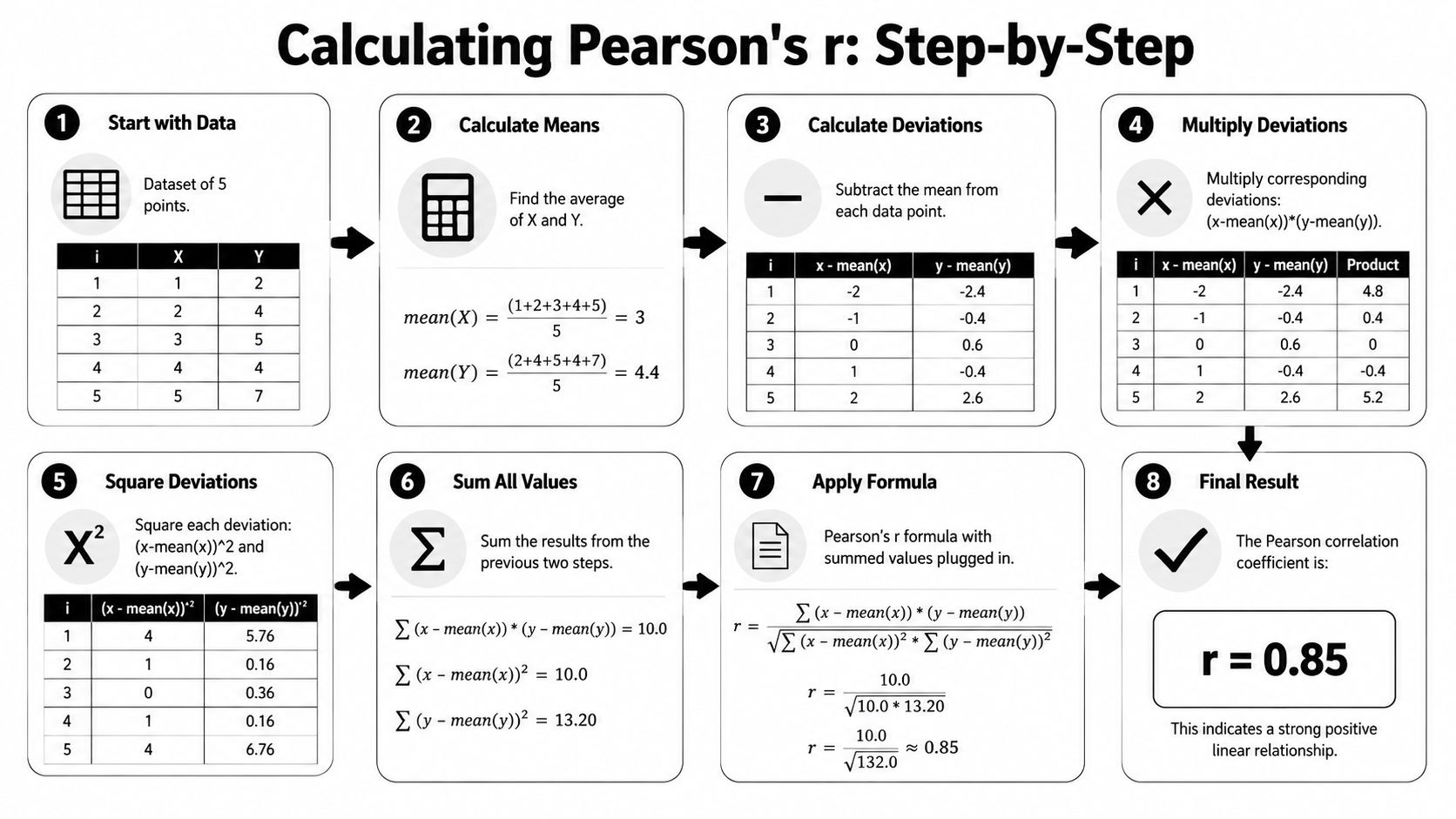
The intuition behind the math
The process is straightforward:
- Find the mean of each variable.
- Measure how far each point is from its mean.
- Multiply paired deviations to see whether the variables move together.
- Scale that result by the spread of both variables.
If the deviations usually have the same sign, the relationship is positive. If they often have opposite signs, it's negative. If they cancel out, correlation moves toward zero.
That's all Pearson's r is doing. It's checking whether two variables depart from their averages in a coordinated way.
How PMs actually do this in tools
In spreadsheets, use:
- Google Sheets or Excel:
=CORREL(range1, range2)
Example:
=CORREL(B2:B31,C2:C31)
In Python with pandas:
df['metric1'].corr(df['metric2'])
That's enough for most ad hoc product analysis. If you want to get stronger with data handling before you touch modeling, this guide on mastering Python for data wrangling is a practical next step.
For SQL, the exact function depends on your warehouse. A common pattern is to aggregate your metrics to the same grain first, then compute correlation in a notebook, BI layer, or SQL function if your database supports it. The important product judgment isn't the syntax. It's getting the grain right.
- Wrong grain: Correlating user-level adoption with company-level revenue.
- Better grain: Align both variables at the same user, account, day, or week level.
- Best habit: Decide the unit of analysis before you run the query.
A PM workflow that works
Here's the lightweight workflow I'd give a team:
- Export aligned data: Same entities, same time window, same metric definitions.
- Run correlation fast: Sheets for a quick check, Python for repeatability.
- Inspect the scatterplot: Always. This catches most embarrassing mistakes.
- Write one sentence of interpretation: “Metric A and Metric B show a positive linear relationship worth testing further.”
- Escalate only if useful: If it affects prioritization, proxy metrics, or experiment design.
If you want a deeper method once you move from relationship screening into prediction, Aakash Gupta's write-up on how to perform regression analysis is one practical next read.
Correlation Pitfalls That Deceive Product Managers
The biggest danger with linear coefficient correlation is that it feels cleaner than reality.
A dashboard gives you one number. Your brain turns that into one story. That's where PMs get trapped.
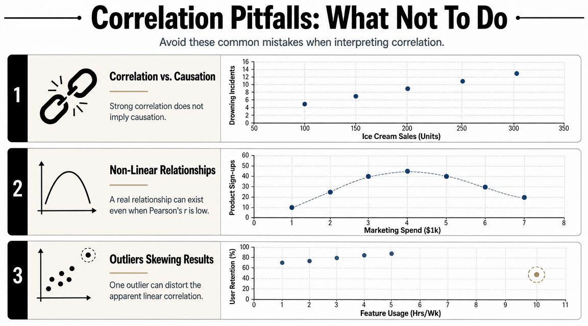
Correlation is not causation
You already know the phrase. Numerous teams still violate it weekly.
If metric A and metric B move together, several explanations are possible. A could influence B. B could influence A. A third factor could drive both. Or the relationship could be an artifact of timing, segmentation, or instrumentation.
The practical implication for PMs is blunt. Correlation can suggest a hypothesis. It cannot validate a causal claim.
If you say “this feature caused retention to rise” from correlation alone, a strong analyst will stop listening.
That's why a good product organization uses correlation to generate candidate explanations, then validates them through experiments, cohort analysis, or stronger observational methods. If your team needs to tighten how it frames assumptions before analysis, this guide on what makes a good hypothesis is directly useful.
Outliers can hijack the story
Pearson's r isn't resistant to outliers. A few extreme observations can materially distort the number. That means one enterprise customer, one broken event stream, or one launch-day anomaly can create a pattern that looks strategic but isn't.
This is one reason experienced PMs ask for the scatterplot before they react to the coefficient. If the line is being pulled by a tiny handful of points, the business takeaway changes.
Non-linear patterns can hide in plain sight
A major blind spot in most explanations is that they stop at “r measures strength and direction” and never answer when r is misleading or invalid. Pearson's r can miss nonlinear relationships, be distorted by outliers, and shouldn't be treated as causation, as noted in this overview of Pearson correlation limitations.
That matters in product work because many important relationships aren't linear:
- Too little personalization hurts engagement.
- Some personalization helps.
- Too much personalization can feel creepy or repetitive.
That can produce a clear business pattern with a weak Pearson correlation.
The contrarian take PMs need
Higher r isn't always better. Sometimes a high correlation just means two noisy metrics share the same artifact. Sometimes a low correlation is the first clue that your users split into very different behavioral modes.
The mature move isn't chasing the biggest coefficient. It's asking whether the coefficient matches the product mechanism you believe exists.
Advanced Correlation for AI Product Managers
You ship a new ranking model. Offline quality looks strong. In production, engagement barely moves, and support tickets climb from one customer segment. That is usually not a model problem alone. It is a measurement problem.
AI PMs need a broader lens than a single correlation coefficient. The critical question is whether the relationship matches the system you are building and the decision you need to make. In AI products, many signals move in the same direction without following a clean straight line. Prompt length, model confidence, latency, user satisfaction, and retention often interact in ways Pearson only partly captures.

Why the geometry matters
Correlation has a useful geometric interpretation. In regression and representation-heavy systems, it can be viewed as the cosine of the angle between centered vectors, as discussed in this paper on correlation geometry in regression analysis. PMs do not need the linear algebra proof. They do need the product implication.
If two inputs point in nearly the same direction, they may be carrying overlapping information. That shows up all over AI product work:
- Feature selection: Highly correlated inputs often add complexity faster than they add signal.
- Embedding analysis: Similar vectors can reflect shared structure in the data, not a user need you should build around.
- Model debugging: Models often latch onto correlated proxies because they are easy to learn.
- Explainability reviews: Groups of inputs moving together can make a weak model story sound stronger than it is.
Many PMs often lose the plot. They hear “strong correlation” and translate it into “important feature.” In model development, that shortcut gets expensive fast.
Where PMs misuse correlation in AI
A feature can line up tightly with model output and still be the wrong thing to optimize. I have seen teams push a highly correlated input into the product narrative, only to learn later that it was a proxy for geography, device class, or annotation quirks. The model was not discovering product truth. It was exploiting structure in the dataset.
That is why slice-level checks matter more in AI than they do in many classic dashboard reviews. Compare correlations across cohorts, time windows, languages, and environments. Compare them across training and evaluation data too. The same habit improves your judgment on training set and test set design, because a relationship that looks stable in one sample can weaken, drift, or reverse in another.
A short explainer can help if your team wants the visual intuition before debating implementation details:
When to move beyond Pearson
Pearson is still useful. Use it when the relationship is roughly linear, both variables are quantitative, and the business question is about straight-line co-movement.
Switch methods when the product question changes.
- Use rank-based correlation when order matters more than exact distance, such as model score versus human preference ranking.
- Use segmented analysis when one global coefficient hides very different user behaviors, which is common in AI assistants and recommendation products.
- Use more resilient methods when outliers come from logging issues, sparse enterprise accounts, or rare failure modes.
- Use plots before summaries when the cost of a wrong conclusion is high, such as feature launch decisions or model rollback calls.
The practical standard is simple. Pick the correlation method that matches the mechanism you are testing, not the method your spreadsheet makes easiest. That is the difference between sounding analytical and making better product bets.
Your Action Plan for Using Correlation This Week
The best use of linear coefficient correlation is operational. Don't file it away as theory. Put it into your next review cycle.
A checklist PMs can use immediately
- For data exploration: Pull two to five metrics from a new feature area and check which ones move together at the same grain. This helps you spot candidate proxy metrics fast.
- For experiment analysis: After your primary A/B result, inspect whether secondary metrics line up with the user behavior you expected. Correlation won't prove the experiment worked, but it can reveal spillover patterns worth investigating.
- For metric definition: If you're proposing a new north-star input metric, test whether it tracks with the outcome leadership cares about. If it doesn't, don't force the story.
A stakeholder template that keeps you credible
Use language like this in reviews:
We found a positive linear relationship between feature usage and the target outcome. That makes the metric worth monitoring as a proxy, but it does not establish causation. We should validate the mechanism through a targeted experiment or segmented analysis.
That sentence does three useful things. It shows analytical maturity, avoids overclaiming, and tells the room what should happen next.
The career angle most PMs miss
Teams trust PMs who can separate signal from narrative. Correlation is one of the fastest ways to build that reputation because it improves prioritization, sharpens experimentation, and cuts down on dashboard theater.
Use it to ask better questions. Not to pretend you have all the answers.
If you want more PM frameworks like this, Aakash Gupta publishes practical resources on product growth, analytics, experimentation, and career development for PMs at every stage.